In this article, we will show you the different features of the Quick Analysis Tool in Excel. There are 5 core features of the Quick Analysis Tool. They are Formatting, Charts, Totals, Tables, and Sparklines.
We can add data bars, analyze date, and highlight values using the Formatting tab. Then, we can create quick charts using the Charts tab. Using the Totals tab, we can find the summation and average of given values.
We can also create a simple pivot table quickly from the Tables tab. Lastly, we can insert sparklines from the Sparkines tab.
Overall we will try to cover most of the things associated with the Quick Analysis Tool.
Download Practice Workbook
You can download and practice this workbook.
What Is Quick Analysis Tool in Excel?
There is a Quick Analysis Tool in Excel that you can use to analyze data quickly. This is a collection of 5 essential features. They are Formatting, Charts, Totals, Tables, and Sparklines. Within each tool, you can find different functions. This Quick Analysis Tool can be handy for quick analysis. This tool was introduced back in 2013. So, you can’t use this tool in the older versions.
How to Open Quick Analysis Tool in Excel
It’s very simple to open the Quick Analysis Tool in Excel.
- First, select your data table.
- Then, click on the Quick Analysis button right beneath the selected cells.
- And, the Quick Analysis Tool has been opened.

- Also, there is a keyboard shortcut to open the Quick Analysis Tool.
- Select any cell within your data table and use the keyboard shortcut Ctrl + Q.
Quick Analysis Tool in Excel: 5 Important Features
We will show you all 5 important features of the Quick Analysis Tool in the following section.
1. Add Data Bars, Analyze Dates, and Highlight Values Using Formatting Tab
In this section, we will use the Formatting tab to add bars, analyze dates, and highlight values.
1.1 Add Data Bars
We have taken the following dataset to add Bars using the Formatting tab.
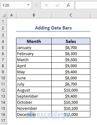
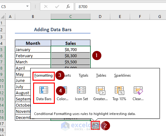
- First, select the data range C5:C16.
- Then, click on the Quick Analysis button.
- Now, from the Formatting tab, select Data Bars.
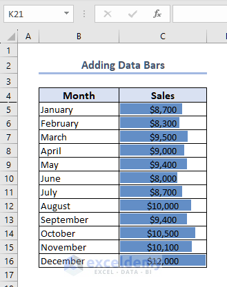
- Therefore, the tool will add Bars right on the selected cells on the basis of their cell values.
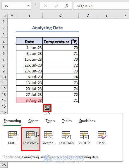
1.2 Analyze Dates
- Now, we will show how you can analyze date values.
- For this purpose, we have taken the following dataset that shows Temperature records on different days.
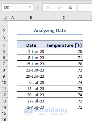
Suppose, we want to find out the date values of last month. Today is 9th of August. And, we want to find out the dates of last month.
- First, select the data range B5:B14.
- Then click on the Quick Analysis button.
- After that, select Last Month from the Formatting tab (you may not find the whole name. But the first option is attributed to Last Month).

- By doing so, all the dates from last month will be highlighted as shown in the following image.
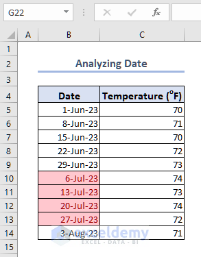
- Similarly, you can analyze dates from Last Week.
- First, copy the data range.
- Then, open Quick Analysis Tool.
- Then from the Formatting tab, select Last Week.
- And, the date values of Last Week will be highlighted as shown in the following image.
1.3 Highlight Values
In this part, we will highlight text values with conditions. We have taken the following dataset of World Cup Winners and their Winning Years. From the dataset, we will highlight the countries that appear more than once.
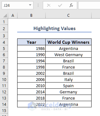
- First, select the data range C5:C14.
- Then, open the Quick Analysis Tool.
- After that, select Duplicate from the Formatting tab.
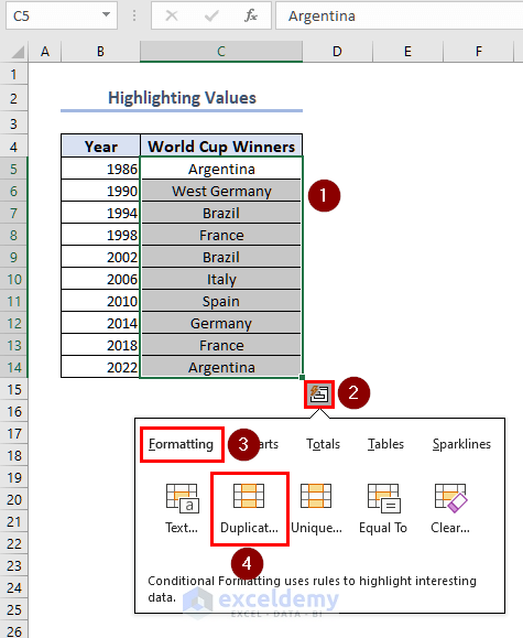
- And, all the countries appearing more than once have been highlighted.
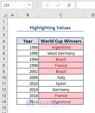
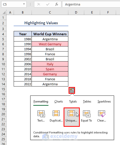
You can also find unique values using the Unique option.
- First, copy the data range C5:C14.
- Then open the Quick Analysis Tool.
- After that, from the Formatting tab, select Unique.
- Now, you can see, the Unique values have been highlighted as shown in the following image.
2. Insert Charts for Better Visual Representation
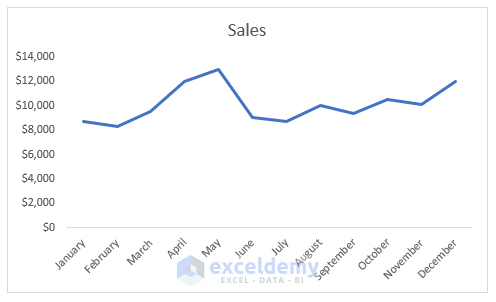
We can insert a quick chart using the Quick Analysis Tool in Excel. For this method, we have taken the following dataset of Sales Report.

- First, select the whole dataset.
- Then, open the Quick Analysis tool.
- After that, from the Charts tab, select Line chart.
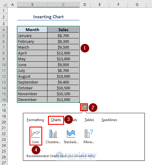
- And, the tool will create a line chart as shown in the following image.
- There are other chart options that you can try out.
- Select Clustered to create a clustered Column Chart.
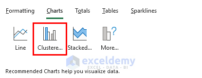
- The following image shows how a Clustered Column Chart will look using the same dataset.

You can find more chart options from the More option based on your dataset.
3. Perform Mathematical Analysis from the Totals Tab
To perform a quick mathematical analysis, we can use the Totals tab. We have taken the following dataset to perform some quick mathematical analysis.

- First, select the whole data table B4:C16.
- Then, open the Quick Analysis Tool.
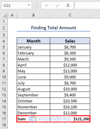
- After that, select Sum from the Totals tab.
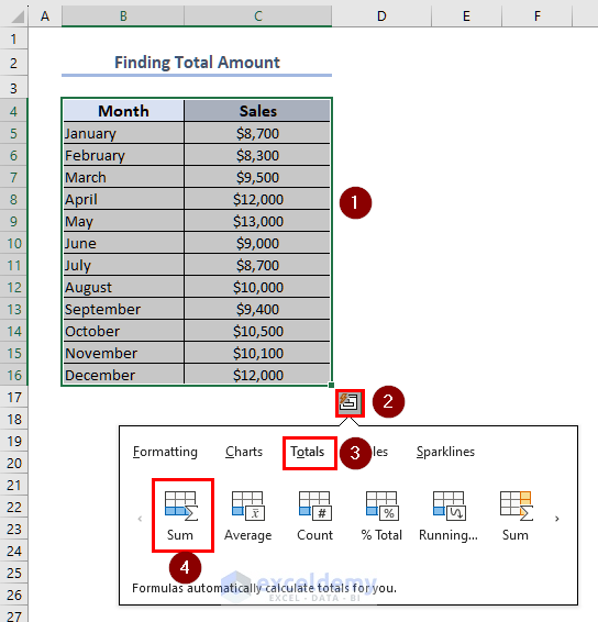
- And, the Analysis Tool will give Total Sum right at the bottom of your data table.
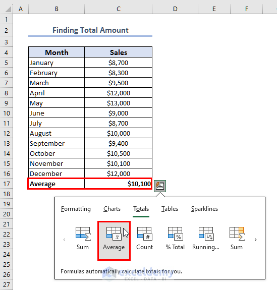
- Also, you can find the Average of the Sales.
- First, select the whole data table B4:C16.
- Then navigate to Quick Analysis > Totals.
- And, select the Average option.
- Therefore, you will get the Average right beneath the data table.

From this Totals tab, you can carry out mathematical analysis both row and column-wise.
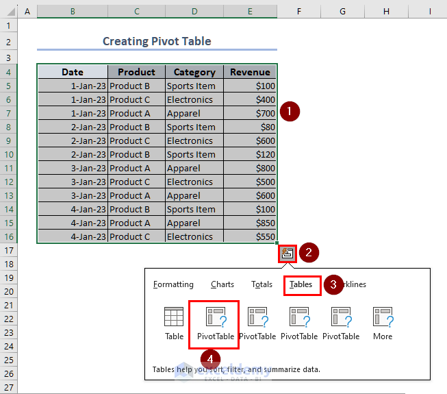
4. Create Pivot Table from the Tables Tab
With this Quick Analysis Tool, we can create a pivot table. We have taken the following dataset to show how we can create a pivot table using the Quick Analysis Tool in Excel.
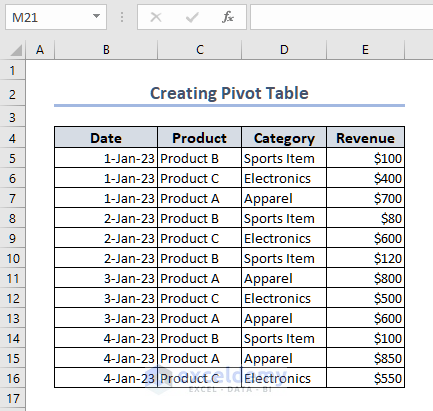
- First, select the whole data table i.e. B4:E16.
- Then, open the Quick Analysis Tool.
- After that, select the first Pivot Table from the Table tab.
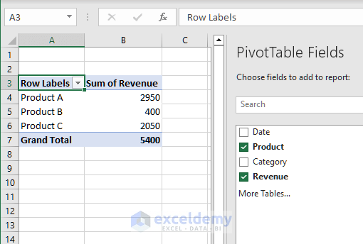
- And, the tool will create a Pivot Table based on Product.
- You can choose other values from the PivotTable Fields window.
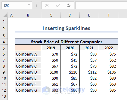
5. Insert Sparklines Quickly Using Quick Analysis Tool
Another useful feature of the Quick Analysis Tool is to quickly insert the Sparklines. To show this procedure, we have taken the following dataset of stock prices of several companies over the last 4 years.
- First, select the whole data table i.e. C6:F12.
- Then, open the Quick Analysis Tool.
- After that, select Line from the Sparklines tab.
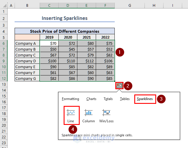
- By doing so, we have inserted Sparklines right next to the data table.
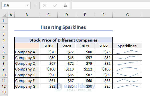
- Also, you can insert Column bars in Sparklines.
- Follow the previous steps and select Column type from the Sparklines tab.
- This will give you Columns as Sparklines.

What to Do When Excel Doesn’t Show Quick Analysis Tool?
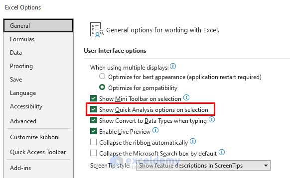
Generally, you should find the Quick Analysis Tool very easily on your PC. However, if this tool doesn’t show up, you can follow these steps to activate Quick Analysis Tool.
- First, from your Excel workbook, navigate to File > Options.
- Then, from the General tab, check whether the Show Quick Analysis option on selection is marked or not. If not, you should mark the option.
- And, now, you will be able to find Quick Analysis Tool from a selection.
How to Clear Quick Analysis Tool Results in Excel
It’s very easy to clear Quick Analysis Tool results.
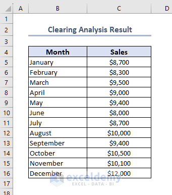
- First, select the data range C5:C16 that has Quick Analysis result.
- Then, open the Quick Analysis Tool.
- After that, from the Formatting tab, select Clear.
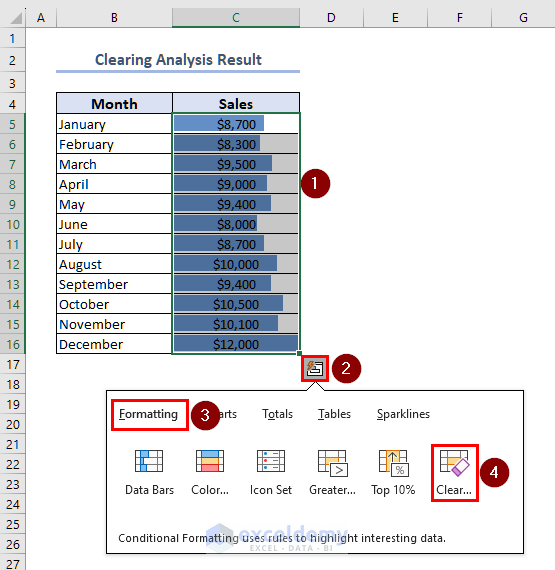
- Your analysis result will be cleared as shown in the following image.
Things to Remember
- You can carry out mathematical analysis both row-wise and column-wise.
- While creating a Pivot Table, this tool will offer many Pivot Tables based on different criteria.
- To highlight duplicate or unique values, you will have to select only the text values.
Frequently Asked Questions
1. Why can’t I use Quick Analysis Tool in Excel?
You can’t use the Quick Analysis Tool if you are selecting blank cells or if you are selecting entire rows or columns. Also, the Quick Analysis Tool could be deactivated. You have to activate the tool by navigating File > Options > General. From this General tab, you can activate the tool.
2. What is the benefit of using the Quick Analysis Tool?
With the Quick Analysis Tool, you can analyze your data very quickly. You can find the sum, and average of a given numeric dataset. You can create quick charts or sparklines. Also, you can create a pivot table and carry out basic formatting with this tool.
3. Where does Excel display the Quick Analysis Tool?
When you select any data range, the Quick Analysis Tool will show up right beneath your selected data table.
Conclusion
Thank you for reaching this far. We have shown you the different features of the Quick Analysis Tool in Excel. We hope you find the content of this article useful. If there are further queries or suggestions, feel free to mention them in the comment section. Have a nice day!
Quick Analysis Tool Excel: Knowledge Hub
<< Go Back to Data Analysis with Excel | Learn Excel

