A Pivot Chart is the visual representation of our raw data. Using a Pivot Chart is one of the best ways to present your data in Excel. It allows us to analyze data using various types of graphs and layouts. The main objective of this article is to explain how to use Pivot Chart in Excel.
What Is a Pivot Chart in Excel?
The pivot chart helps to summarize large amounts of data in Excel. A pivot chart is mainly a graphical representation of a pivot table. Pivot charts and pivot tables are linked together. A pivot chart can be convenient while representing data. And, it also can be used in various cases.
In this article, we will create a pivot chart first. Later we will discuss how to use a pivot chart in Excel.
Create a Pivot Chart in Excel
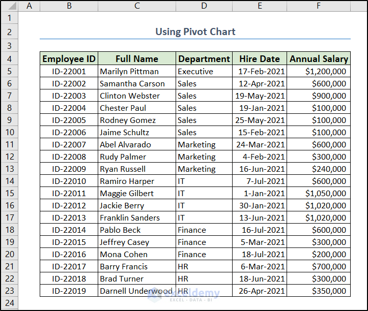
Let’s assume we have the following dataset. It contains some employee information of a corporation including their IDs, names, departments, hiring dates, and annual salaries.
First, we are going to show how we can create a pivot chart out of it in Excel.
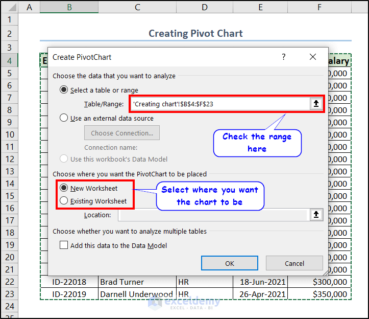
- Select any cell from your dataset. Here, I selected the first cell of my dataset which is B4.
- Now go to the Insert tab and click on the PivotChart in the Charts A drop-down menu will appear.
- Select PivotChart from that drop-down menu.

- Now select the cell or spreadsheet you want the chart to be from the Create PivotChart We have selected New Worksheet here.
- After clicking on OK, a blank pivot table will appear on a new sheet with our options.
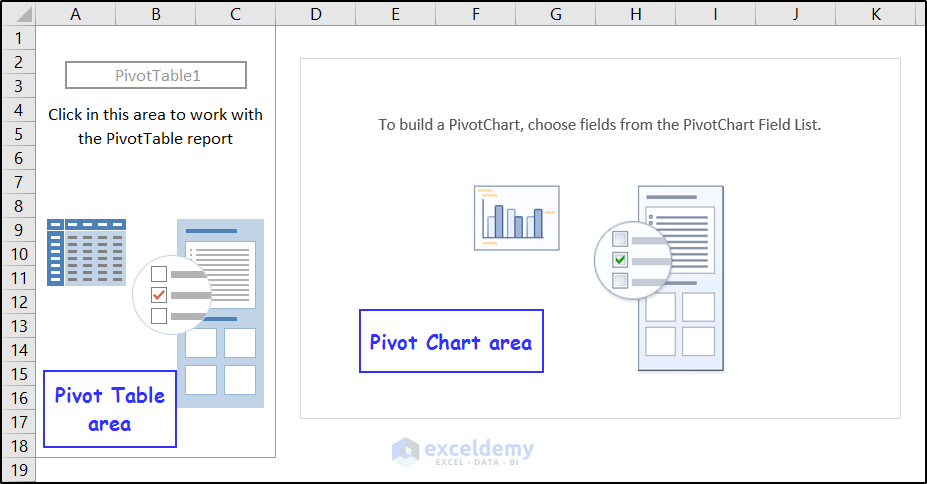
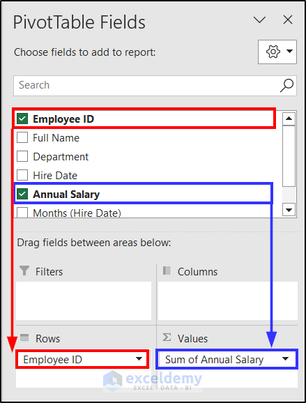
- Now click on any of the cells within the table or chart area, and you will get the PivotTable Fields window on the right side of the spreadsheet.
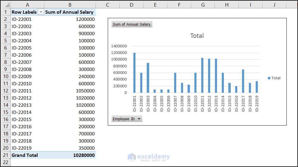
- In this window, we are selecting Employee ID in the Rows field and Annual Salary in the Values field.
As a result, we will get the pivot chart as well as the table on the spreadsheet.
Note: You can create a pivot chart from the pivot table too. If you have already created a pivot table, you can get the PivotTable Analyze tab on the ribbon once you have selected any of the cells in the table. You can get the PivotChart option available there in the Tools group.
Read More: How to Create Chart from Pivot Table in Excel
How to Use Pivot Chart in Excel: 5 Different Uses
The pivot chart has many uses- data analysis, exploration, visualization, comparison, filtering, dashboard creation, etc. It offers many functionality that normal charts don’t offer. We will be discussing some of them in this section. We are going to demonstrate them in the chart that we have created.
1. Use Pivot Chart by Filtering Data
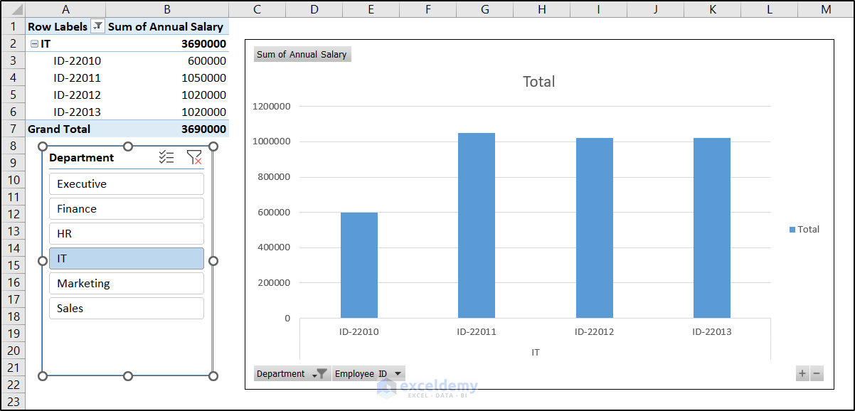
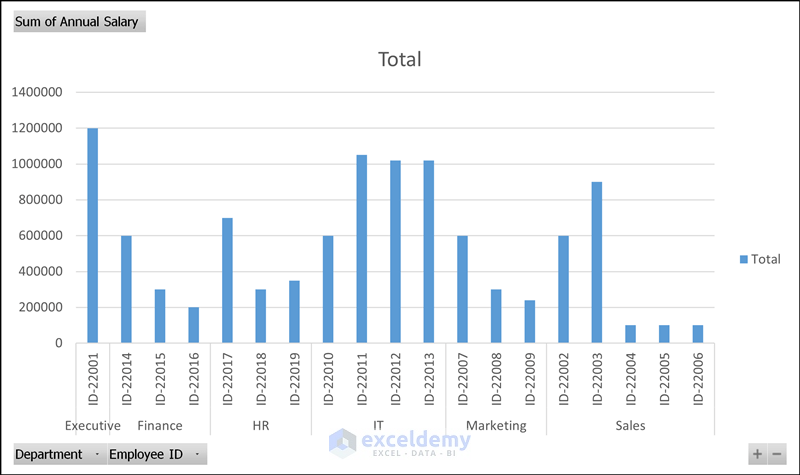
Let’s suppose, we have created the following pivot chart from our dataset. This chart not only represents the employee IDs but also the designated departments.
What if we want to filter out some employees from the data? Or do we want to show employees from particular departments only? The pivot chart has the option to filter out data for these unique problems. To filter the data in the pivot chart in Excel, follow these steps.
- To filter departments, click on the filter button named Department at the bottom left of the chart.
- In the filter menu, manually select/deselect the departments you want to filter out from the chart. We have selected “Executive”, “IT”, and “Marketing” manually here.
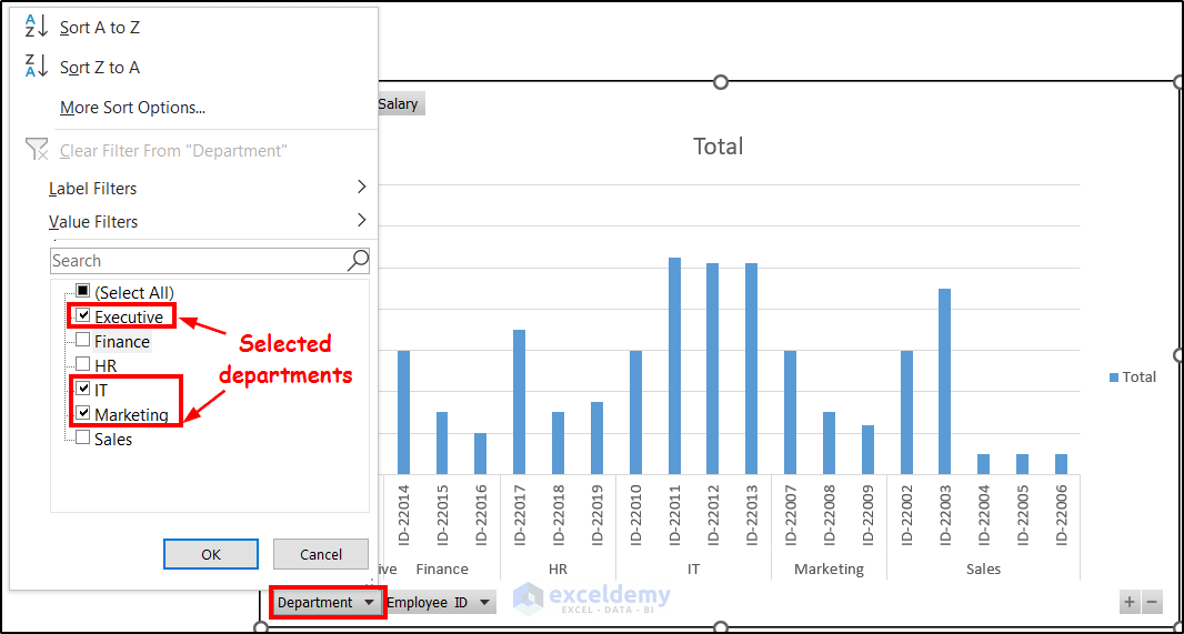
- After clicking on OK, we can get the filtered pivot chart on the same Excel spreadsheet.

Note: You can do that for any of the particulars you have inserted in the Rows field of the pivot chart.
2. Insert Slicer in Pivot Chart to Filter Data from Particulars
Let’s go back to the original chart and add a slicer to them now. The purpose of adding a slicer is to filter data from the Rows field particulars.
It will give the same result as the previous one. So using this or the previous one is entirely up to the user’s choice.
Another advantage involved with the slicer is the filtering options are always available beside the pivot chart.
To add slicer and filter data from them, follow these steps.
- First, select the pivot chart.
- Then go to the Insert tab and select Slicer from the Filters group.
- The Insert Slicers box will open, select Department from it.
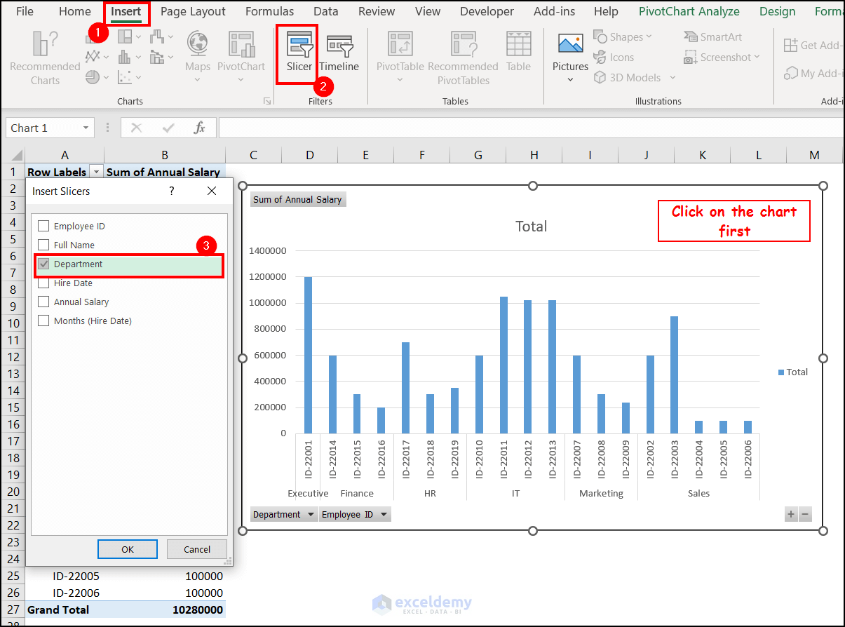
- After clicking on OK, the slicer will be available in the spreadsheet. Select the desired department you want to filter out by clicking on it here. For example, we have selected IT in the following figure.
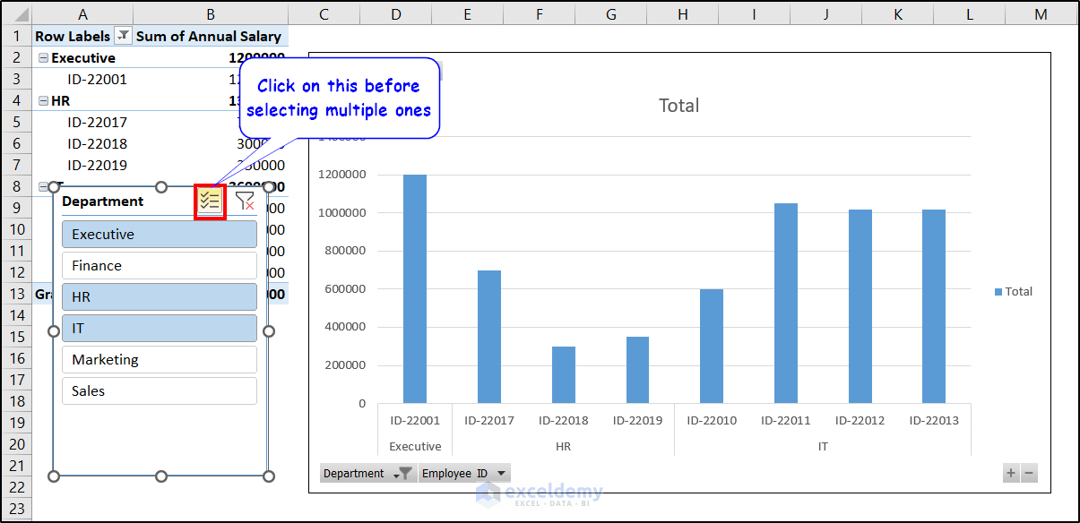
- With slicers, you can select multiple options too. The Multi-Select option is available on top of the slicer. Click on it and select multiple options from the slicer. The graph will follow.
Read More: Use Excel VBA to Create Chart from Pivot Table
3. Insert Timeline with Pivot Chart to Filter Dates
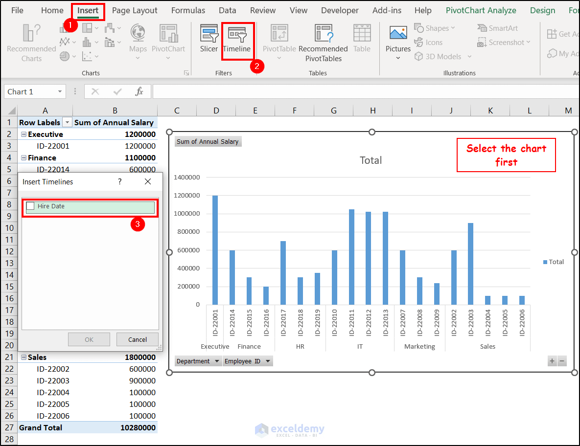
You can also add timelines in pivot charts. This helps filter out data based on a particular time period. Basically, this is a slicer for the time period. To add a timeline in a pivot chart, follow these steps.
- Select the chart first.
- Then go to the Insert tab and select Timeline from the Filters group.
- The Insert Timelines window will appear. The timeline options from the dataset will be available here. We have the Hire Date as our dataset has that.
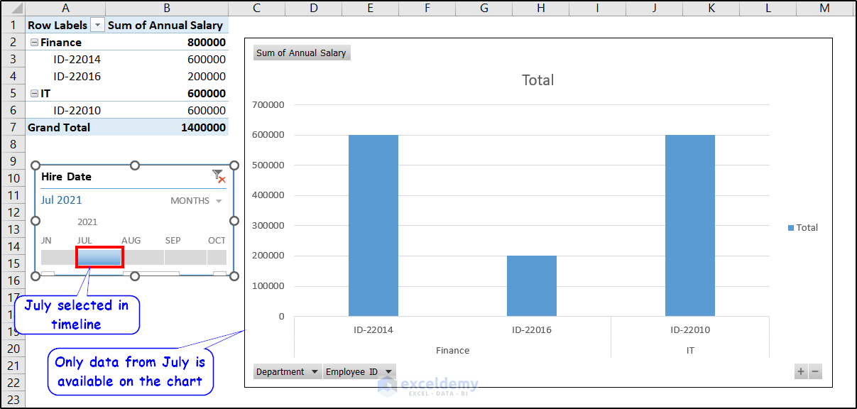
- As a result, the timeline will appear on the spreadsheet. Select the time period you want from here now on.
We have selected July in the timeline. So the chart changed accordingly to reflect that.
4. Display Running Total in Pivot Chart
Another option we can have in the pivot chart is to calculate and display the running total. The running total indicates the cumulative total of the ongoing values available to a point. To display the running total in the chart we have created, follow these steps.
- Let’s first modify the chart to have a separate running total. We have added the “Annual Salary” again in the Values field.
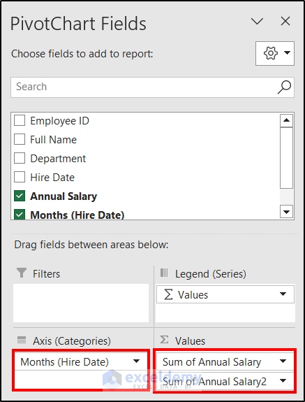
You can skip this step if you just want the running total to show in the pivot chart.
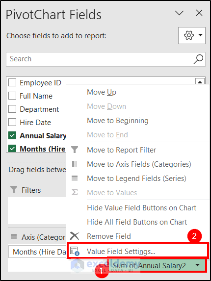
- Click on the “Sum of Annual Salary2” (or the first one if you wish) and select Value Field Settings from the menu.
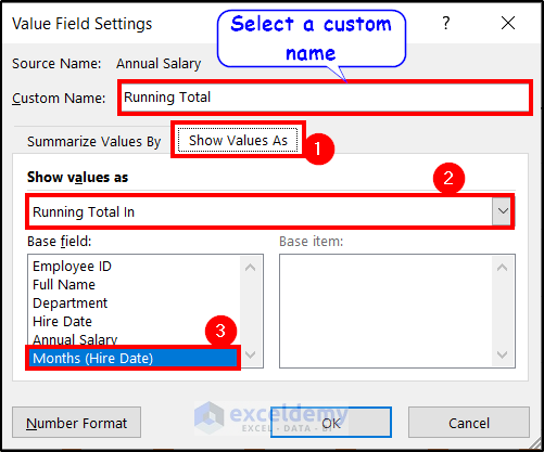
- In the Value Field Settings box, select a custom name. Here we named it ‘Running Total’.
- Go to the Show Value As Under the Show Value As option, select Running Total In. In the Base field, select Months (Hire Date).
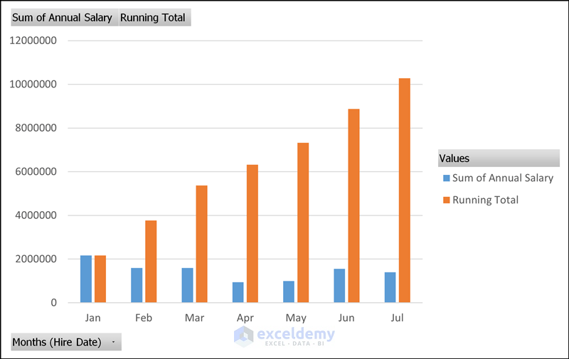
- After clicking on OK, you can get the running total in the pivot chart.
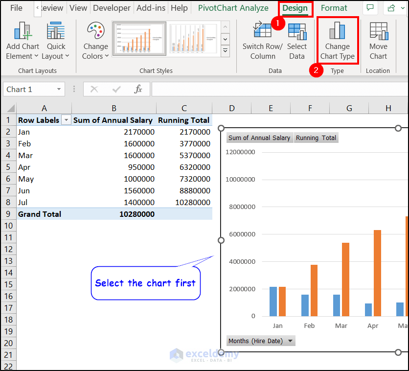
- To make it more presentable, let’s modify it to a line chart. We can do that by selecting the chart and selecting the Change Chart Type option from the Type group of the Design tab.
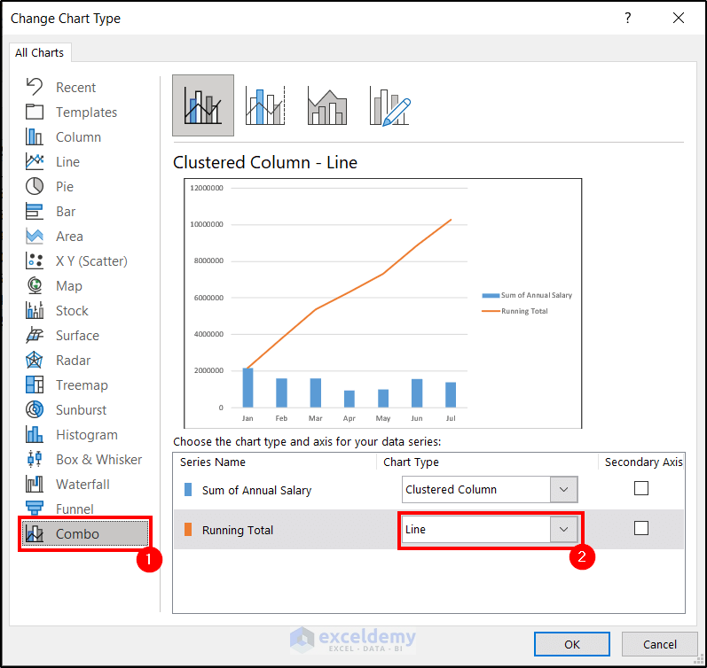
- We have selected a Line for the second line from the Combo tab of the Change Chart Type box as shown in the figure below.
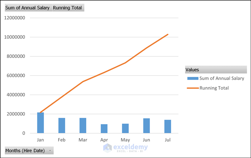
We can finally get the additional running total in the pivot chart like below.
Read More: Types of Pivot Charts in Excel
5. Group Dates in Pivot Chart
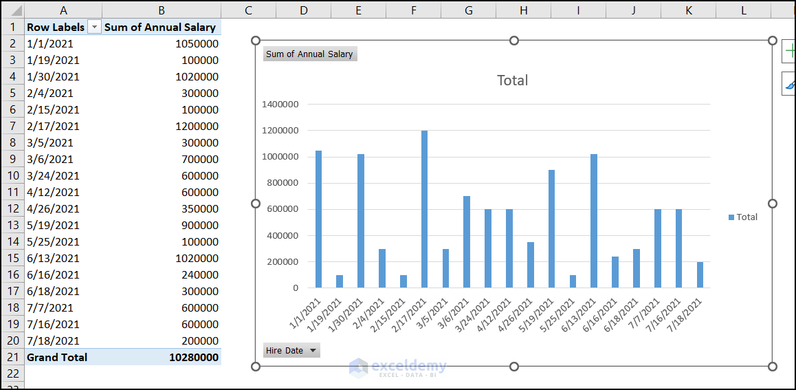
We can also group dates in a pivot chart. This helps to summarize the data on a timely basis like days or months. Let’s assume we have the chart below. It has the dates against the annual summary in the pivot chart.
We are going to group the dates and determine the annual salaries assigned on a monthly basis with the following steps.
- Right-click on a date of a pivot table and select Group from the context menu.
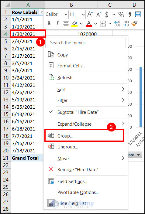
- In the grouping box, you can manually determine the starting and ending date. Although it will be automatically filled up. However, you have to select Months under the By field and click on OK.

We will get all the dates now grouped in months in the pivot chart.

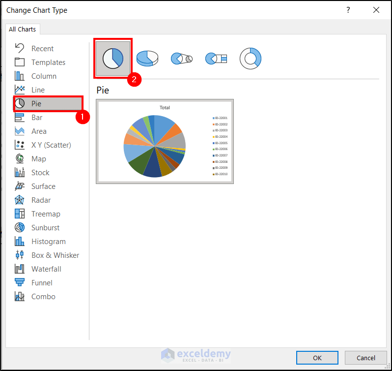
How to Change Chart Type of Pivot Chart in Excel
Once you have created a pivot chart, you are not stuck with it for the rest of the calculations or presentations. You don’t have to create a chart from the very first point either. You can follow the steps to change the chart type if you have already created one and want a new way to represent your data.
- First, click on the chart and go to the Design tab on the ribbon.
- Then select the Change Chart Type option in the Type group.
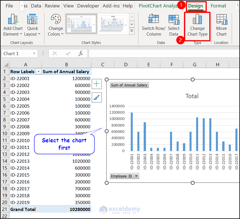
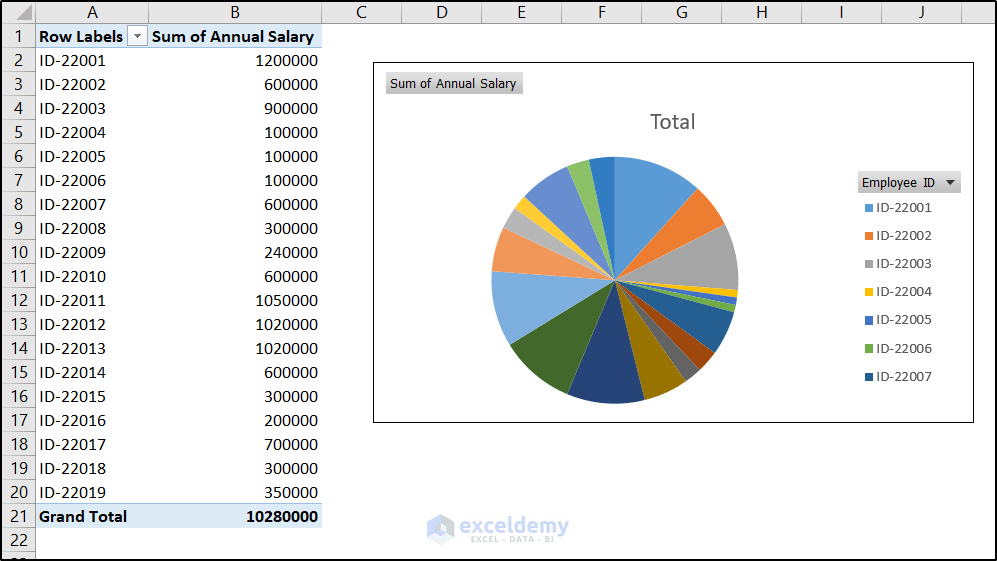
- In the Change Chart Type box, select the type of chart you want now. We have selected a 2-D pie chart from the Pie tab.
- After clicking on OK, we will see Excel has changed the pivot chart type.
Read More: How to Edit Pivot Chart in Excel
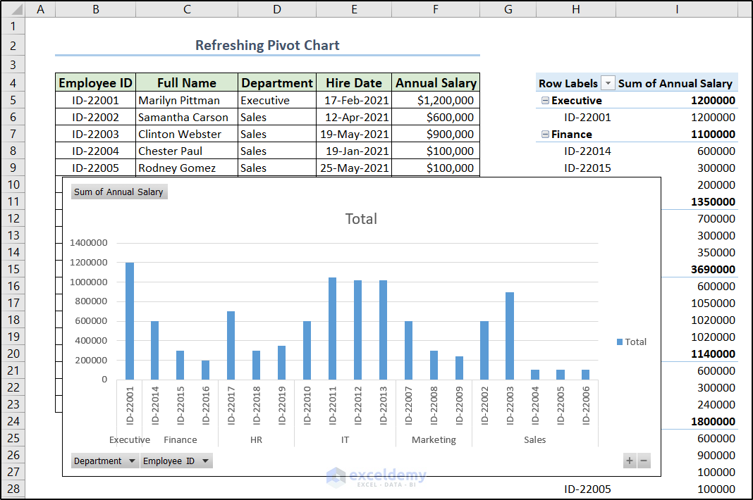
How to Refresh a Pivot Chart in Excel
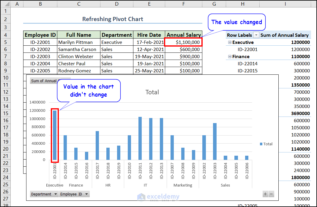
Changing any data in the original dataset won’t automatically update the data. For example, let’s take the following chart we have created from our dataset previously.
If we change the annual salary input of the first entry, there won’t be any change in the pivot chart.
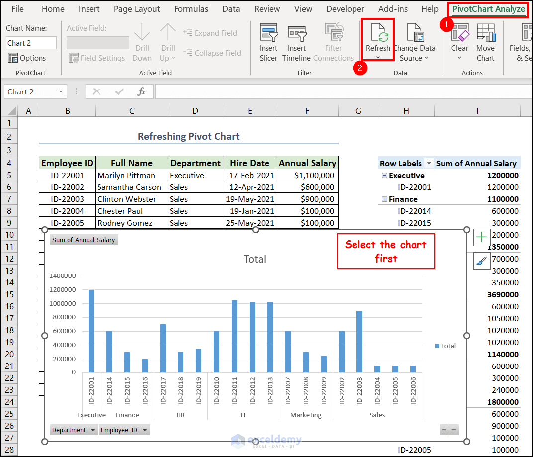
To update the data in the chart or refresh it, follow these steps.
- First, select the chart.
- Then go to the PivotTable Analyze tab on the ribbon and select Refresh from the Data group.
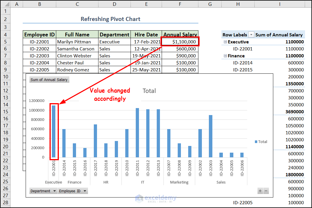
The chart data will now refresh to match that of the dataset.
Read More: How to Refresh Pivot Chart in Excel
Things to Remember
- If you group any data in your pivot table it will group in all the other worksheets of your workbook.
- You can directly insert a pivot chart without creating a pivot table first.
- Inserting a pivot chart will always include the pivot table in the sheet automatically.
Frequently Asked Questions
- What is the difference between a pivot chart and a normal chart?
A pivot chart is always linked to a pivot table. Where the normal chart is linked to a range of cells. The pivot chart is always more dynamic, flexible, and interactive and makes data aggregation and summarization easier because of the features we have described in the article.
- What is the difference between a pivot chart and a pivot table?
A pivot chart is represented by visually representing graphic elements such as columns, bars, lines, etc. Meanwhile, a pivot table is the data in a tabular format with rows and columns that provides a bit more functionality than the normal range of cells in Excel.
- How many types of pivot charts are there in Excel?
There are many types of pivot charts available in Excel. Most notable ones include- column charts, bar charts, line charts, area charts, pie charts, doughnut charts, scatter charts, bubble charts, pivot chart stacked column charts, pivot chart 100% stacked column charts.
Download Practice Workbook
You can download the workbook used for the demonstration from the link below.
Conclusion
That concludes our discussion on how to use pivot chart in Excel. We included the use of a filter, slicer, timeline, running total, and grouping as general usage. This article also covers the method to change the chart type and how to update or refresh pivot chart data in Excel. Hopefully, this made creating and working with pivot charts easier for you. I hope you found this guide helpful and informative.
If you have any questions or suggestions, let us know in the comments below.

