Excel spreadsheet is extensively used for data analysis. Also Excel provides many inbuilt features for insightful data visualisation. In this article, we are going to demonstrate data visualisation by different features in Excel.
Download Practice Workbook
You can download and practice this workbook.
7 Examples of Data Visualisation in Excel
There are different ways to visualise data in Excel. We are going to illustrate the most useful and prevalent features for data visualisation. So let’s see these processes.
1. Implementing Excel Column Chart for Data Visualisation
Column Chart is a simple data visualisation tool that represents data in vertical columns. This type of visualisation is particularly useful for single data types.
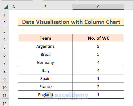
We have taken a dataset of all the countries that have won the FIFA World Cup and the number of times they won it.
Now, let’s visualise them in the Column Chart.
Steps:
➤ First, Select the Dataset.
➤ After that, go to the Insert ribbon and from the Insert Column or Bar Chart option and Select a suitable 2-D or 3-D Column.
Thereby, we get the No. of WC titles visualized in Column Chart.
Read More: Visualization Examples in Excel
2. Use of Excel Bar Chart for Data Visualisation
Bar Chart is also useful for single data types. We are going to use the same dataset for Bar Chart visualisation.
Steps:
➤ First, Select the Dataset.
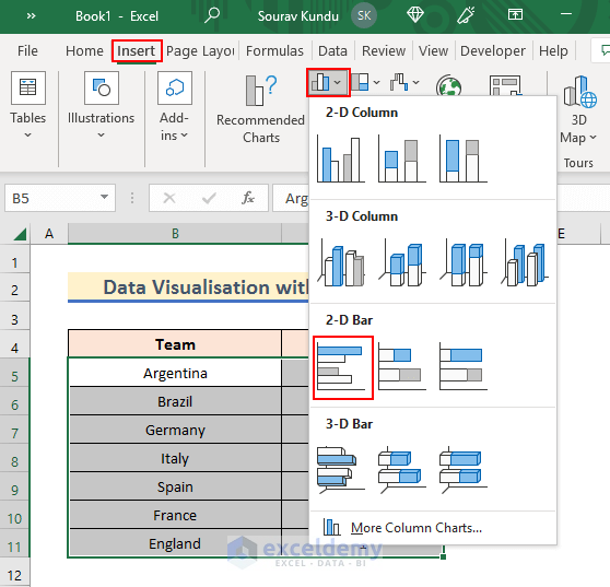
➤ Then, go to the Insert ribbon and from the Insert Column or Bar Chart option and Select a suitable 2-D or 3-D Bar.
Doing so, all the data will be shown in a Bar Chart.
3. Applying Pie Chart for Data Visualisation
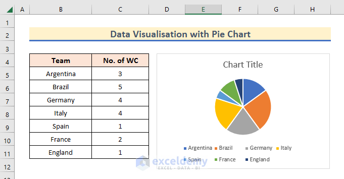
Now, let’s use the Pie Chart with the same single types dataset.
Steps:
➤ First, Select the Dataset.
➤ Then, go to the Insert ribbon and from the Insert Pie or Doughnut Chart option and Select a suitable 2-D or 3-D Pie.
Thereby, the dataset is visualised in a Pie Chart.
4. Use of Doughnut Chart
Doughnut Chart is more or less the same as a Pie Chart. It differs mainly visually.
Steps:
➤ First, Select the Dataset.
➤ Then, go to the Insert ribbon and from the Insert Pie or Doughnut Chart option Select the Doughnut named ring.

5. Implementing Line Chart
Line Chart is useful to compare between two or more entities.
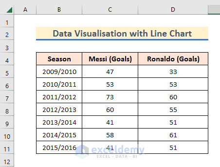
We have taken a dataset of the number of goals scored by Messi and Ronaldo. Lets see them in a Line Chart.
Steps:
➤ First, Select the Dataset.
➤ Then, go to the Insert ribbon and from the Insert Line or Area Chart option and Select a suitable 2-D or 3-D Line.
Thus, this Line Chart shows the Goals data in Y-axis and gives a sense of comparison.
6. Use of Scatter Chart for Data Visualisation
When we have to show a chart for two variables in the X-Y graph, what we need is a Scatter Chart.
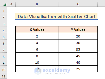
For that we have taken this dataset containing X and Y Values.
Steps:
➤ First, Select the Dataset.
➤ Then, go to the Insert ribbon and from the Insert Scatter (X, Y) or Bubble Chart option and Select a suitable Scatter option.
And thereby, we get the visual representation in a X-Y graph.
7. Use of Bubble Chart
The Bubble Chart is quite similar to the Scatter Chart.
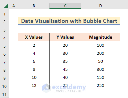
Along with the X-Y Values, it also represents the Magnitude.
For our purpose, we have modified the previous dataset to this one.
Steps:
➤ First, Select the Dataset.
➤ Then, go to the Insert ribbon and from the Insert Scatter (X, Y) or Bubble Chart option and Select a 2-D or 3-D Bubble option.
Thereby, your data will show up in a X-Y graph along with their magnitudes.
Conclusion
Thank you for making it this far. We have shown how you can perform data visualisation in Excel. Hope, you find the content of this article useful. If there are further queries or suggestions, don’t forget to mention them in the comment section.
Data Visualisation in Excel: Knowledge Hub
<< Go Back to Learn Excel
