This tutorial will show you how to create a meter chart in Excel. Learning how to create a meter chart in Excel can help you monitor your data in an organized way. Excel provides several options for creating a meter chart in Excel using the combination of Doughnut and Pie charts, creating an interactive thermometer chart using a 2-D Column chart, and so on. Whether you use a meter chart or a thermometer chart, those charts will give you an extra advantage in expressing your data more clearly to your audiences.
Download Practice Workbook
How to Create a Meter Chart in Excel
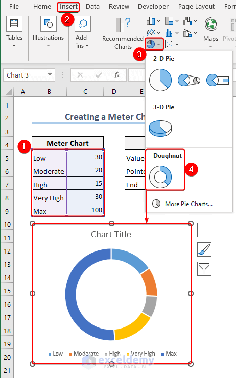
- Follow the path to insert the Doughnut chart: Insert>> Charts>> Pie Chart>> Doughnut.
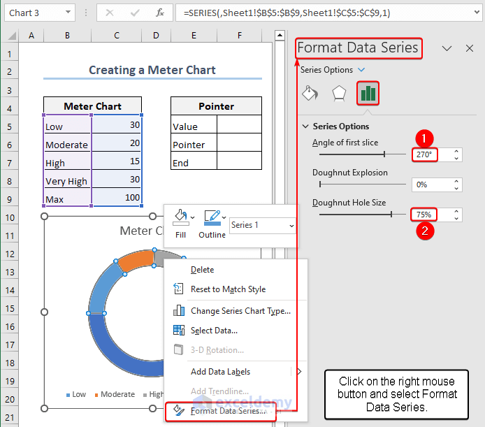
- Right-click on Mouse >> Select the Format Data Series option.
- In the field next to the drop-down list labeled “Series Options” enter 270 degrees for the Angle of First Slice. You can select the Doughnut Hole Size as you like, and we chose 75%.
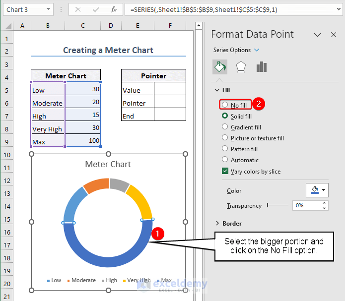
- Choose the larger portion of the doughnut chart >> Check the No Fill box below Fill in the drop-down menu.
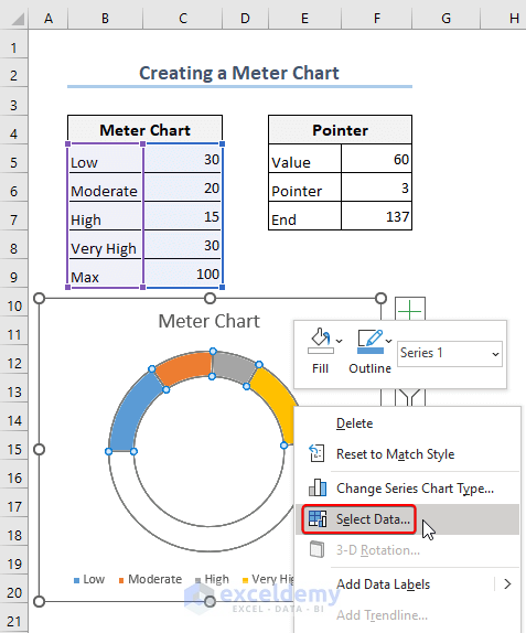
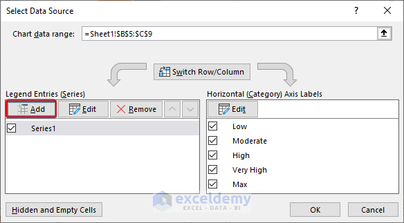
- Put your cursor on the chart >> right-click on the mouse >> choose Select Data from the menu.
- As a result, you will see a dialog box with the name Select Data Source. Make your selection from the Add option in the Select Data Source dialog box.
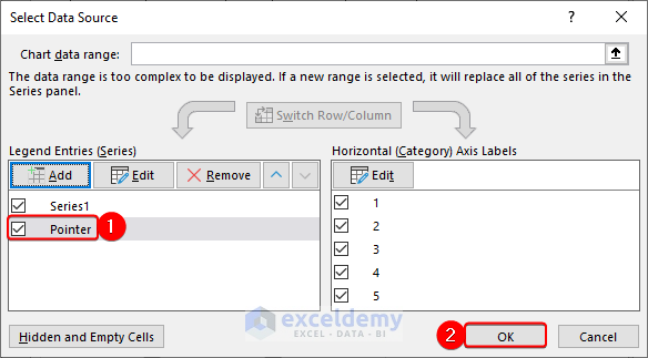
- An Edit Series dialog box appears as a result. Enter =Sheet1!$E$4 in the field for the Series name in the Edit Series dialog box >> type =Sheet1!$F$5:$F$7 in the Series values>> Press OK to finish.

- You will then return to the Select Data Source dialog box and select OK.
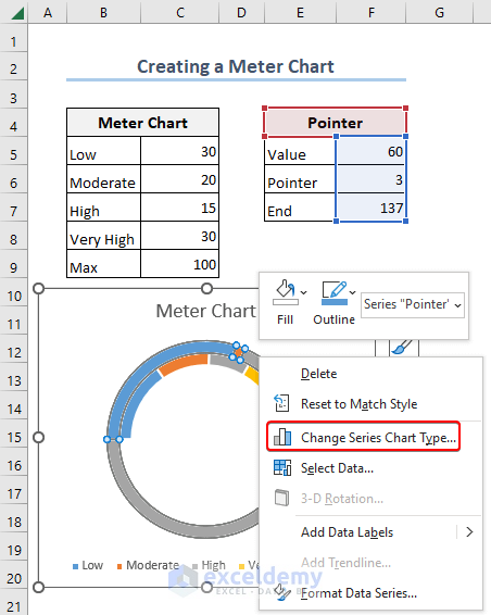
- As a result, you will make a new chart. Put your cursor on the chart >> right-click on the mouse, >> Choose the Change Series Chart Type option from that window.
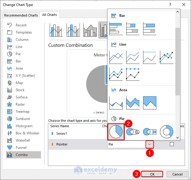
- A Change Chart Type dialog box then appears. A pie chart for Pointer data can be chosen from the Change Chart Type dialog box by clicking the drop-down menu. Click OK to finish.
- Choose the larger two segments of the pie chart, then check the No fill box next to Fill in the sidebar named Format Data Point.
- As the value changes, so does the meter chart in Excel.
Read More: How to Create Meter Chart in Excel
How to Create a Thermometer Chart
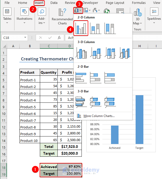
- First, choose the cells C18:D19 range >> Select the Insert Column or Bar Chart option >> Then select the Clustered Column from the 2D Chart drop-down menu.
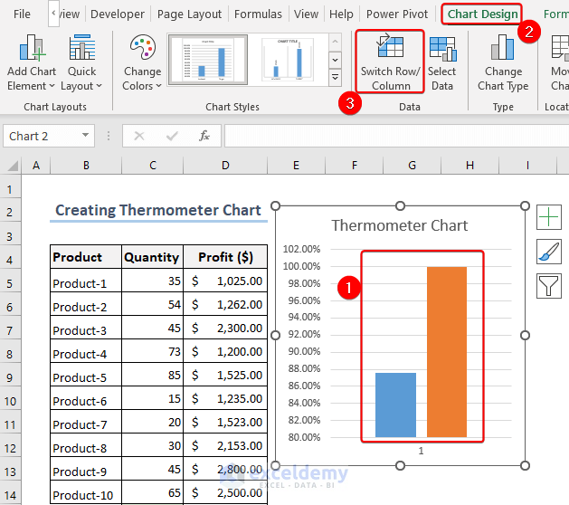
- Select a data column in the new chart, and then click the Switch Row/Column button on the Chart Design tab.
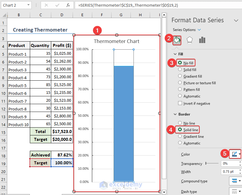
- Right-mouse click on any of the columns you want to select >> then select Format Data Series from the context menu.
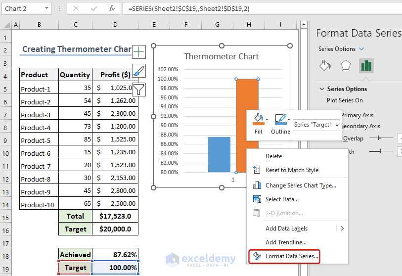
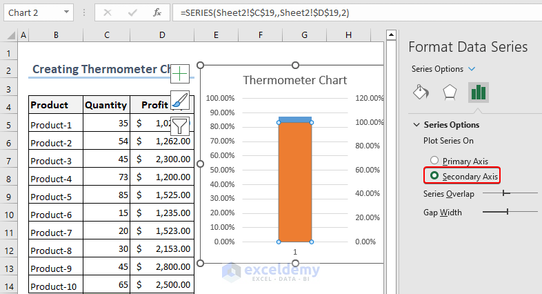
- After that, click on the Secondary Axis under Series Options from the right-side panel.
- To delete the right axis, first, choose it and then press Delete.
- Then choose the left axis by right-clicking on it >> Select the Format Axis option from the context menu >> Enter “0.0” for the Minimum bound in the right-side panel >> And then enter after entering 1.0 in the Maximum bound option. This will correct the axis’s visible limit. The Chart axis value will now start at 0.0 and end at 1.0 as the Chart changes.
- Next, click the Tick Marks and choose Inside from the Major type.
- The tick will then show up inside the Chart as a result.

- Once more, right-click on any of the columns >> select Format Data Series from the context menu >> Go to Fill and Line in the right-side panel’s menu >> Select No Fill under the Fill option >> Click on the Solid line under the Border option >> Make sure the border’s hue matches that of the column.
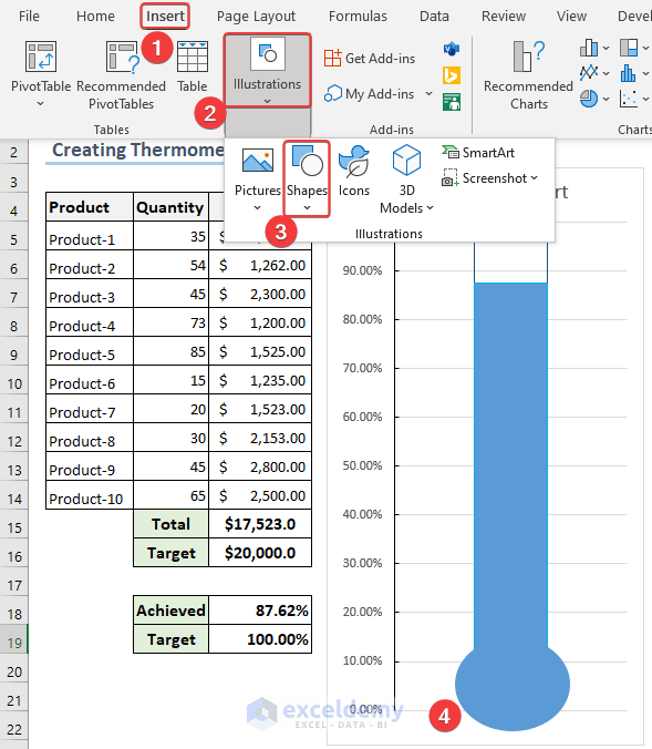
- The bulb shape can now be added below the chart, with the thermometer shape on top >> Go to the Insert tab to add this shape >> Click on the Shapes tab, then click the Oval shape icon from there.
Things to Remember
Meter Chart Overview: A visual representation of a value within a given range or target is a meter chart, also referred to as a gauge chart. With a needle or pointer indicating the value on a scale, it resembles a gauge or meter. Meter charts are frequently used to display results, measurements, or progress.
Configuring the Meter Chart: You can change the meter chart’s settings and appearance after inserting it. This entails adjusting the scale range, specifying the target or threshold values, and choosing the design or color scheme that best meets your visualization needs.
Setting the Scale Range: The minimum and maximum values shown on the meter scale are represented by the chart’s scale range. To visualize a range of values, adjust the scale range to correspond. According to the data range, Excel lets you choose whether to set the scale manually or automatically.
Conclusion
The ability to visually represent data within a predefined range is provided by the creation of meter chart in Excel. You can change the font, color, and layout of your charts to improve their readability and visual appeal. Once you’ve mastered these techniques, you’ll be able to produce professional meter charts that effectively convey information and facilitate understanding.
Frequently Asked Questions (FAQs)
1. What does an Excel meter chart mean?
Answer: A meter chart, also called a gauge chart, is a representation that utilizes a circular meter-like shape to display a value within a specified range.
2. How do I make an Excel meter chart?
Answer: By choosing the data range, inserting a doughnut or pie chart, adjusting the chart’s properties, and including data labels, you can create a meter chart in Excel.
3. Can I make meter charts in earlier Excel versions?
Answer: Yes, you can create a meter chart in Excel 2010, Excel 2013, or Excel 2016 by using the same procedures as described for the newer versions.
Meter Chart in Excel: Knowledge Hub
- How to Create Speedometer Chart in Excel
- How to Create Speedometer Chart with Two Needles in Excel
- How to Create a Gauge Chart in Excel
<< Go Back to Excel Charts | Learn Excel

