In this article, you’ll learn how to create a Matrix Bubble chart, a 4-Quadrant Matrix chart and a Scatterplot Matrix chart in Excel.
In a variety of investigation situations when you want to see the connections between two sets of category data, Excel matrix charts can be helpful.
Matrix charts can help you understand the relationships between various products and the regions or customer segments where they are popular. This analysis can guide your marketing and sales strategies.
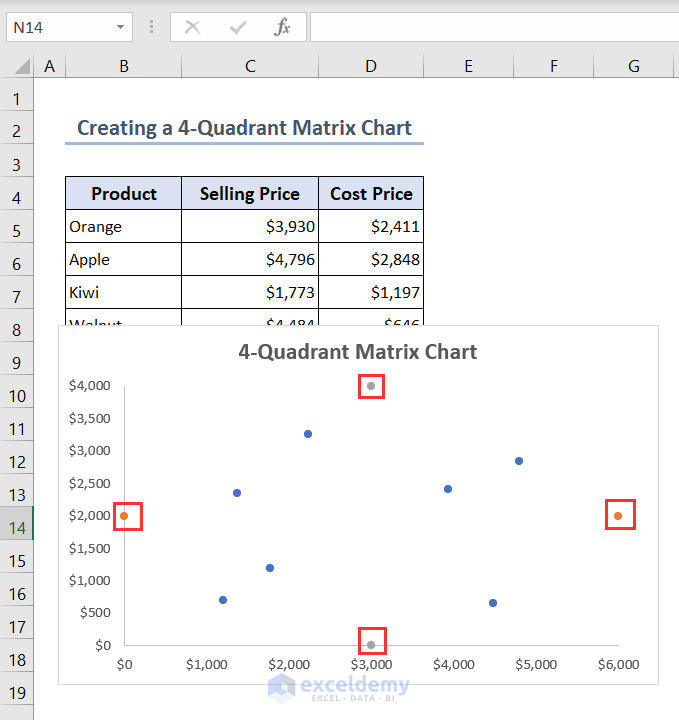
Below you’ll see an overview image showing a 4-Quadrant Matrix chart in Excel.

Download Practice Workbook
You can download the Excel file from here for practice.
What Is Matrix Chart in Excel?
A matrix chart, also known as a table chart or a contingency table, is a graphical representation of data in a matrix format. It is commonly used to display the relationship between two sets of categorical data. Excel provides several ways to create and format matrix charts.
How to Create a Matrix Bubble Chart in Excel
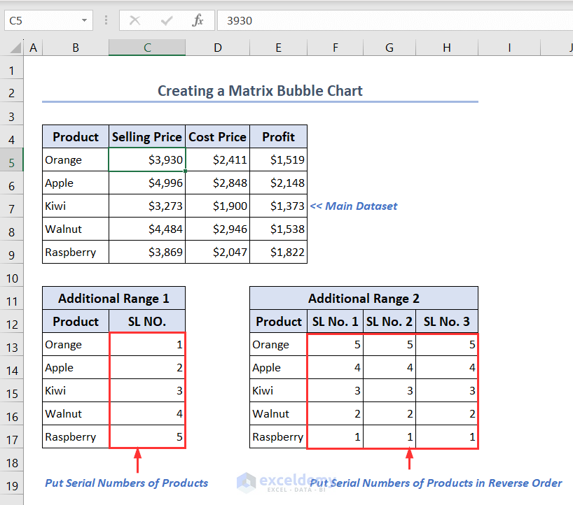
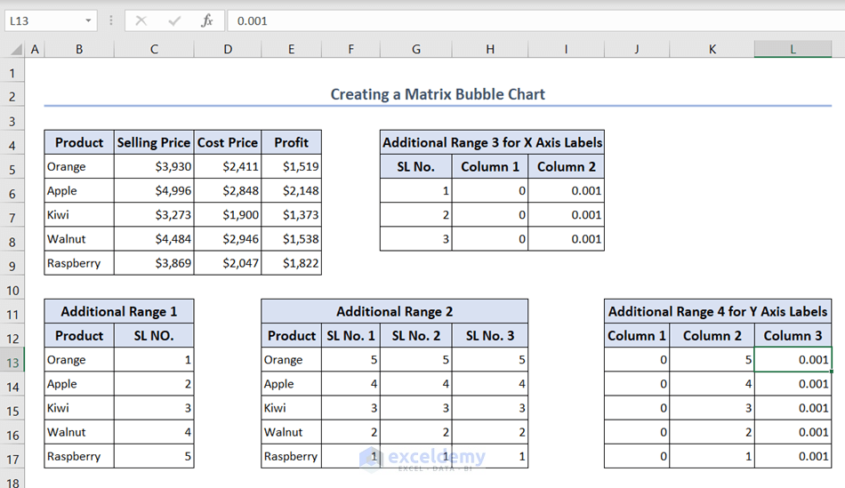
Step 1: Making a Suitable Dataset with 2 Additional Data Ranges
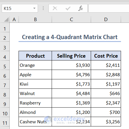
Here, we have the records of the selling prices, cost prices, and profits of some of a company’s products.
- To create 5 different series for the 5 available products in the Matrix Bubble chart we will need 2 additional ranges.
- In Additional Range 1, you can add two columns; one contains the product names and the other contains the products’ serial numbers.
- For the Additional Range 2 after entering the product names in the first column, you have to add 3 extra columns. Because we have 3 sets of values in the Selling Price, Cost Price and Profit columns. Make sure that the serial numbers in these columns are arranged in reverse order.
Step 2: Inserting and Editing Bubble Chart to Create a Matrix Chart
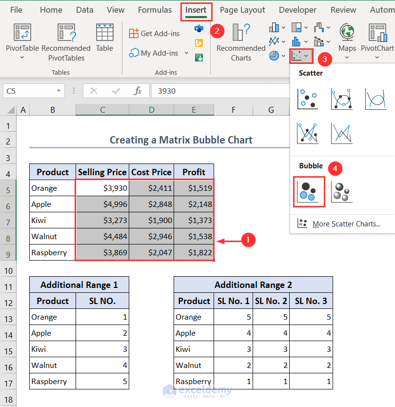
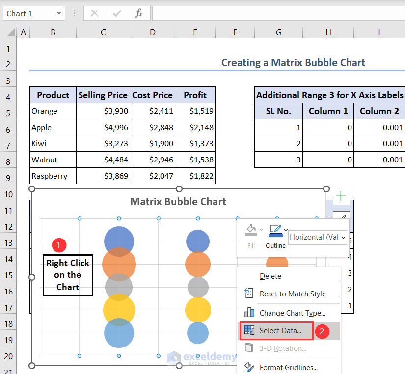
- Select ranges C5:E9 and then go to Insert > Insert Scatter (X, Y) or Bubble Chart > Bubble.
- You’ll see the following Bubble chart.
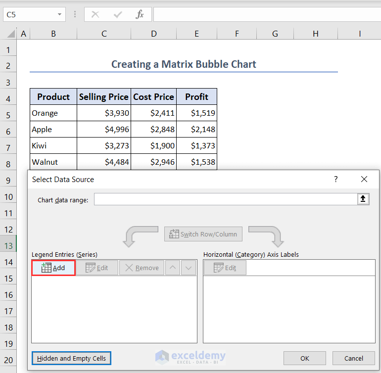
- Select the chart and right-click on it. Then choose the option Select Data from the Context menu.
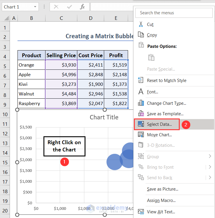
- The Select Data Source dialog box will open up.
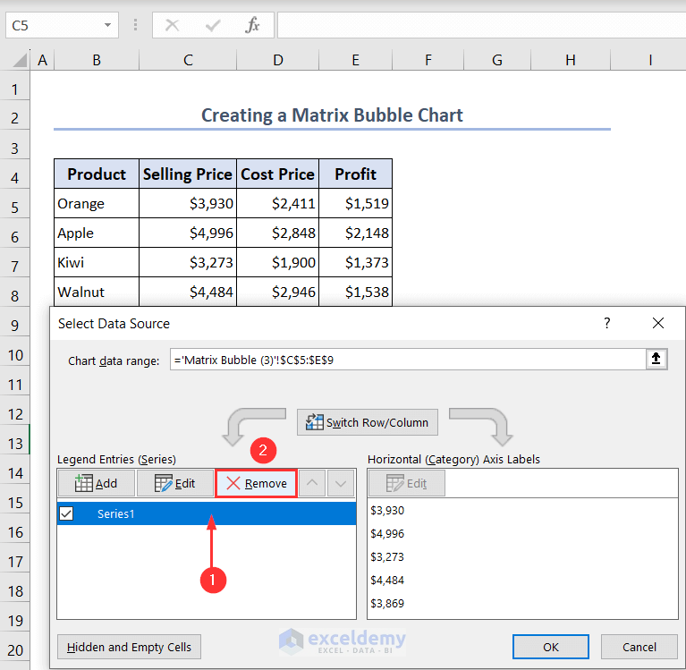
- Select the already created series Series1 and click on Remove.
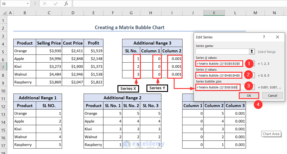
- Click on Add to include a new series.
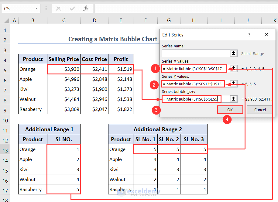
- The Edit Series wizard will pop up.
- For Series X values select the serial numbers of the Additional Range 1, for Series Y values select the serial numbers in the three columns of Product Orange of the Additional Range 2 and for Series bubble size select the selling price, cost price, and profit of the product Orange of the main dataset.
- Press OK to apply these changes.
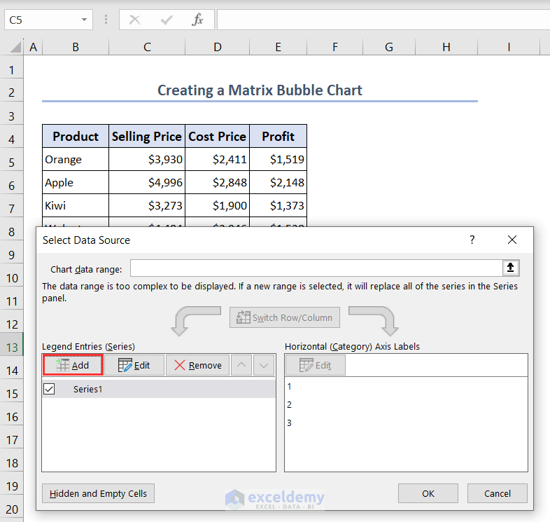
- In this way, we have added a new series Series1.
- Click on the Add button to enter another series.
- Similarly, complete all of the 5 series for the 5 products and press OK.
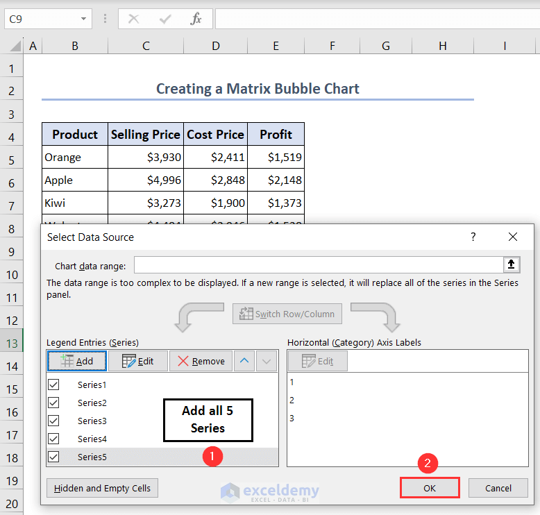
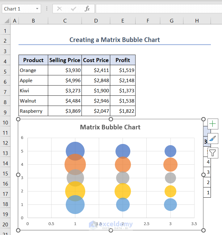
- Then you will get the following Bubble chart.
Read More: How to Create a Matrix Chart in Excel
Step 3: Removing Default Axes Labels and Adding Two Extra Ranges for New Labels
We’ll have some default labels that will not be used in this chart so we have to remove them.
- Select the labels on the X-axis and then right-click on them. Choose the option Format Axis.
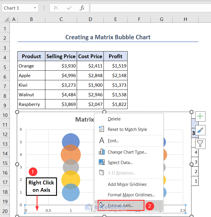
- The Format Axis pane will appear.
- Expand the Labels option and choose None.
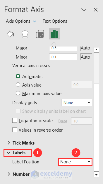
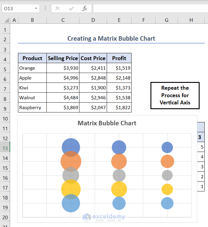
- In this way, we have removed the labels of the X-axis and done a similar process for Y-axis also.
- To add our desired new labels for this chart we will add two extra ranges in our dataset.
- For the X-axis label, we have entered a 3-row and 3-column data range, Additional Range 3. The first column contains serial numbers, the second column contains 0 and the last column is for the bubble width (0.001).
- Similarly, create the Additional Range 4 for the labels of the Y-axis. Here, the first column contains 0, the second column contains the serial numbers in reverse order and the last column is for the bubble widths which is 0.001.
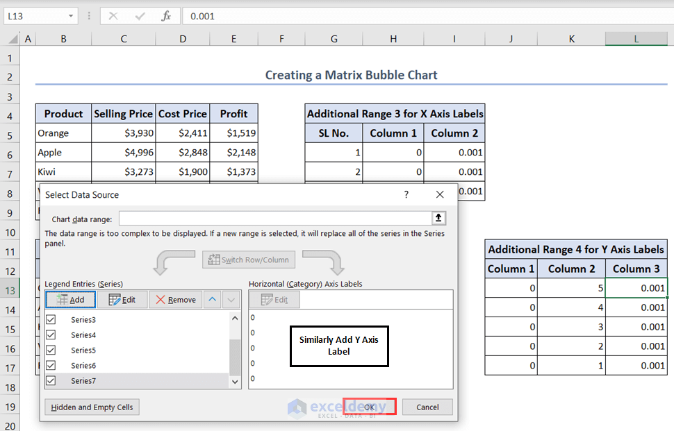
- To add the new 2 series to the chart, right-click on the chart and then choose the Select Data option.
- Click on Add in the Select Data Source dialog box.

- The Edit Series wizard will pop up.
- For Series X values select the first column of the Additional Range 3 and for Series Y values select the second column and choose the third column for the Series bubble size.
- Press OK to apply these changes.
- In this way, we have added a new series Series6.
- Similarly, add the other series Series7 for the Y-axis label and press OK.
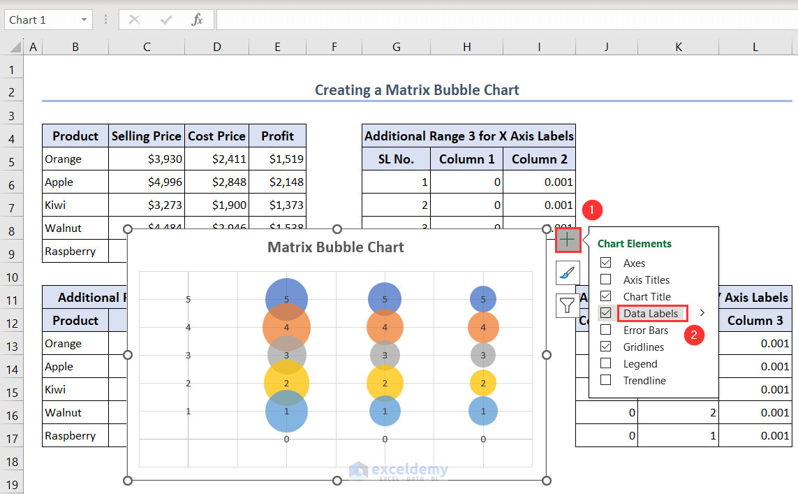
- Click on the Chart Elements symbol and check the Data Labels option.
- After that, all of the data labels will be visible on the chart.
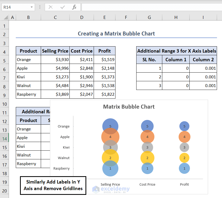
Step 4: Adding Labels for Axes
- Select the labels of the X-axis and then right-click.
- Click on the Format Data Labels option.
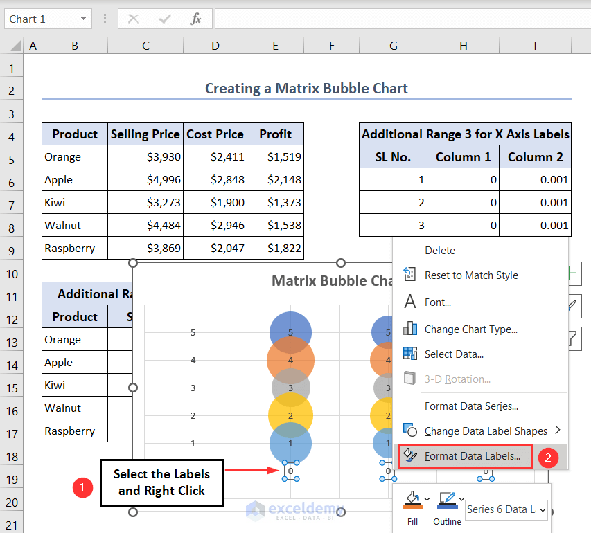
- The Format Data Labels pane will be visible.
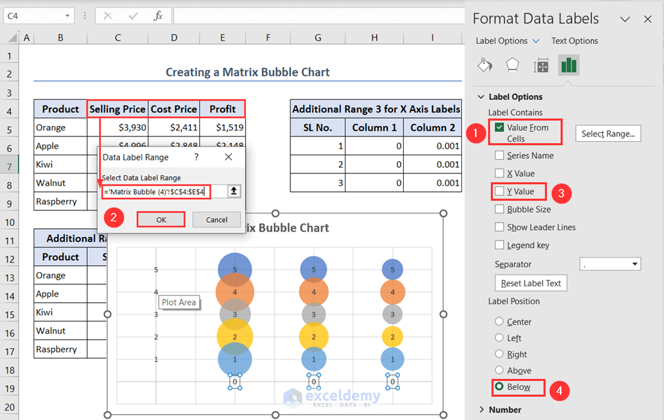
- Check the Value From Cells option and the Data Label Range dialog box will open up.
- Select the column headers of the values in the Select Data Label Range box and then press OK.
- Uncheck the Y Value from the Label Options and select the Below option as the Label Position.
- In this way, we will be able to add our desired X-axis labels.
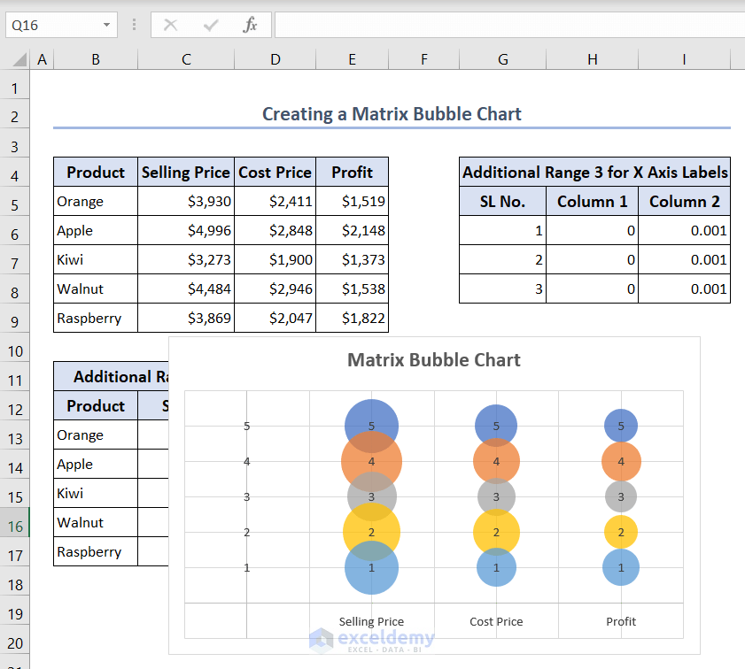
- Similarly, add the Y-axis labels.
- Just put the product names instead of the column headers of the values in the Select Data Label Range box and select the Left option as the Label Position.
- We also removed gridlines to make it visually clear.
Step 5: Adding Labels for Bubbles
- Select the bubble with the number 5 and then right-click on it.
- Choose the Format Data Labels option.
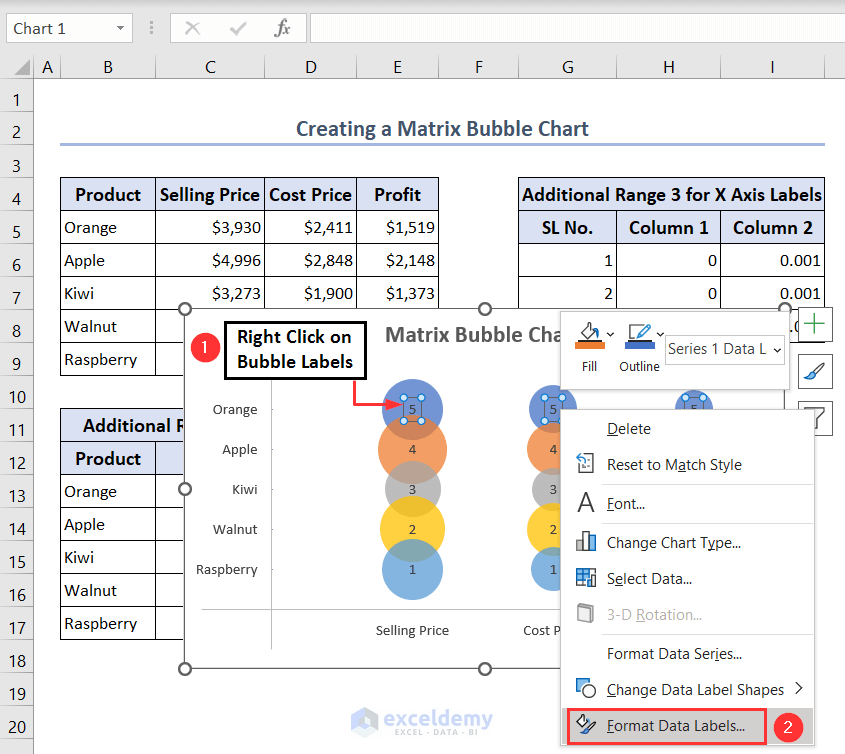
- The Format Data Labels pane will open up.
- Uncheck the Y Value option and check the Bubble Size option.

- After that, the labels of the bubbles will be converted into the values of the Selling Prices, Cost Prices and Profits.
- Repeat the process to add labels for the rest of the bubbles.
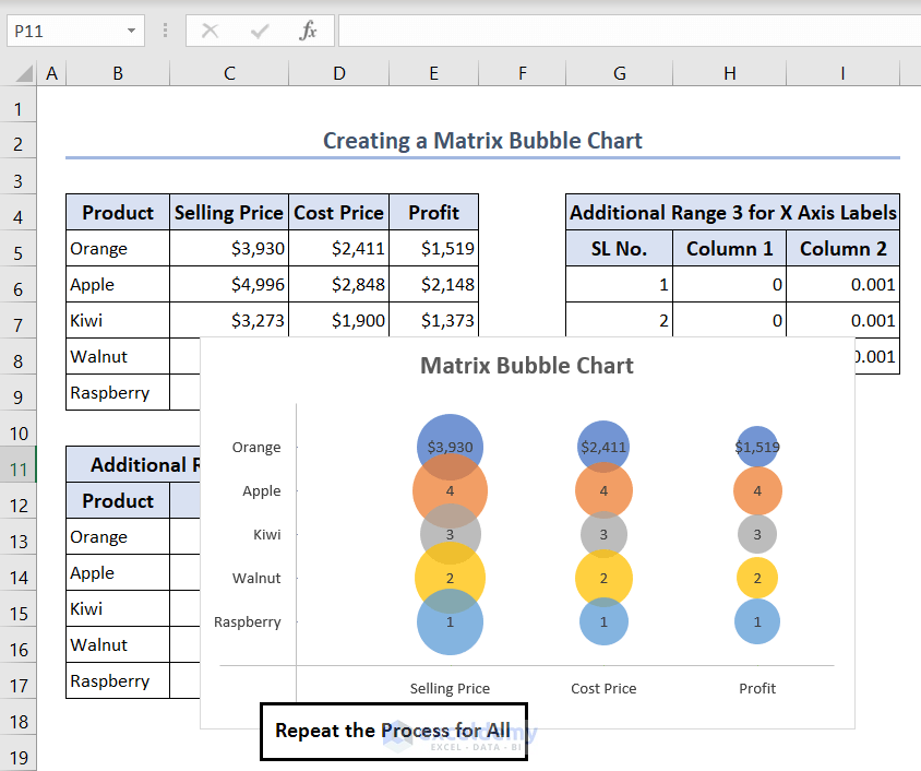
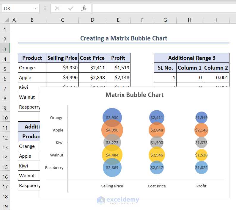
- The Matrix Bubble chart is finally ready.
How to Create a 4-Quadrant Matrix Chart in Excel
Step 1: Making a Suitable Dataset
You can only create a 4-Quadrant Matrix chart for 2 sets of values. So, we take the records of the selling prices and cost prices of a company’s products.
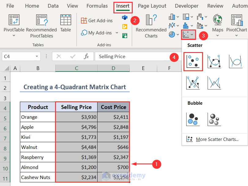
Step 2: Inserting and Editing Scatter Chart to Create a Matrix Chart
- Select ranges C4:D11 and then go to Insert > Insert Scatter (X, Y) or Bubble Chart > Scatter.
- After that, the following graph will appear.
- We have to set the upper bound and lower bound limits of the X-axis and Y-axis.
- Select the Y-axis label then right-click there and choose the Format Axis option.
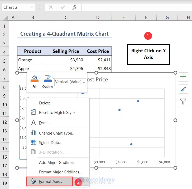
- The Format Axis pane will open up.
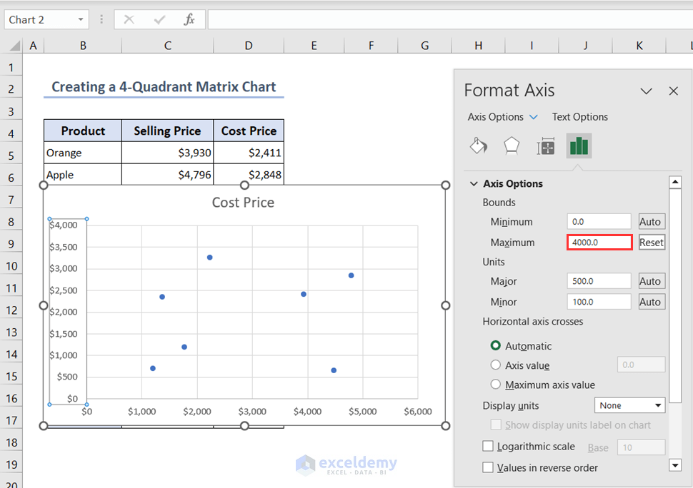
- Keep the limit of the Minimum Bounds as 0.0 and set the limit of the Maximum Bounds as 4000.0.
- We’ll have the modified Y-axis labels with new limits and we don’t need to modify the X-axis labels.
Step 3: Creating Additional Data Ranges to Have 4 Quadrants
For adding the 2 lines to have 4 quadrants we have to add an additional data range here.
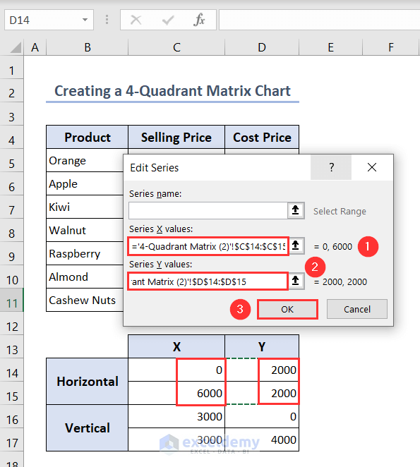
- Create the following format of the data table with two portions for the Horizontal and the Vertical and two columns for the two coordinates X and Y.
- For the Horizontal part add the following values in the X and Y coordinates. X = 0 (minimum bound of X-axis) and 6000 (maximum bound of X-axis). Y = 2000 (average of the minimum and maximum values of the Y-axis).
- For the Vertical part add the following values in the X and Y coordinates. X = 3000 (average of the minimum and maximum values of the X-axis). Y = 0 (minimum bound of Y-axis) and 4000 (maximum bound of Y-axis).

- Select the graph, right-click there, and then choose the Select Data option.
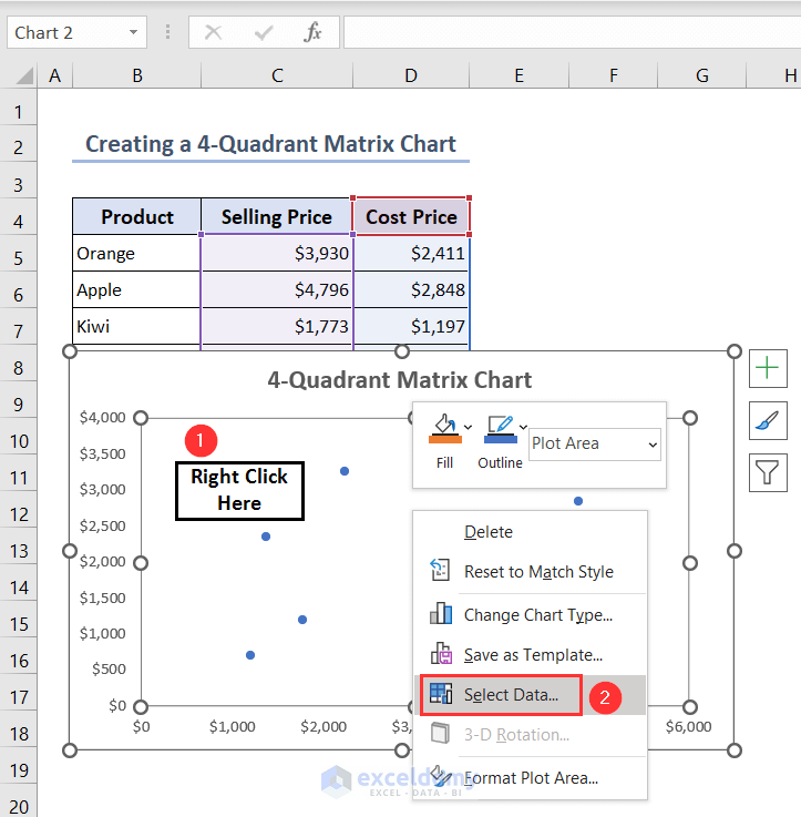
- The Select Data Source wizard will open up.
- Click on Add.
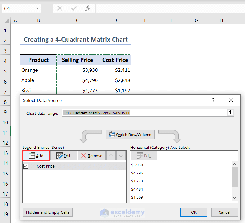
- The Edit Series dialog box will appear.
- For Series X values select the X coordinates of the horizontal part and then for Series Y values select the Y coordinates of the horizontal part and press OK.
- In this way, we have added the Horizontal series Series2.
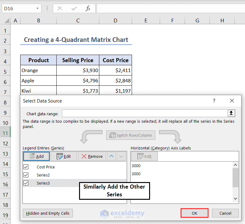
- Similarly, add the other series Series3 for the Vertical series and press OK.
- Finally, we will have 2 Orange points indicating the horizontal part and 2 Ash points indicating the vertical part.
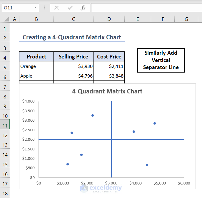
Step 4: Inserting Quadrant Lines and Labels to Create a Matrix Chart
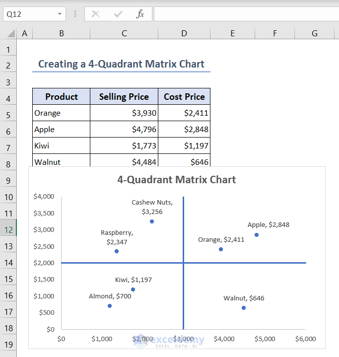
- Select the 2 Orange points and then right-click there.
- Then choose the Format Data Series option.
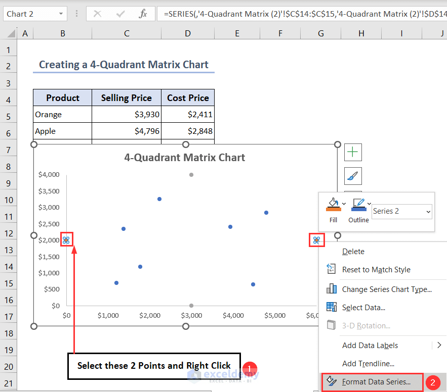
- You’ll see the Format Data Series pane.
- Go to Fill & Line > Solid line > choose your desired color.
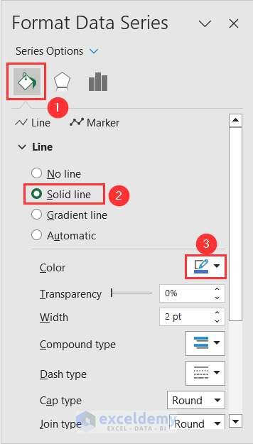
- To hide the points, go to Marker > Marker Options > None.
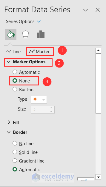
- In this way, the horizontal line will appear in the chart.

- Similarly, create the vertical separator line also by using the 2 Ash points.
- Select the data points and then click on the Chart Elements symbol and check the Data Labels option.
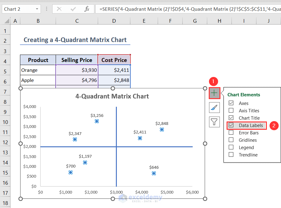
- After that, the values of the points will appear beside them and we have to convert them to the name of the products.
- Right-click after selecting these data points and click on the Format Data Labels option.
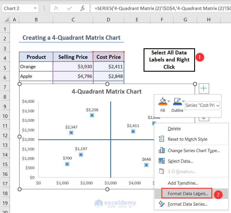
- The Format Data Labels pane will open up.
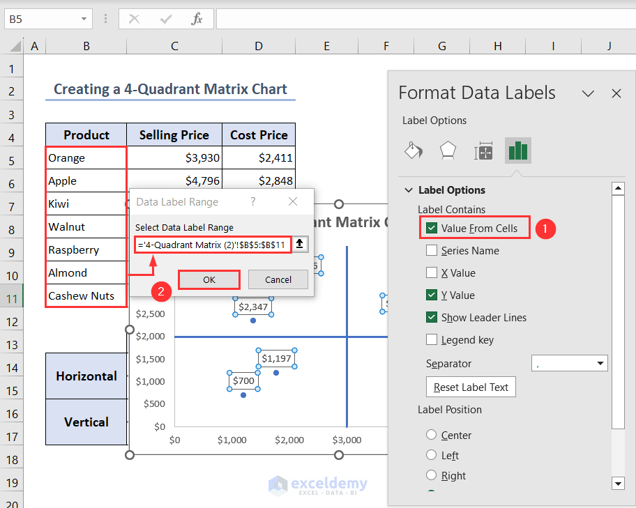
- Check the Value From Cells option from the Label Options.
- The Data Label Range dialog box will open up.
- Select the name of the products in the Select Data Label Range box and then press OK.
- Finally, the outlook of the 4-Quadrant Matrix chart will be like the following.
How to Create a Scatterplot Matrix in Excel
Step 1: Making a Suitable Dataset
Here, we have the records of the points, assists and rebounds of some values.

Step 2: Inserting and Editing 3 Scatter Charts to Create a Matrix Chart
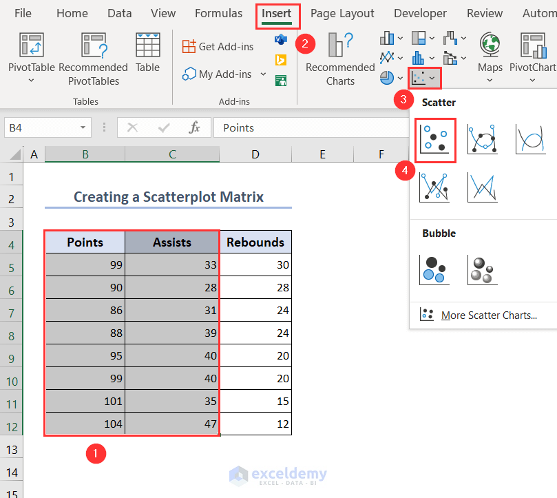
- To insert a Scatter chart for Points and Assists, select ranges B4:C12 and then go to Insert > Insert Scatter (X, Y) or Bubble Chart > Scatter.
- After that, the following graph will appear.
- We have to set the upper bound and lower bound limits of the X-axis and Y-axis.
- Select the X-axis label then right-click there and choose the Format Axis option.

- The Format Axis pane will open up.
- Set the limit of the Minimum Bounds as 80.0 and the Maximum Bounds as 110.0.
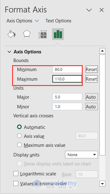
- Similarly, set the limit of the Minimum Bounds as 20.0 and the Maximum Bounds as 50.0 for Y-axis.
- You’ll see the following chart after that.
- We have also deleted the chart title and grid lines.
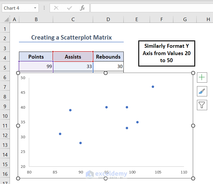
- Similarly, create a Points Vs Rebounds Scatter chart and place it under the existing chart.
- Also, create an Assists Vs Rebounds Scatter chart and place it in the bottom right corner.
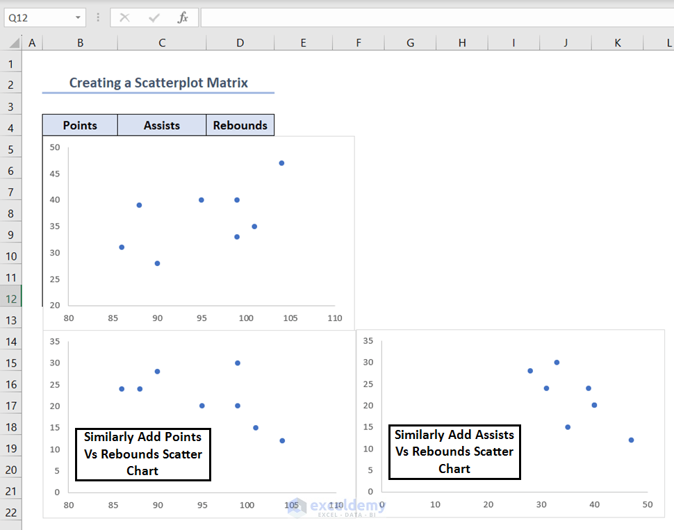
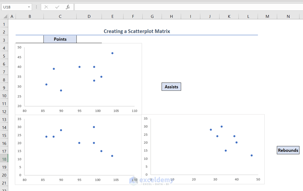
Step 3: Labeling the Scatterplots to Understand the Matrix Chart
- To make it clear which scatterplots correspond to which variables, type the variable names next to the scatterplots.
- The correlation between points and assists appears in the scatterplot in the upper left corner.
- The correlation between points and rebounds appears in the scatterplot in the bottom left corner.
- The correlation between assists and rebounds appears in the scatterplot in the bottom right corner.
Frequently Asked Questions
1. How do I create a matrix chart in Excel?
You can create a matrix chart using the steps described in this article. You can create a Matrix Bubble chart, a 4-Quadrant Matrix chart, or a Scatterplot Matrix through this article.
2. How do you use a matrix chart?
You can use the Matrix charts in Excel for various data analysis scenarios where you want to visualize the relationships between two sets of categorical data.
3. What is the best chart for matrix data?
The best chart for matrix data is the L-shaped Matrix Chart. It is the most common. It is utilized to compare two sets of information along one or more dimensions. It’s most likely an L-shaped type if you’re looking at a matrix of product comparisons.
Conclusion
In conclusion, you have learned step-by-step measures to create a Matrix Bubble chart, a 4-Quadrant Matrix chart and a Scatterplot Matrix chart in Excel through this article. Please let us know in the comment section if there is any query or suggestions related to this topic.
<< Go Back to Excel Charts | Learn Excel

