This tutorial will provide an ultimate guide on Excel Bar Chart topics. You will learn to insert a bar chart using features, shortcuts and VBA.
We’ll also walk you through various practical examples of using bar charts.
Assume you are analyzing sales, surveys, or market trends. A bar chart will present data in a more visually satisfying. Thus, it would be easy to identify patterns and trends from the data.
Bar Charts provide a clear, concise way to compare values across different categories or groups. By the end, you’ll be able to create visually compelling bar charts. Let’s dive in and unlock the potential of bar charts.
Download Practice Workbook
You can download the Practice Workbook for free.
What Is a Bar Chart in Excel?
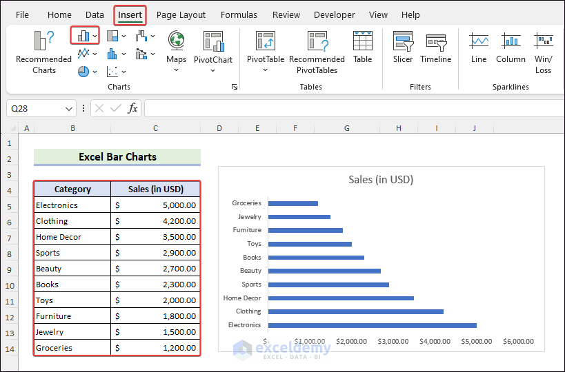
A bar chart uses rectangular bars to show and compare data for different categories or groups. The bars represent the values, and their length or height shows how big or small each deal is. Bar charts help us to see patterns and differences in the data.
Types of Bar Charts in Excel
1. Clustered Bar Charts
To insert a Clustered Bar, go to All Charts >> choose Bar >> click on the icon Clustered Bar >> hit OK.
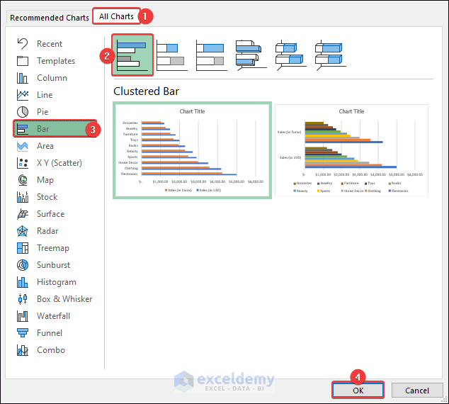
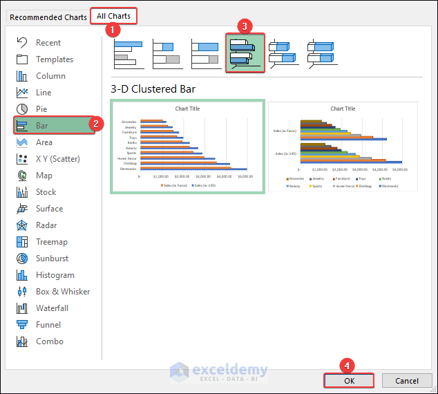
Likewise, you can also insert a 3-D Clustered Bar by clicking the icon.
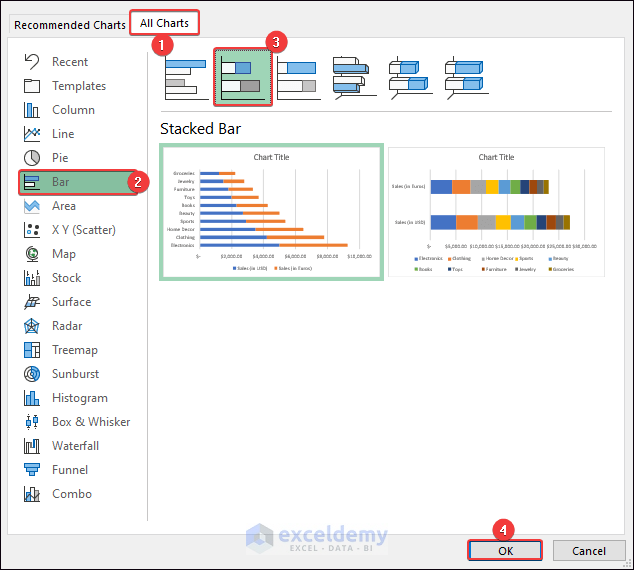
2. Stacked Bar Charts
To insert a Stacked Bar, go to All Charts >> choose Bar >> click on the icon Stacked Bar >> hit OK.
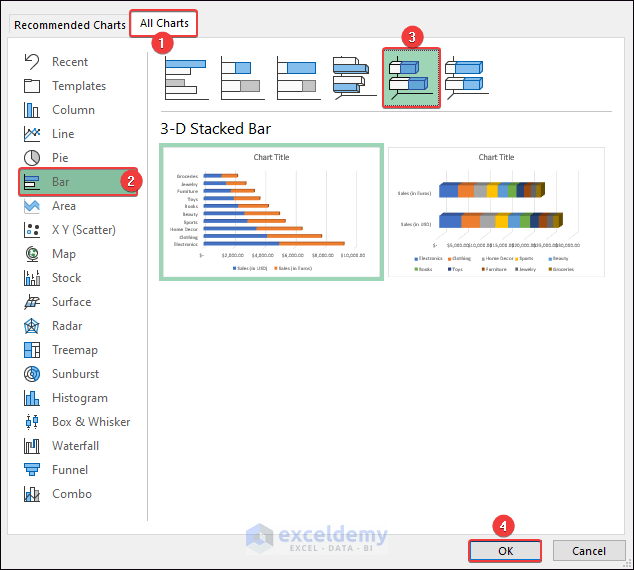
You can insert a 3-D Stacked by following the previous steps. But click on the 3D Stacked Bar icon in this case.
3. 100% Stacked Bar Charts
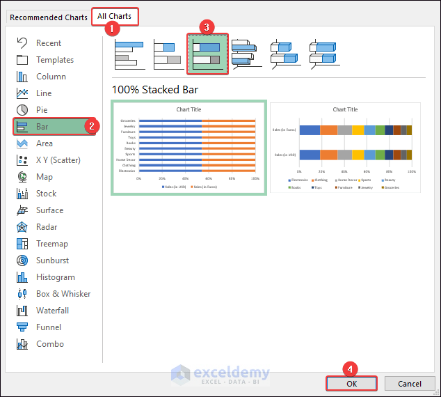
To generate a 100% Stacked Bar, go to All Charts >> choose Bar >> click on the icon 100% Stacked Bar >> hit OK.
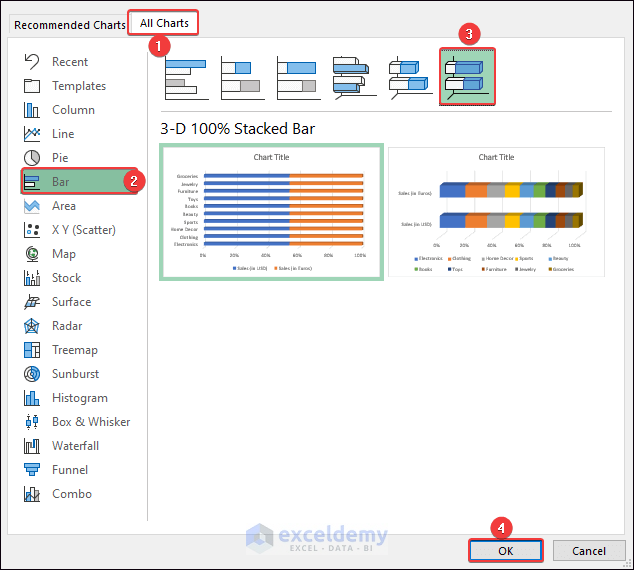
Insert a 3D 100% Stacked Bar chart by clicking on the intended icon.
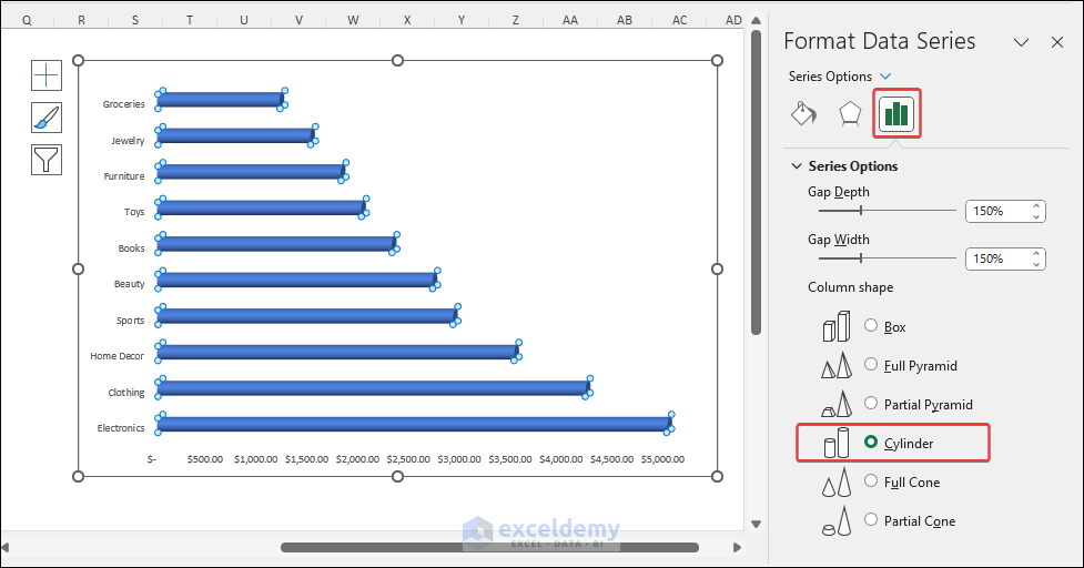
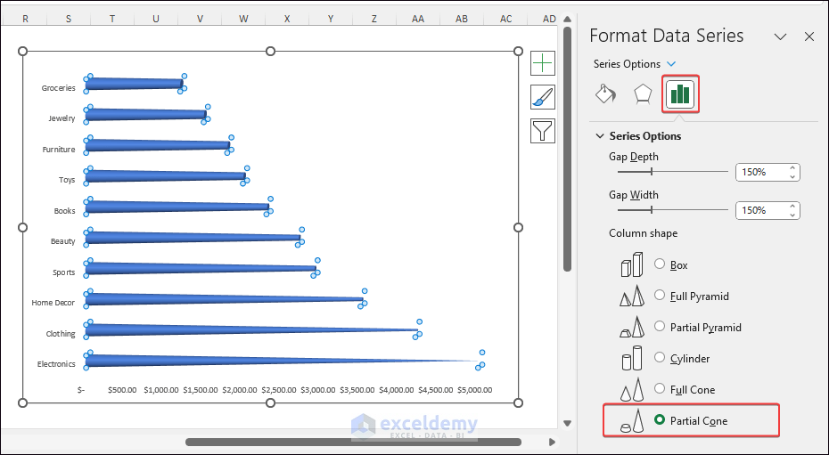
4. Cylinder, Cone and Pyramid
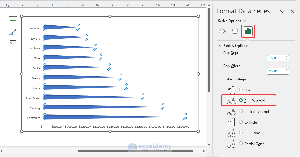
Choose Series Options >> Check Full Pyramid in the Format Data Series pane.
Select Series Options >> Check Cylinder in the Format Data Series pane.
Choose Series Options >> Check Partial Cone in the Format Data Series pane.
How to Create Bar Chart in Excel
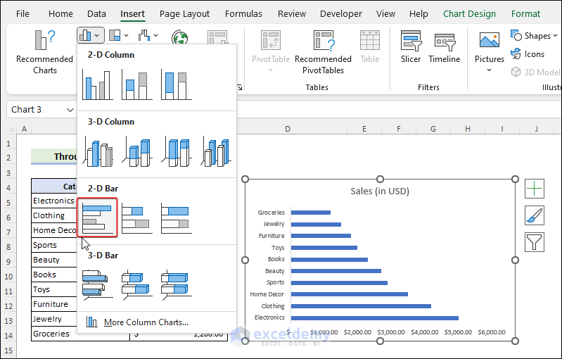
Method 1: Through Charts Group of Insert Tab
First, choose range B4:C14 >> navigate to the Insert tab >> click on Insert Column or Bar Chart.

Later, choose a 2-D Bar chart to see the output.
Read More: How to Create Bar Chart in Excel
Method 2: Use Shortcut Key
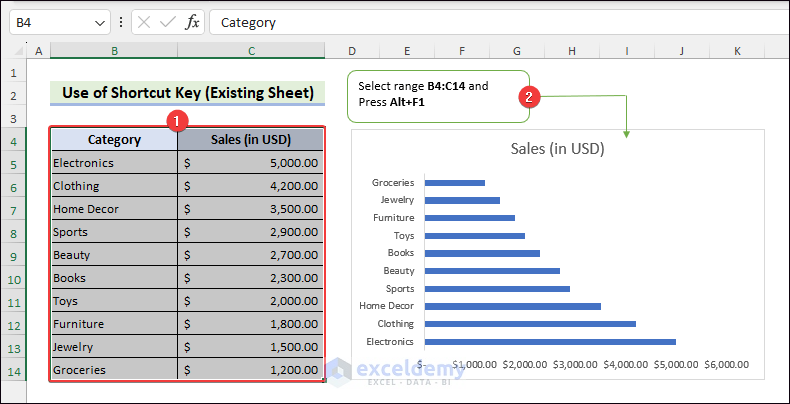
2.1 Insert a Bar Chart in Existing Sheet
Select intended cells >> press Alt+F1.
Often you may get a Column chart. In that case, you must change the chart type into a Bar Chart.
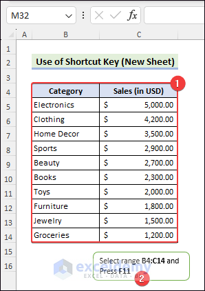
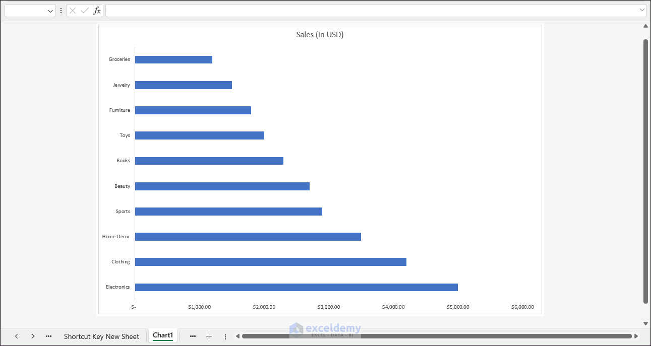
2.2 Insert a Bar Chart in New Sheet
Initially, choose desired cells >> press F11.
As a result, we will get an output like the below one.
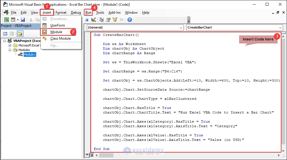
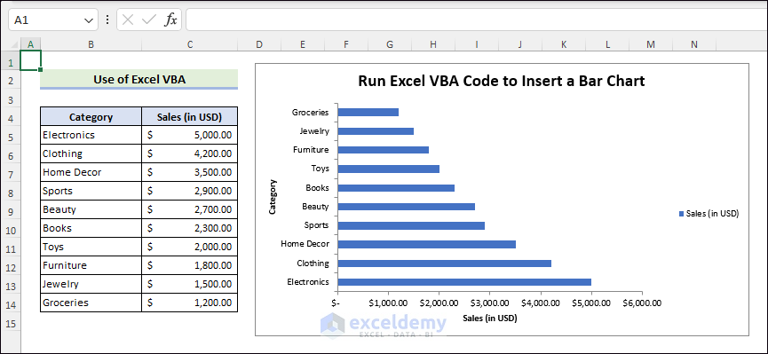
Method 3: Run Excel VBA Code
To open the VBA editor, press Alt+F11 >> go to Insert followed Module >> insert the below code and Run.
As a result, we will see an output like the following.
How to Format Bar Chart in Excel
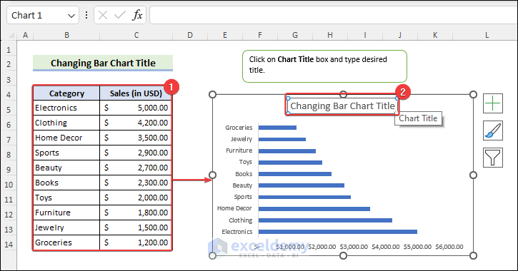
Example 1: Change Chart Title
Choose the intended cell range >> Insert a Bar Chart >> Click the Chart Title box >> Type the intended title.
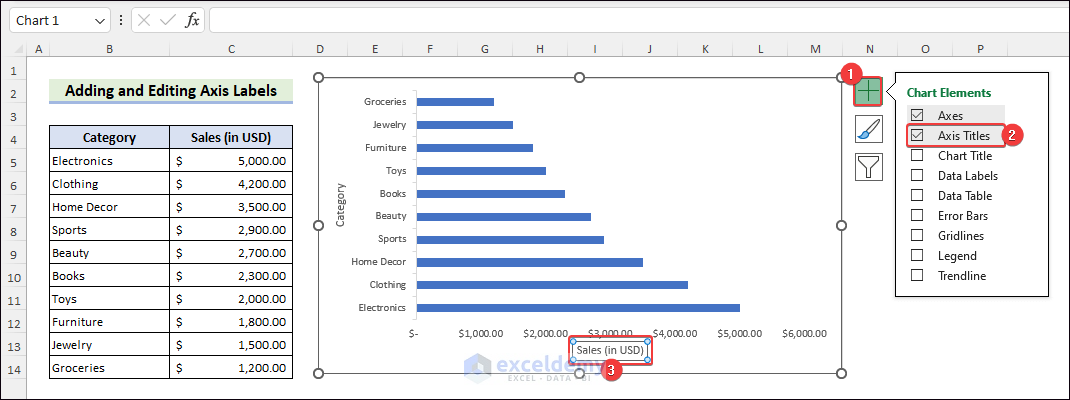
Example 2: Add and Edit Axis Labels
First, insert the intended chart. Click on Chart Elements >> check Axis Titles >> click on Axix Title box to edit.
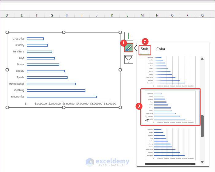
Example 3: Change Chart Style and Colors
Likewise, insert a Bar Chart. Later, click on Chart Styles >> choose the Style tab >> click on the desired style.
Lastly, to change color, navigate to the Color tab >> select the intended color set.

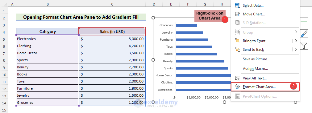
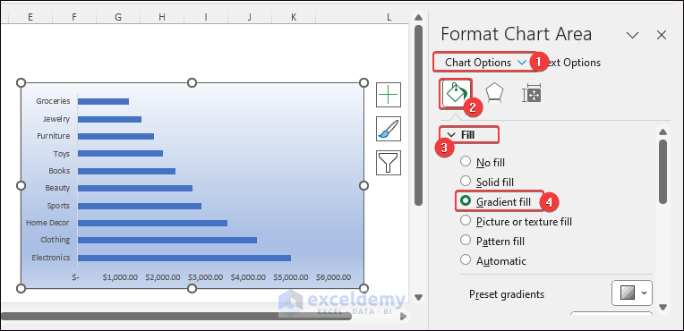
Example 4: Open Format Chart Area Pane to Add Gradient Fill
Insert a Bar Chart from the intended data. Right-click on Chart Area >> choose Format Chart Area.
Later, go to Chart Options >> click on Fill & Line >> expand the Fill down arrow >> choose Gradient fill.
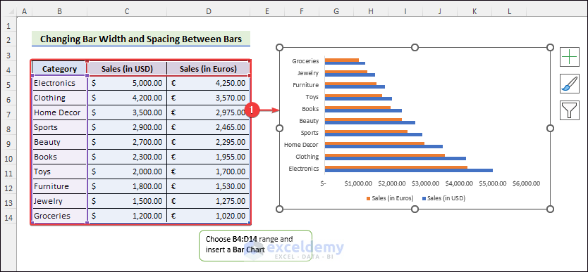
Example 5: Change Bar Width and Spacing Between Bars
First, choose intended cells >> insert a Bar Chart.
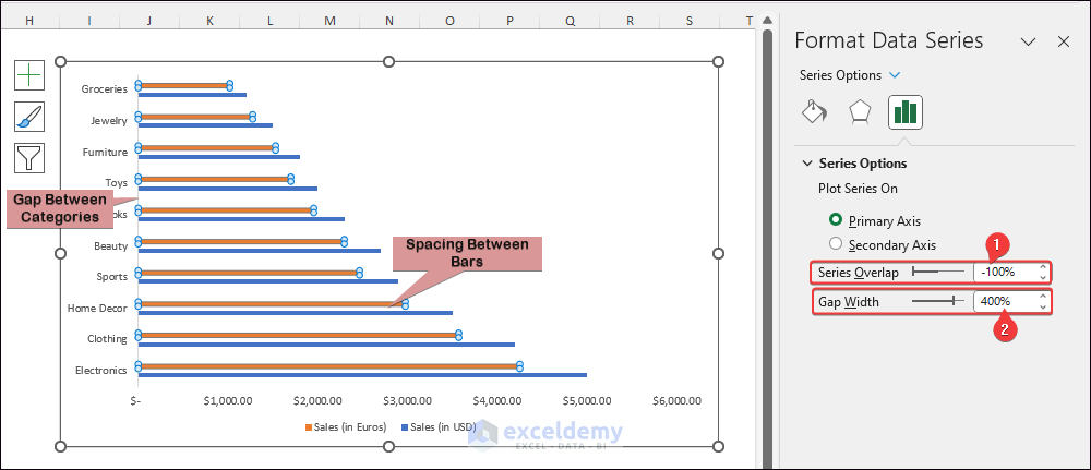
Later, right-click on a Data Series >> click Format Data Series >> select Series Options.
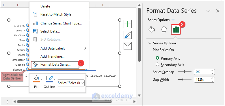
Next, set Series Overlap to -100% >> input Gap Width as 400%.
Read More: How to Edit Bar Graph in Excel
How to Sort Data on Bar Chart in Excel
Case 1: By Sorting Source Data
Insert a Bar Chart. Later, select range B4:C14 >> go to Home >> next, click on Sort & Filter >> then choose Filter.
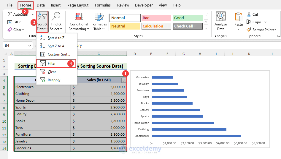
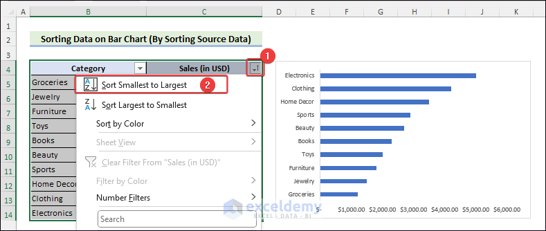
Later, click on the Filter icon >> choose Sort Smallest to Largest.
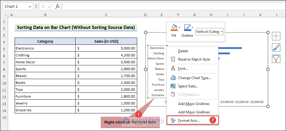
Case 2: Without Sorting Source Data
Insert a Bar Chart likewise. Later, right-click on Vertical Axis >> choose Format Axis.
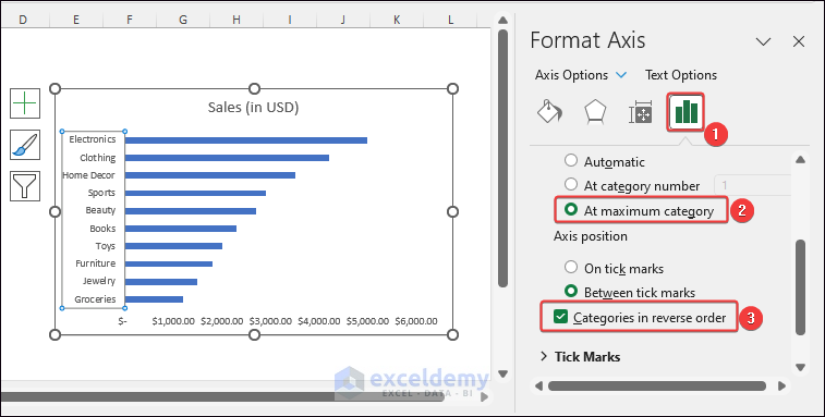
Next, click on Axis Options >> later, check At maximum category >> also check Categories in reverse order.
Read More: How to Sort Bar Chart in Excel without Sorting Data
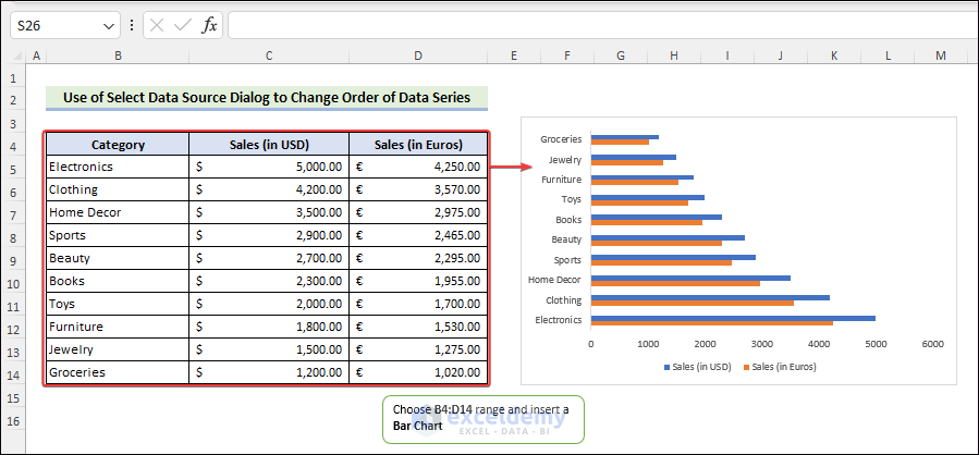
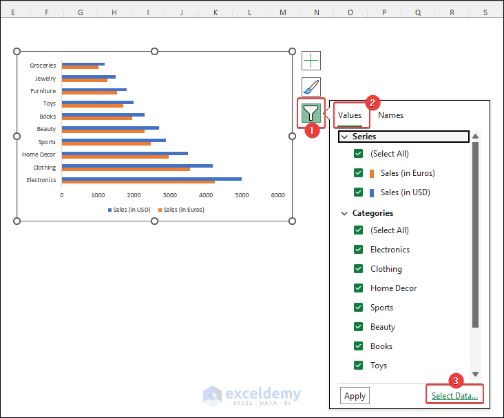
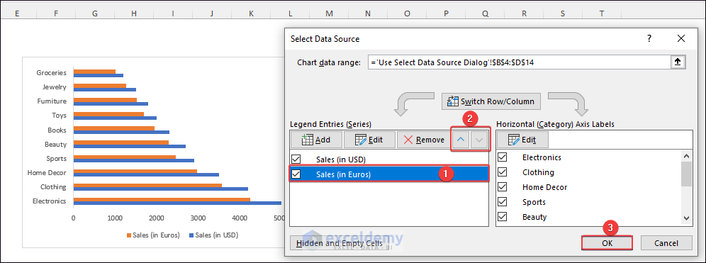
How to Change Order of Data Series in Excel Bar Chart
Method 1: Use Select Data Source Dialog
First, select intended range >> insert a Bar Chart.
Later, click on Chart Filters >> go to Values tab >> choose Select Data.
Lastly, click on a Data Series >> Use the Up and Down arrows to change the order of the data series >> Click on OK.
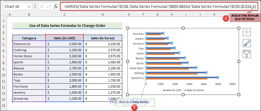
Method 2: Use Data Series Formulas
Initially, click on a Data Series >> adjust the formula shown in the formula bar >> hit Enter.
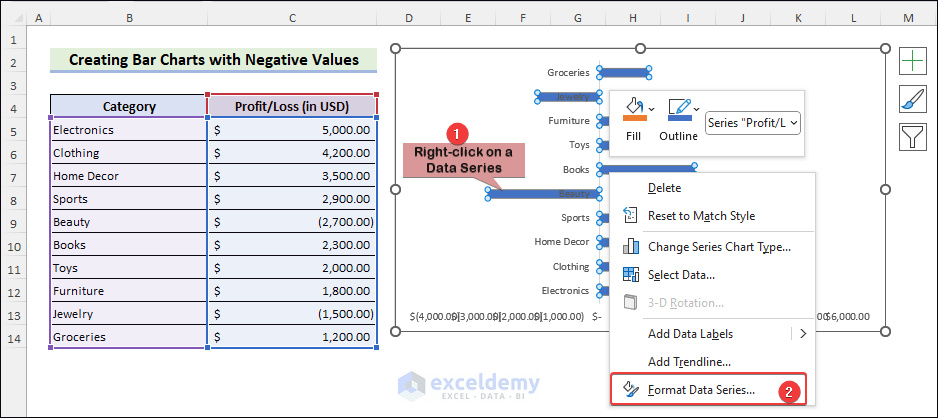
How to Create Bar Charts with Negative Values
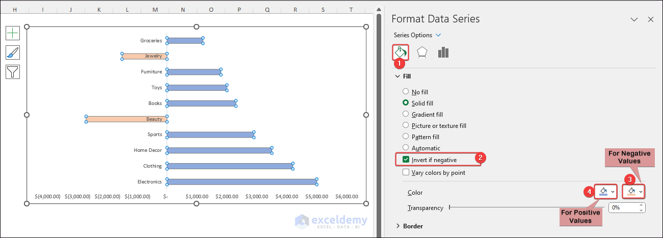
Firstly, insert a Bar Chart from the desired range. Later, right-click on a Data Series >> click on Format Data Series.
Later, click Fill & Line >> check Invert if negative >> choose the colors for positive and negative values.
Things to Remember
- You can apply the Pyramid, Cylinder and Cone type features in only a 3D Bar Chart.
- If you want to use the mentioned Excel VBA code for some other datasets, you must modify the code accordingly.
Frequently Asked Questions
- What are the uses of bar charts?
Bar charts compare data, track progress, analyze surveys, and present rankings. We can also compare performance and display categorical information using bar charts. They simplify data interpretation and communication in various fields.
- How to make a bar chart?
First, you must identify the categories or groups and their corresponding values to insert a bar chart. Next, you have to add the vertical axis with the groups. Lastly, adding the horizontal axis with the values will generate a bar chart.
- What are the types of bar in Excel?
Excel provides four various kinds of bar charts. A simple chart displays data bars for a single variable. A grouped bar diagram indicates data bars for several variables. A stacked bar graph shows the share of every factor in the total. The percentage chart depicts the percentage of overall assistance.
Conclusion
Knowing about Excel Bar Chart is essential for displaying more understandable data. We guided you through this context with topics ranging from basic to advanced. This post has provided practical examples about almost everything related to bar charts. Visit our ExcelDemy page to learn more about the various aspects of Excel. You can also submit your Excel issue to our ExcelDemy Forum.
Excel Bar Chart: Knowledge Hub
- Stacked Bar Chart Excel
- Color Bar Chart by Category
- Sort Bar Chart in Descending Order
- Excel Bar Graph Color with Conditional Formatting
- Change Bar Chart Width Based on Data in Excel
- Show Difference Between Two Series in Excel Bar
- Show Number and Percentage in Excel Bar Chart
- Show Variance in Excel Bar Chart
<< Go Back to Excel Charts | Learn Excel

