This tutorial will show you how to change the Chart Style in Excel. Learning how to change the chart style can help your charts look better overall. Excel provides several options for changing the colors, fonts, and other visual elements of your charts using Format Data Series, Chart Design, and so on. Whether you use bar graphs, line charts, or pie charts, the ability to customize chart styles will allow you to create great visuals that effectively express your data.
Download Practice Workbook
How to Change Chart Style
- First, choose the Insert tab >> choose the Bar Chart option. There will be a dropdown menu available. Next, pick the first choice from the 2D Column section.
- First, choose the Chart >> move to the Plus icon on the right side’s top Chart Elements: Axes, Axis titles, Chart titles, Data labels, Data table, Error bars, Gridlines, Legend, Trendline >> mark or unmark the boxes shown in the following image.
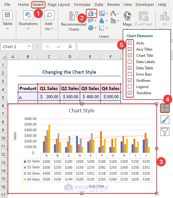
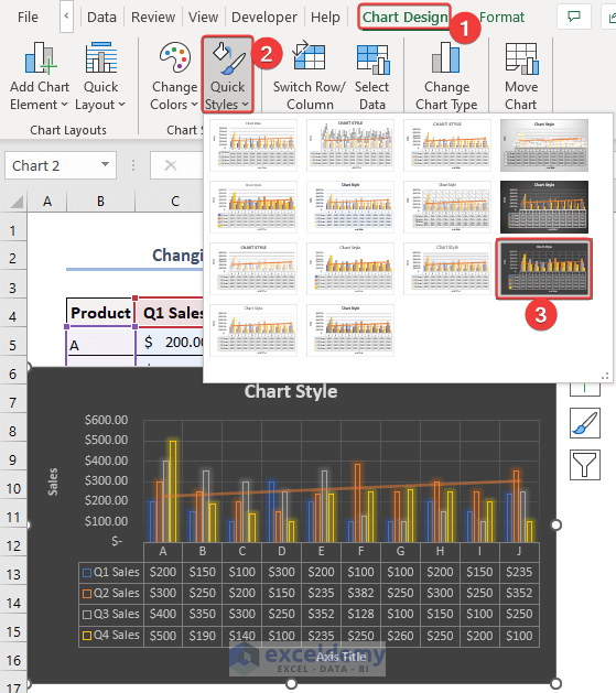
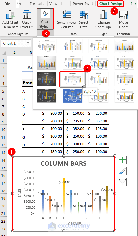
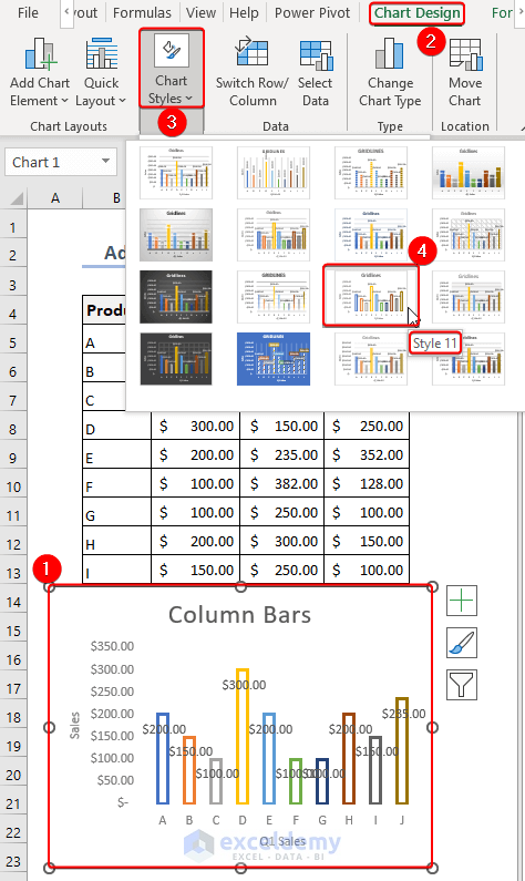
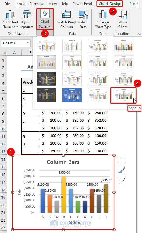
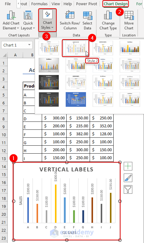
- Select the Chart first >> Go to the Chart Design Tab >> Choose Quick Styles>> Pick one from Style 1:Style 16.
Read More: How to Change Chart Style in Excel
How to Change Chart Color
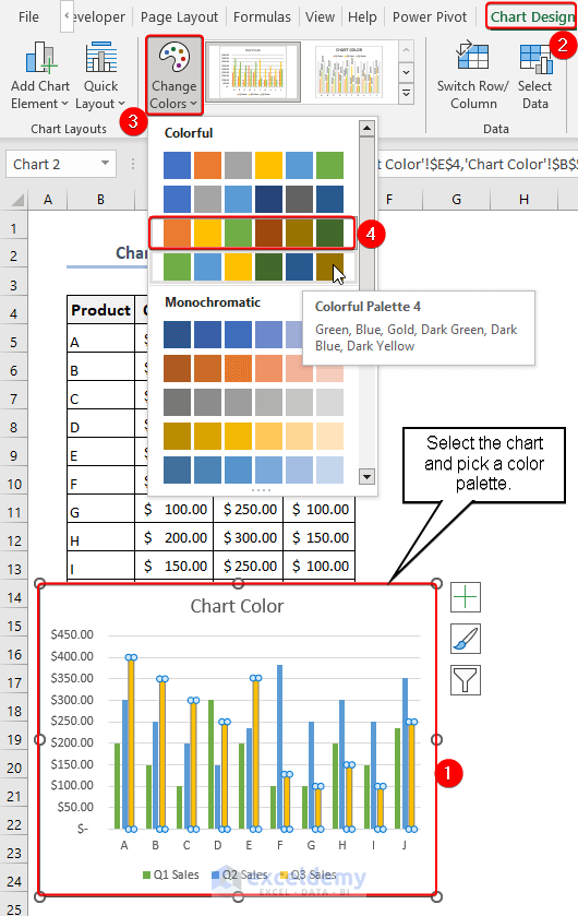
Method 1. Using Chart Design Tab
- Select the chart >> Go to Chart Design Tab >> Change Color >> Select a Colorful or Monochromatic >> Choose Palette.
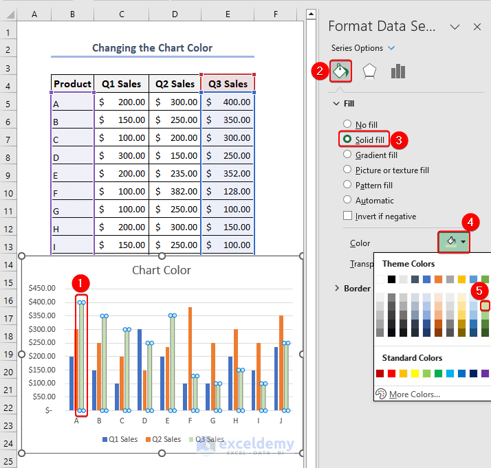
Method 2. Using Solid Fill Color
- Click on any bar on your chart to start. Then a sidebar with the title Format Data Series will show up.
- Choose Fill >> Solid Fill >> Color under the Format Data Series Options.
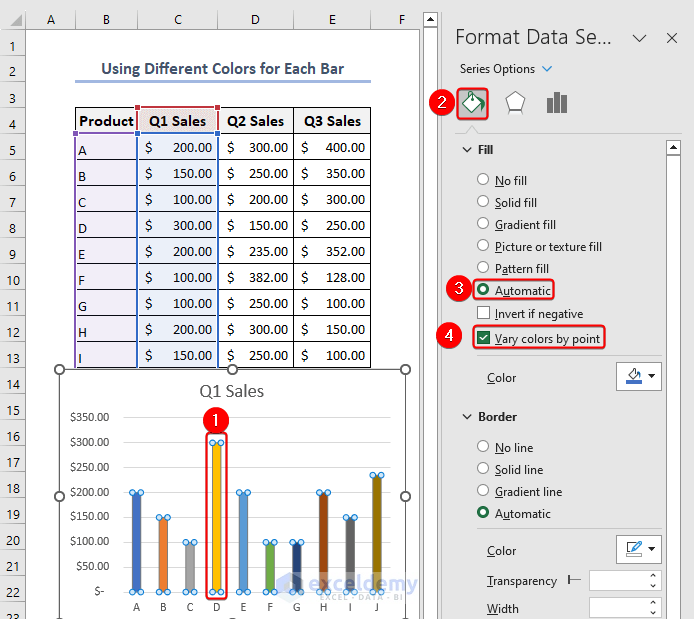
Method 3. Using Different Colors for Each Bar
- First, choose any bars from the chart >> go to Format Data Series >> then click Fill >> choose Automatic >> mark the box beside Vary colors by point.
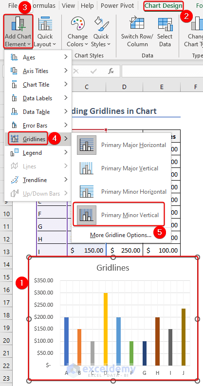
How to Add Grid Lines
Method 1. Add Default Gridlines
- Go to Chart Design tab >> Select Add Chart Element >> Select Gridlines >> Now select any gridline options you want to display.
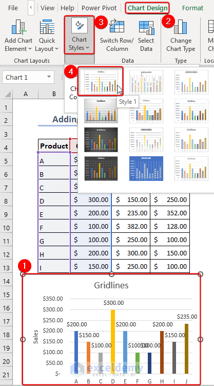
Method 2. Adding Only Gridlines
- Select Style 1 to add horizontal gridlines to your chart.
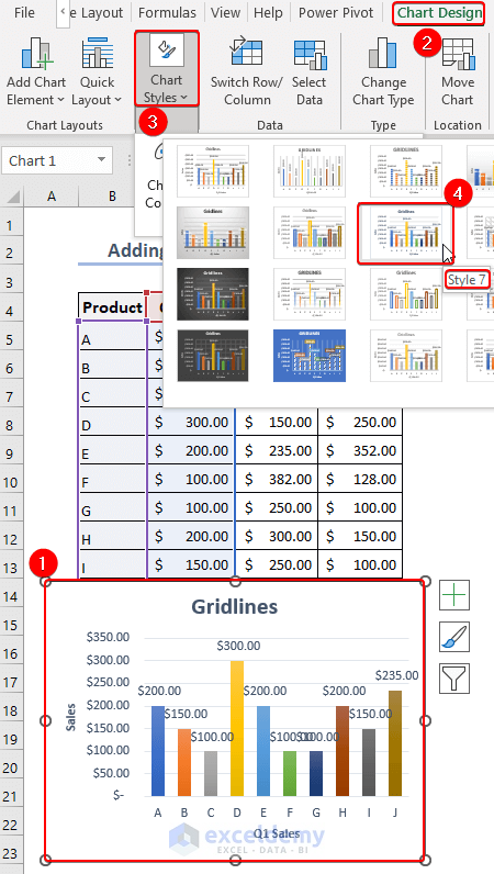
Method 3. Adding Light Gridlines
- Select Style 7 to add light gridlines to your chart.
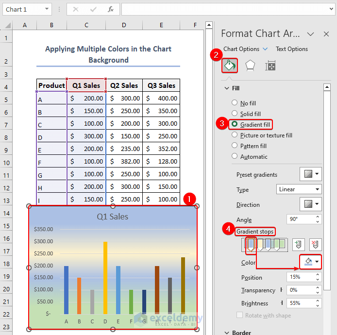
How to Apply Multiple Colors to an Excel Chart Background
Method 1. Using Gradient Fill
- Select the whole chart >> go to Format Data Series >> select the Fill & Line menu from the Chart options >> choose Gradient Fill from the list of Fill options >> Move the Gradient stops arrow after picking the color you want from the Color for any of the Gradient stops.
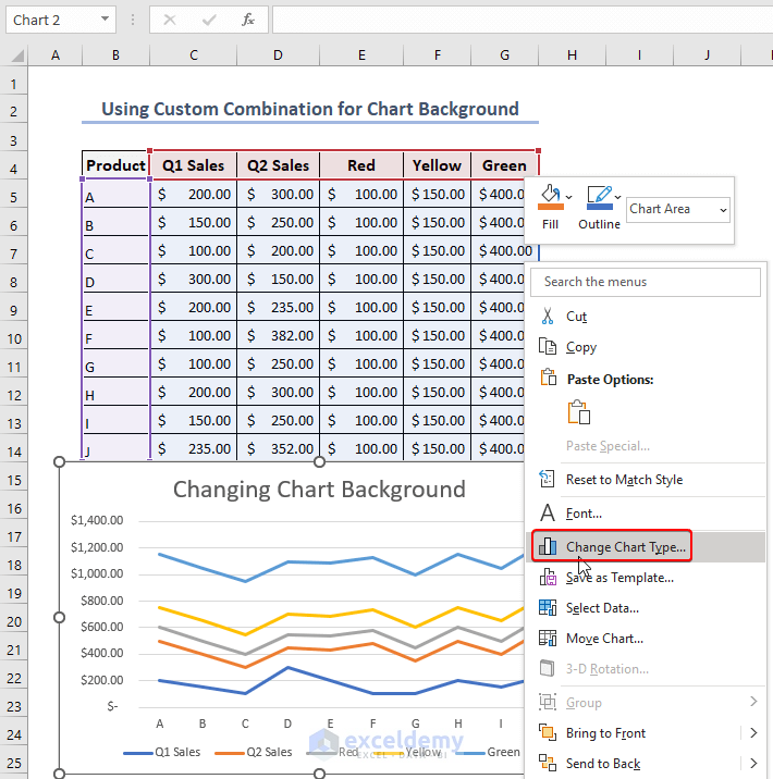
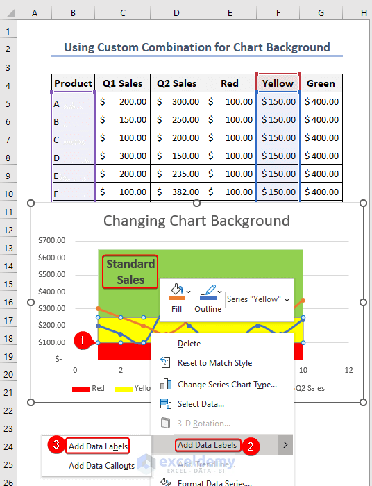
Method 2. Using Custom Combination
- Simply right-click the chart >> select Change Chart Type from the Context Menu Bar.
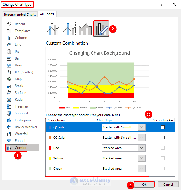
- A new window titled Change Chart Type will now show up.
- Firstly, from the Combo chart >> select Custom Combination. Next, select Q1 and Q2 Sales as Scatter with Smooth Lines >> Switch the color series to the Stacked Area chart. Lastly, click OK.
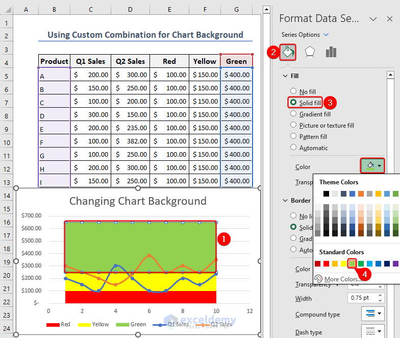
- Click twice on the Data Series for Colors now.
- The Excel sheet’s upper right corner will now display a new window with the name Format Data Series.
- Go to the Fill & Line menu now under Series Options.
- Then, from the Fill options, choose the color you prefer from the Color.
- Select the Data Series for Colors >> Right button click on the mouse>> Select Add Data Labels to define the color range.
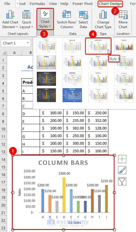
How to Add Column Bars
Method 1: Using Style 3 to Add Shaded Column Bars
- Choose Style 3 to add shaded column bars to your chart.
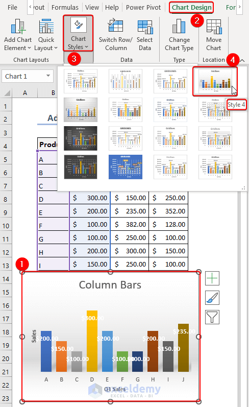
Method 2: Using Style 4 to Add Increased Width of Column Bars and Shadow of Column Bars
- Choose Style 4 to add the increased width of column bars and shadow of column bars in your chart.
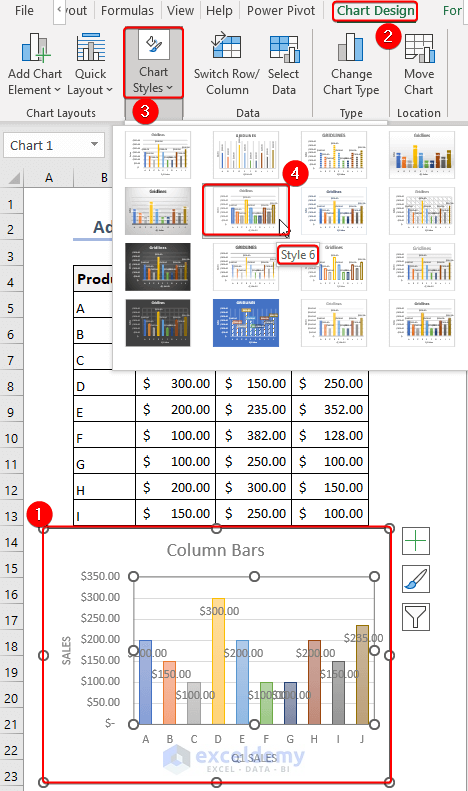
Method 3: Using Style 6 to Add Light Color to the Column Bars
- Choose Style 6 to add light color to the column bars in your chart.
Method 4: Using Style 10 to Add Smoky Bottom to the Column Bars
- Choose Style 10 to add a smoky bottom to the column bars in your chart.
Method 5: Using Style 11 to Add Only borders to the Column Bars
- Pick Style 11 to add only borders to the column bars in your chart.
Method 6: Using Style 16 to Add Intense Effect to the Column Bars
- Pick Style 16 to add an intense effect to the column bars in your chart.
How to Show Data Labels in Vertical Way
- Choose Style 2 to show data labels in a vertical way to the column bars in your chart.
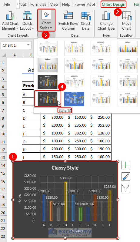
How to Apply Classy Style in Excel Chart
- Choose Style 13 to apply a classy style to your Excel chart.
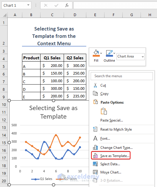
How to Save Chart as a Template
- To start, choose the chart>> click the mouse’s right button next>> choose the Save as Template option.
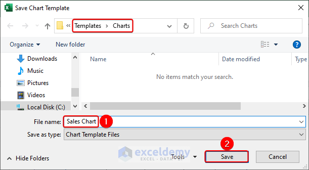
- After that, enter any name in the File Name field>> press the Save button.
Things to Remember
Chart Style Overview: In Excel, the term “chart styles” refers to pre-made arrangements of colors, fonts, and effects that can be used to improve the readability and appeal of your charts. With the variety of chart styles Excel offers, you can easily alter the appearance of your charts with a few mouse clicks.
Customizing Chart Styles: Although Excel has predefined chart styles, you can further modify them to meet your unique needs. The formatting options found in the “Chart Design” or “Chart Tools” tabs allow you to change a chart’s components after applying a style, such as colors, fonts, backgrounds, and effects. This enables you to design a unique appearance for your chart.
Chart Style Compatibility: Not all chart type is appropriate for every chart style. Depending on the type of data you have and the narrative you want to tell, some chart styles are better suited to certain chart types. Try out various styles to determine which one best suits your chosen chart type and best communicates your data.
Save and Reuse Custom Styles: A chart style can be saved as a custom chart style for later use if you have modified it to your preferences. Once the chart style has been modified, right-click the chart and choose “Save as Template”.
Conclusion
The chart Style in Excel feature enables you to improve your charts’ visual appeal and readability. To create visuals that look professional, you can change the fonts, colors, and layouts. Maintaining consistency in your charts is made more accessible by saving chart templates. By mastering these methods, you can produce charts that effectively represent your data and help others understand others.
Frequently Asked Questions (FAQs)
1. Can I modify the chart style after it has already been made?
Answer: You can change the chart style after it has been created quite easily. You can change the colors, fonts, layouts, and other design elements of your chart using Excel’s numerous customization options.
2. Can I design a unique chart style in Excel?
Answer: Excel does allow you to design your unique chart styles. Once you’ve made a chart exactly how you want it, you can save it as a template or use it as the foundation for additional charts, ensuring consistency and reducing the time required for data visualization.
3. Is there any impact on the underlying data when the chart style is changed?
Answer: No, altering the chart’s style has no impact on the data underneath. You can present your information in a way that is both visually appealing and effective by simply changing the visual representation of the data in the chart.
Chart Style in Excel: Knowledge Hub
<< Go Back to Excel Charts | Learn Excel

