In this Excel tutorial, you will learn how to change the Excel axis scale of charts by setting the minimum and maximum bounds of the axis manually/automatically and changing it to a logarithmic scale. Additionally, you will also learn how to change X and Y-axis data points.
Here, we prepared the dataset using the Microsoft 365 version of Excel. However, all the features used in this article can be found in other versions of Excel, starting from Excel 2007.
Changing the axis scale becomes extremely important when the default scale fails to represent graphs in a proper manner. Specially, when dealing with a large range of data points on a chart that has limited space, changing the axis scale can be very beneficial.
Click on the image for a detailed view.
Download Practice Workbook
What Is Axis Scale in Excel?
Understanding the idea and significance of the axis scale is crucial before learning how to change it. The axis scale simply means the range of values displayed on a graph or chart, such as the time on the horizontal X-axis or the speed on the vertical Y-axis. The axis scale plays an important role in interpreting the data presented. If the scale is very large, then the data points might be underestimated. On the other hand, if the scale is very small, all the data points might not be able to be accommodated in the chart. Hence, choosing an appropriate axis scale is essential.
How to Change the Axis Scale in Excel?
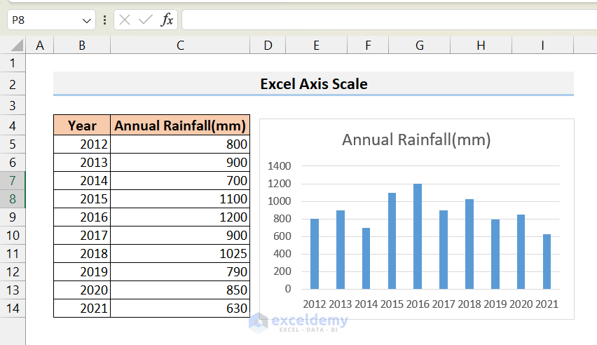
In this section, I am going to show you how to change the axis scale of an Excel chart. For illustration, I have created a column chart from the following dataset.
Click on the image for a detailed view.
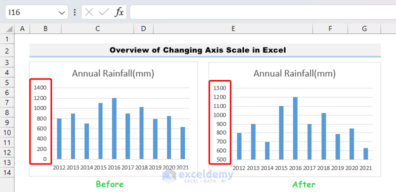
- From the chart, we can see that the Y axis starts at 0 and ends at 1400.
- On this scale, the differences among different years are not very apparent.
- If we change the scale of the Y axis in such a way that the starting point of the Y axis is, say, 500, then the differences will be more obvious, and we can interpret the graphs in a more accurate way.
- So, our target here is to change the scale of the Y-axis.
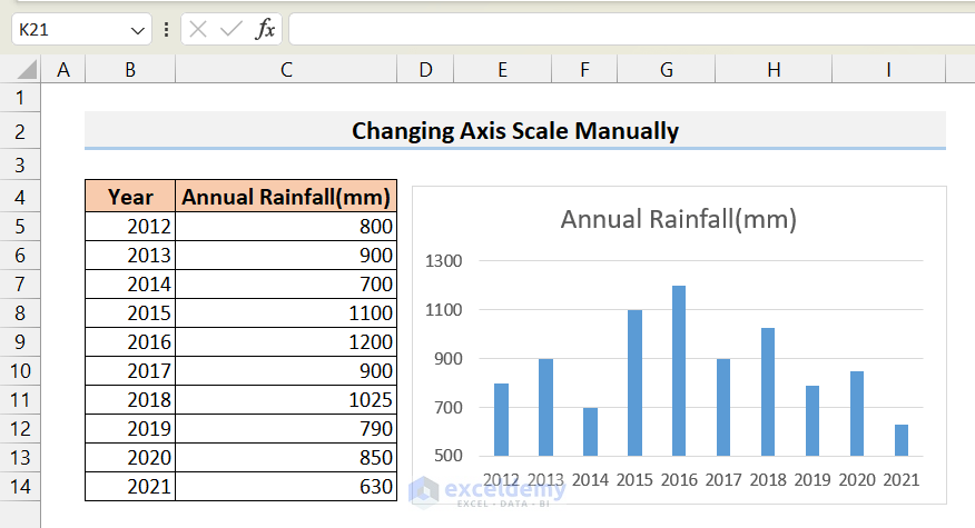
1. Changing Axis Scale Manually
We can use the Format Axis menu to change the scale of any axis. To do that, follow the steps below.
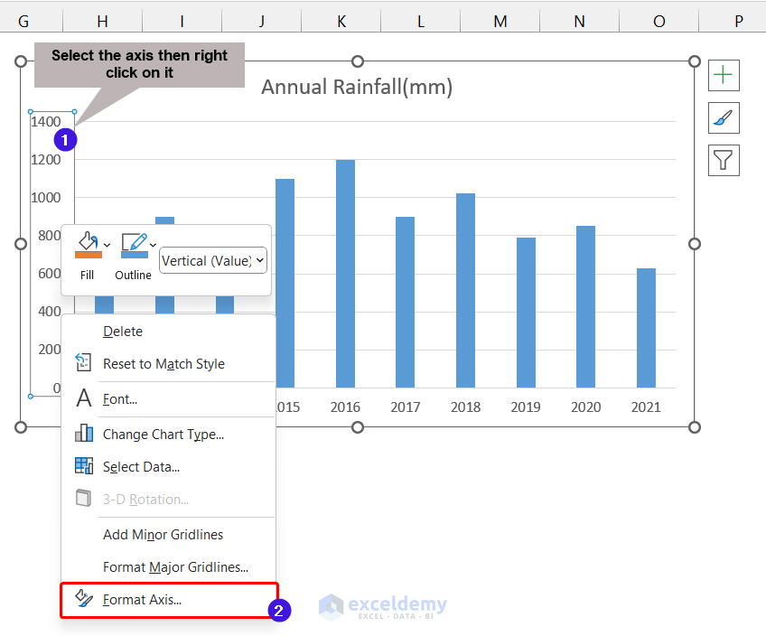
- Click on the axis whose scale you want to change. Make sure that it is highlighted. Then right-click on it.
- As a result, a context menu will open up. From the menu, choose Format Axis.
Click on the image for a detailed view.
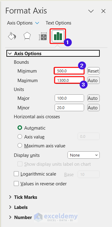
- As a result, the Format Axis menu will be displayed on the right side.
- From there, click on Axis Options.
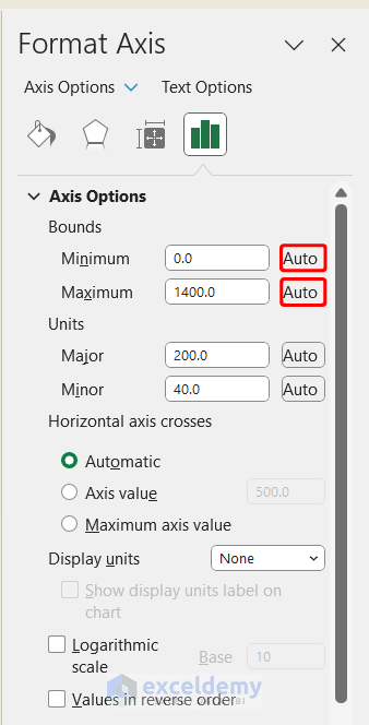
- Now, from here, you can change the Maximum and Minimum bounds of the axis.
- I set the Minimum bound to 500 as my data points start at 630 so I don’t need the prior scale points.
- As a result, the Y axis is rescaled, and it looks like this.
Click on the image for a detailed view.
2. Changing Axis Scale Automatically
Instead of manually setting up the Maximum and Minimum bounds of the axis, you can use the Automatic option. Many times, it automatically rescales the axis.
- To do this, again go to the Format Axis menu as mentioned above and click on Auto on the Maximum and Minimum bounds.
- As a result, the scale of the axis will be automatically set up by Excel.
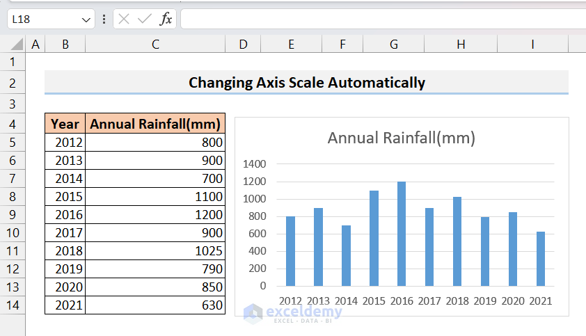
Click on the image for a detailed view.
As we can see, in our situation, the axis scale has been restored from manual adjustment to its original automatic setting.
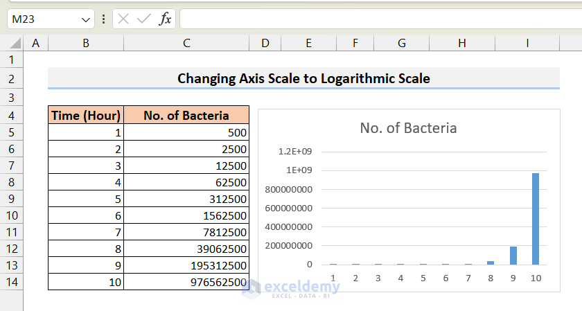
3. Changing Axis Scale to Logarithmic Scale
Sometimes, the range of data points becomes so large that it becomes very difficult to accommodate all of the data in a normally scaled axis. Even if you manage to accommodate all of them, interpreting the charts becomes very difficult as the lower data points are not perfectly visible on the chart.
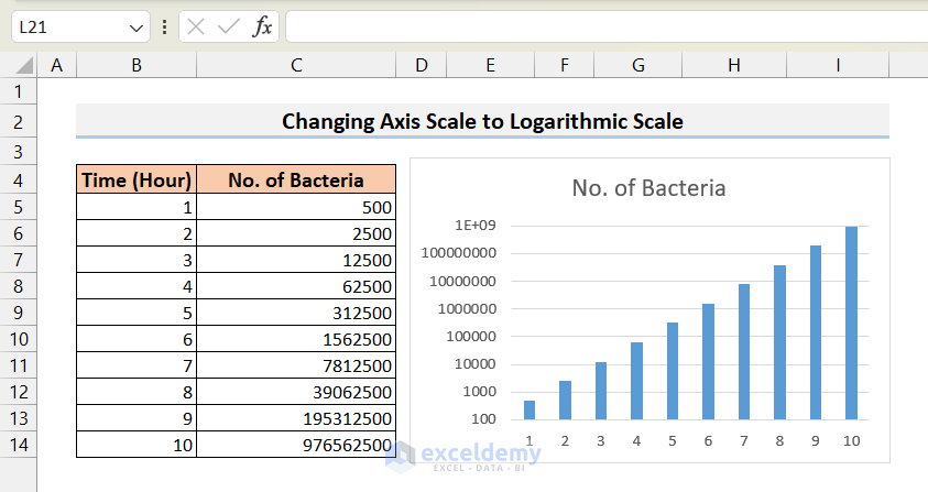
For example, look at the dataset and chart below, where the growth of bacteria in a cultured medium is shown. As we know, the bacteria’s growth rate is an exponential function, so the number of bacteria will have a very large range.
Click on the image for a detailed view.
From the chart, it is clear that the lower data points are almost invisible in the normally scaled Y-axis. In this type of case, we need to use a logarithmic scale. To use a logarithmic scale, follow the steps below.
- Similar to the first example, open the Axis Format menu, and check the Logarithmic scale option.
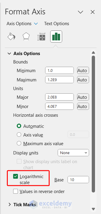
- As a result, you can easily view all the data points in a proper manner.
Click on the image for a detailed view.
How to Change the X-Axis Values in Excel?
Suppose, we want to change the data points of the X-axis in an already existing chart in Excel. To do that, follow the steps below.
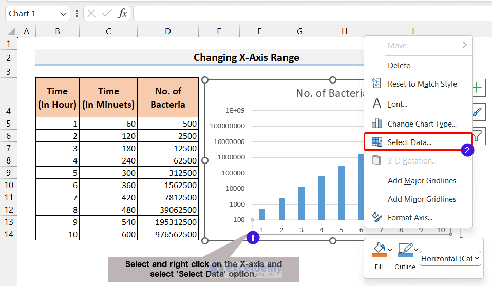
- First, select the X-axis on the chart, then right-click on the mouse.
- As a result, a context menu will appear. From the context menu, select the “Select Data” option.
Click on the image for a detailed view.
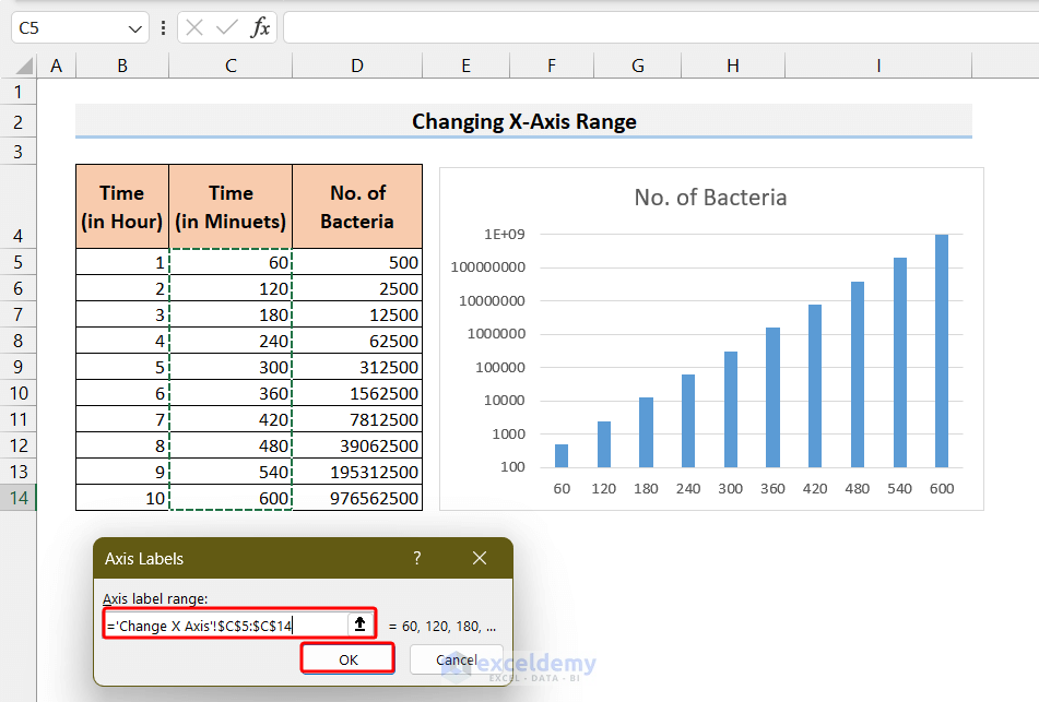
- Now, click on the Edit option from the Horizontal Axis Labels.
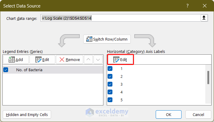
- Now, select the new range of data points and click OK.
Click on the image for a detailed view.
- Finally, again click OK on the Select Data Source window.
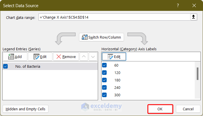
- As a result, you will see that the X-axis range has changed.
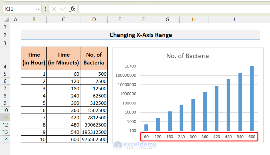
Click on the image for a detailed view.
How to Change Y-Axis Values in Excel?
Sometimes, we need to modify or change the range of data points in the Y-axis in an existing graph. If you want to change the values on the Y-axis, you can follow the steps below.
- First, select the Y-axis on the chart. Then, right-click on it.
- Next, click on the Select Data option from the context menu.
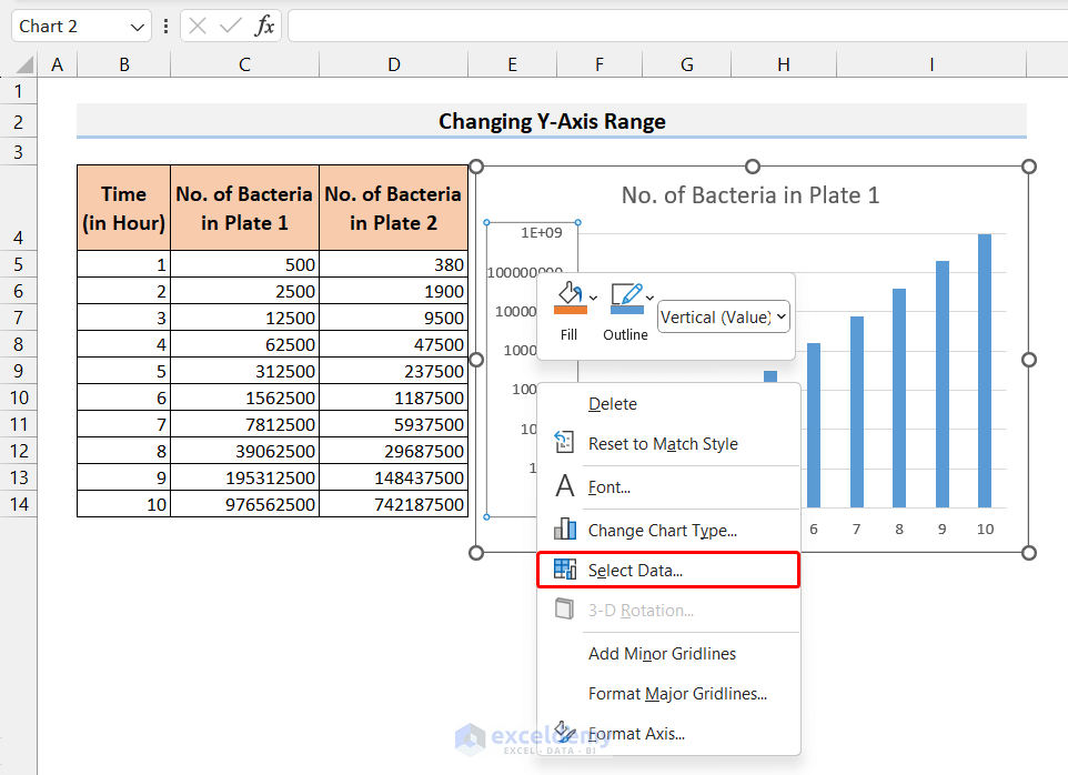
Click on the image for a detailed view.
- As a result, the Select Data Source window will open up.
- Now, click on the Edit option from the Legend Entries (Series).
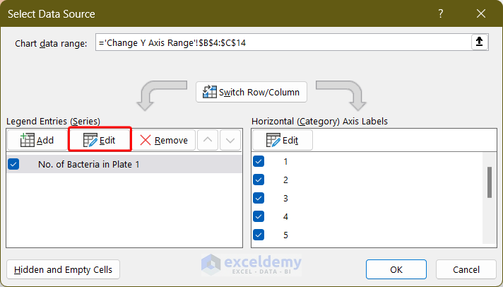
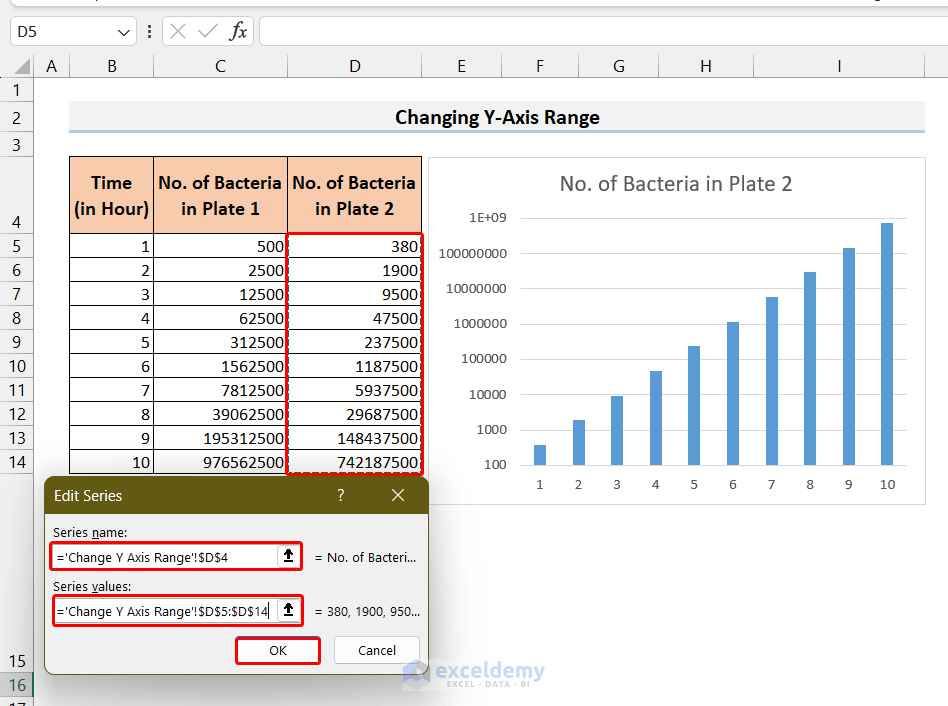
- Consequently, the Edit Series window will open up.
- From there, select the new range for the Series name and Series values and then click OK.
Click on the image for a detailed view.
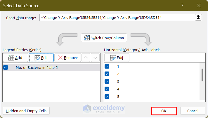
- Again, click on OK in the Select Data Source window to confirm the change.
- As a result, the data points of the Y-axis will change as expected.
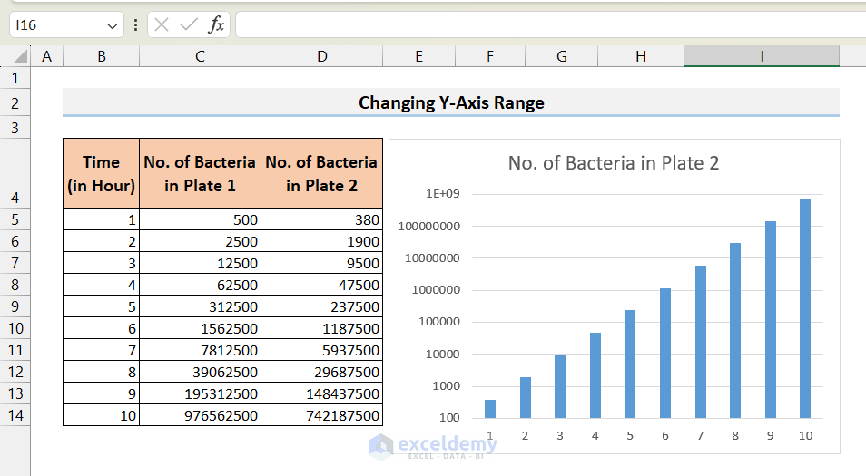
Click on the image for a detailed view.
Things to Remember
- You can also access the Format Axis menu by first selecting the axis and going to the Format tab and selecting Format Selection.
- You can add different elements to the chart (Axis titles, Data labels, etc.) to further beautify the chart.
Frequently Asked Questions
1. Can I switch between a linear and logarithmic axis scale in Excel?
Sure. you can click on the Logarithmic Scale in the Format Axis menu to switch the axis scale to a log scale with the desired base.
2. Can I change axis values on an existing chart in Excel?
Of course. We can change axes values using the Select Data Source menu.
3. Can I switch the axis in the Excel chart?
Sure. We can switch axes using the same Select Data Source menu.
Conclusion
We have reached the end of this article. Here, I showed how to change axis scale manually and automatically. I also described the way to convert an axis scale into a logarithmic scale. The logarithmic scale is very useful to conveniently illustrate a large range of data. I also discussed how to change the X-axis and Y-axis values in an existing chart. If you like this article, please share it with your friends and colleagues. Moreover, don’t hesitate to share your thoughts and suggestions in the comment section. Goodbye!
Excel Axis Scale: Knowledge Hub
<< Go Back to Excel Charts | Learn Excel

