A Pivot Table is a feature in Excel that reorganizes and summarizes data from unorganized raw datasets.
In this Excel tutorial, we are going to learn all the details about the pivot table feature in Excel.
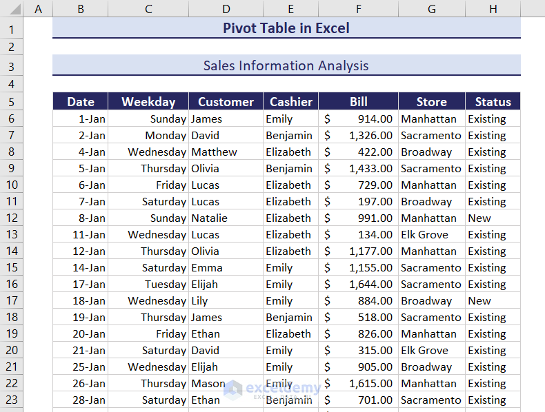
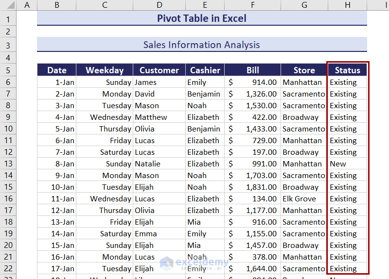
In the following image, we have a dataset containing sales information for a store, along with the cashier, its branches, and the status of a customer.
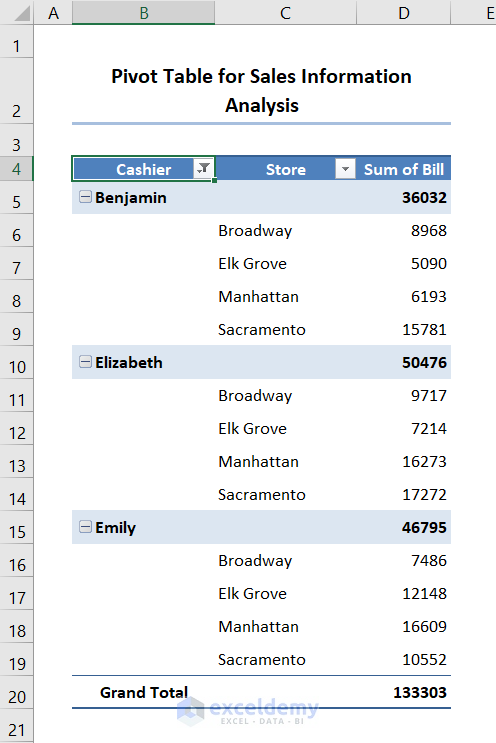
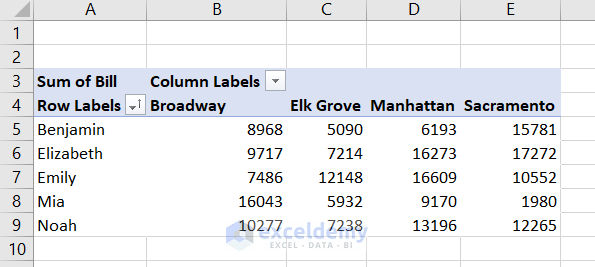
With the help of Excel, we can transform the dataset into a pivot table like the image below. We see the store-wise bills of cashiers in an organized way. The pivot table sums up all the repeated values and displays the total sales by each cashier and their branches.
In this article, we will cover
- What is a pivot table?
- Different parts of a pivot table
- Creating different types of pivot tables from different sources
- Working with fields in a table
- Working with different tools
- How to change designs and formats of pivot tables and headers
- Methods to group/ungroup data
- Sort and filter data in a pivot table
- Changing summary calculations and formats of values
- Extracting data from with GETPIVOTDATA function
- Common issues while working with pivot tables and their solutions
A pivot table is dynamic. It allows users to change and manipulate layouts by dragging fields. This helps explore data from different perspectives.
We have used Excel for Microsoft 365 in this article. Most of the features of Pivot Table are available from Excel 2007 to later versions. Adding Slicers requires Excel 2010 or later versions.
⏷ What Is a Pivot Table in Excel?
⏷ What Are Pivot Tables Used for?
⏷ Different Parts of Pivot Table
⏷ Create a Pivot Table in Excel
⏷ Add Field to a Pivot Table in Excel
⏵ Show Different Calculations in Value Fields
⏷ Create a Two-Dimensional Pivot Table in Excel
⏷ Create Multi-Level Pivot Table in Excel
⏷ Remove a Field from a Pivot Table
⏷ Change Summary Calculation of Pivot Tables
⏷ PivotTable Analyze Tab in Excel
⏷ Insert a Calculated Field and Calculated Item in a Pivot Table
⏷ Group Pivot Table Items in Excel
⏵ Ungroup Pivot Table Items
⏷ Refresh Pivot Table in Excel
⏷ Change Data Source of a Pivot Table in Excel
⏷ Move Pivot Table to a New Location in Excel
⏷ Change Pivot Table Field List View
⏷ Format Pivot Table in Excel
⏵ Show/Remove Subtotals
⏵ Show/Remove Grand Totals
⏵ Remove “Row Labels” and “Column Labels” from Table
⏵ Pivot Table Style Options
⏵ Change Pivot Table Styles
⏵ Change Date Format in Excel Pivot Table
⏷ Copy Pivot Table in Excel
⏷ Sort a Pivot Table in Excel
⏷ Filter a Pivot Table in Excel
⏵ Add Slicer in Excel to Filter Pivot Table Quickly
⏷ Extract Data from a Pivot Table Quickly
⏷ Calculate Difference in Pivot Table
⏷ Display Percentage Contribution in a Pivot Table
⏷ Use Pivot Tables for Frequency Distribution in Excel
⏷ Create PivotChart from a Pivot Table
⏷ Remove a Pivot Table in Excel
⏷ Tips and Tricks for Using Excel Pivot Table
⏷ Issues Related to Pivot Table in Excel
What Is a Pivot Table in Excel?
A Pivot Table is a data analysis tool in Excel. Its main purpose is to summarize, analyze a large amount of data and present them in a short and structured format. The rearranging and summary help users understand complex data.
A simple pivot table looks like this:
What Are Pivot Tables Used for?
The main goal of a Pivot Table is to improve the representability of complex and long sets of data. Some of its uses include:
- Comparing Sales of Products: It can sum sales of different instances of the same product. This can happen for every product in a sales dataset, which is helpful to compare sales of a specific product to another one.
- Frequency Comparison: Pivot Table counts the frequency of non-numeric data. It can count the frequency of numeric data too. With this feature, we can identify the contribution of a specific data point in a dataset.
- Percentage Calculation: Besides frequency and summing, a Pivot Table can also count the percentage of numeric values compared to the total.
- Pattern Recognition: The Pivot Table shows structured and organized data. So it is helpful to find insights into large datasets that are not immediately visible.
- Combining Duplicates: If the same header appears more than once, the Pivot Table can sum them up. It shows the total value of that point. This avoids the manual process of combining all the repeated data.
- Report Generation: As Pivot Table’s data are organized, we can directly present them as a report with some minor formatting. The report generated this way can also be dynamic. Moreover, we can add dynamic Pivot Charts from the tables too.
- Assigning Default Value to Empty Cells: Empty cells need to be treated in every data analysis process. We can add a single value to all empty cells with a Pivot Table. This makes the data-cleaning procedure a whole lot easier than other methods.
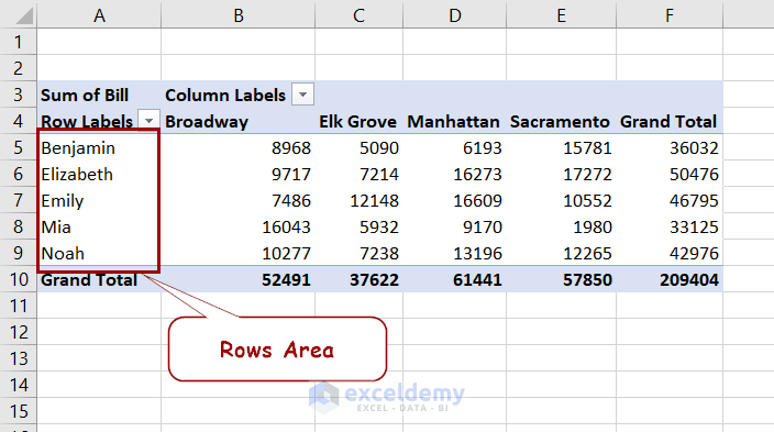
Different Parts of Pivot Table
A Pivot Table has 4 main components-
- Rows Area: This is mainly the row headers of a Pivot Table. It generally has at least one field. It is also possible to have no fields in this area. Multiple fields form a hierarchy of data.
- Columns Area: This holds the column headers. Unlike the Rows Area, it needs at least one field to function. It can have multiple fields, creating a hierarchy.
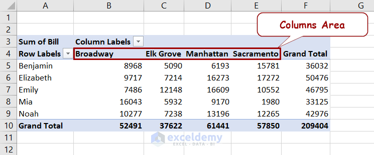
- Values Area: This contains the field of actual data for analysis. When compared with a normal table, these are the values or frequencies of column or row headers.

- Filter Area: This is an optional section of a pivot table. It is a drop-down list that can filter the data in the Values Area.
How to Create a Pivot Table in Excel
Before starting the steps to create a Pivot Table, let’s introduce the dataset we will use.
The following figure contains sales information about a store’s different locations, the cashier’s receiving date, and customer names. It also contains whether the customer is a new or recurring customer.

The above dataset is a bit complex to analyze because it contains raw data. Furthermore, it has 205 rows of entries. The Pivot Table can manipulate the presentation of these data to satisfy individual scenarios.
First, we are going to create a Pivot Table from this data.
1. Using Insert Tab from the Ribbon
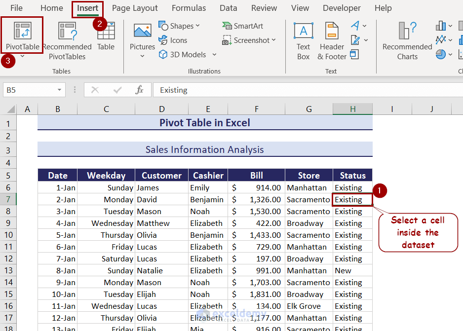
To create a Pivot Table from our existing dataset, follow these steps.
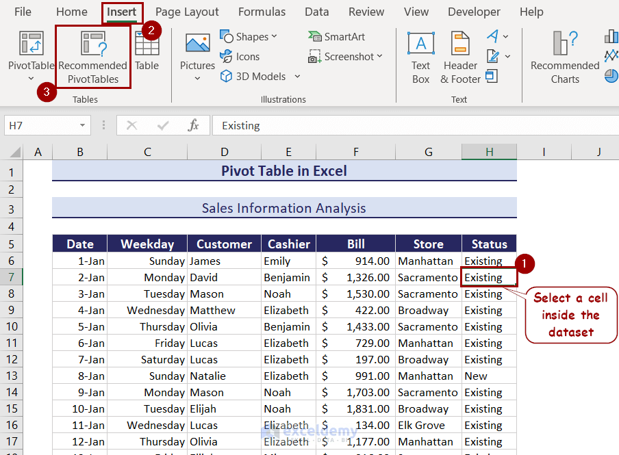
- First, select a cell inside the dataset.
- Go to Insert >> Tables >> PivotTable.
- Select whether you want the table to be on the existing sheet or a new sheet in the box that appears.
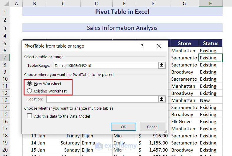
- Click on OK.
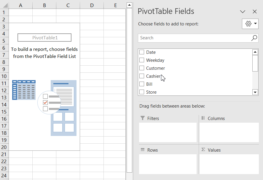
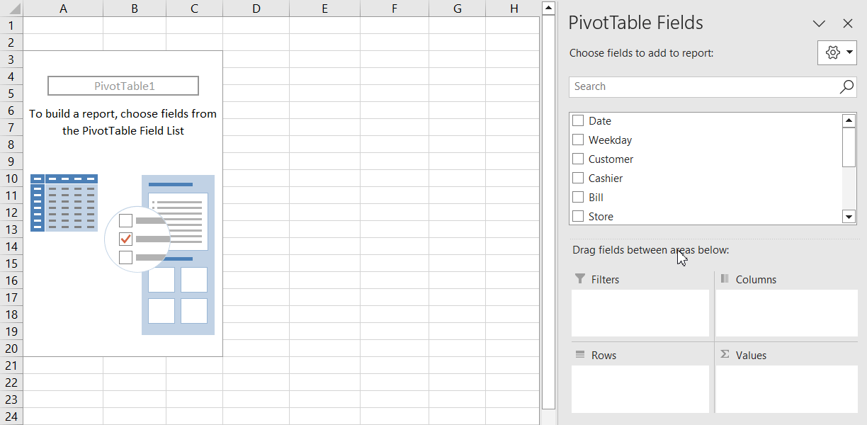
- A new sheet will open up (based on the option you have selected). It will contain the pivot table. The sheet will have the PivotTable Fields window on the right.
- To create Row Values and Column Values, drag those fields into their respective ones. For example, we have dragged Cashier to the Rows field and Bill to the Values field.
This is the simplest form of a pivot table. The table displays how much each cashier has charged.
How to Create Pivot Tables from Other Sources in Excel
The method above creates a pivot table within the workbook. It usually creates the table in a previous sheet if you select the new sheet option.
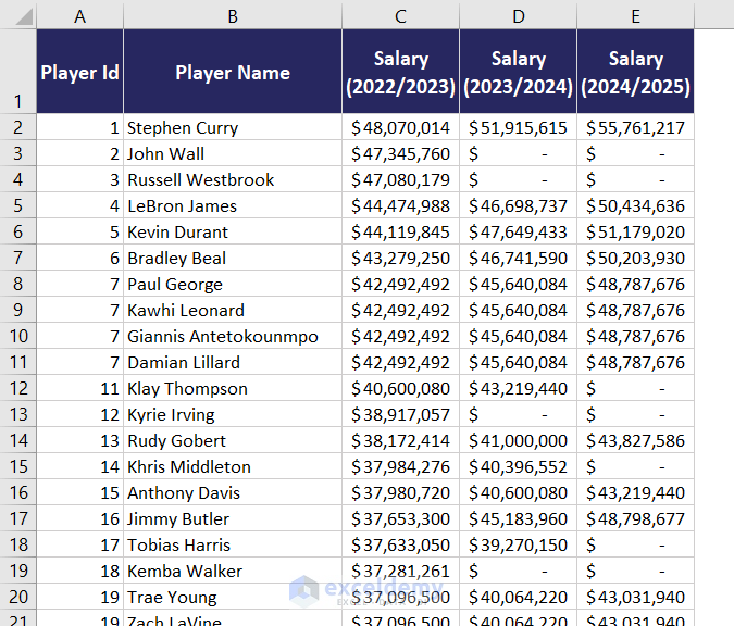
What if the dataset belongs to a different workbook or other data source? We have the following dataset in another workbook.
Note: The dataset should start from cell A1 in the external source for this method.
We will use this to create a pivot table in our current workbook using these steps.
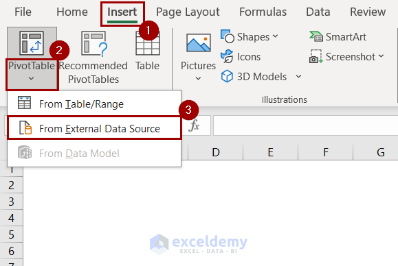
- Go to Insert >> Tables.
- Click on the drop-down arrow under PivotTable.
- Select From External Data Source from there.
- Click on Choose Connection in the box that pops up.
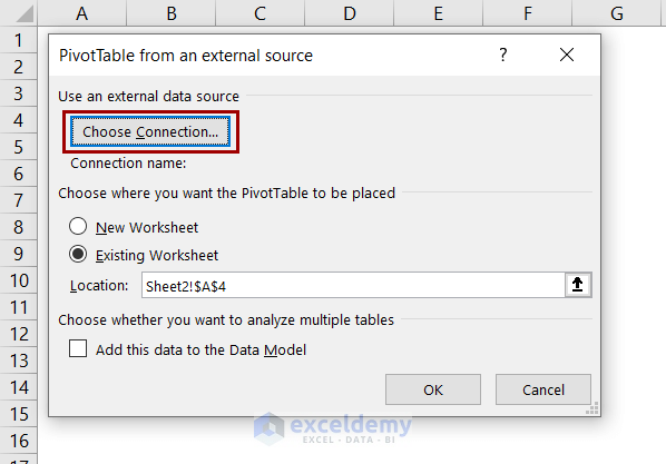
- In the External Connections box, select Browse for More.
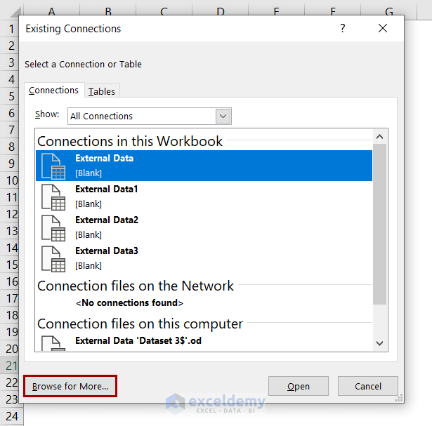
- Navigate to your external workbook and open it.
- Now select the sheet you want to load data from and click OK.
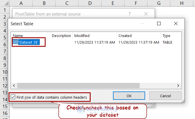
- Close all the boxes after that.
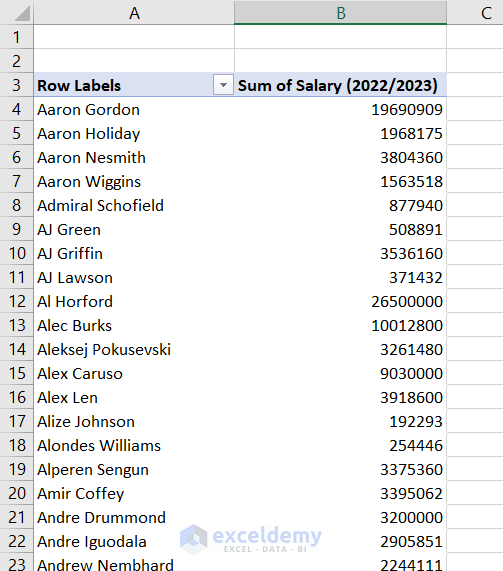
- Drag your preferred fields into the PivotTable Fields.
Finally, the pivot table is created from an external Excel file and it describes the salaries of different players.
2. Using Recommended PivotTables Option
Excel can pick up the pattern of a dataset and recommend a custom Pivot Table with fields. This way, we don’t have to manually drag fields while creating a Pivot Table. This feature is available with the Recommended PivotTable tool.
Here is how we can use this tool to create the same Pivot Table described in the first method using the same dataset.
- Select a cell inside the dataset.
- Go to Insert >> Tables >> Recommended PivotTable.
- On the left of the Recommended PivotTable box, you can find several pivot table formats. Select the one you prefer and click OK.
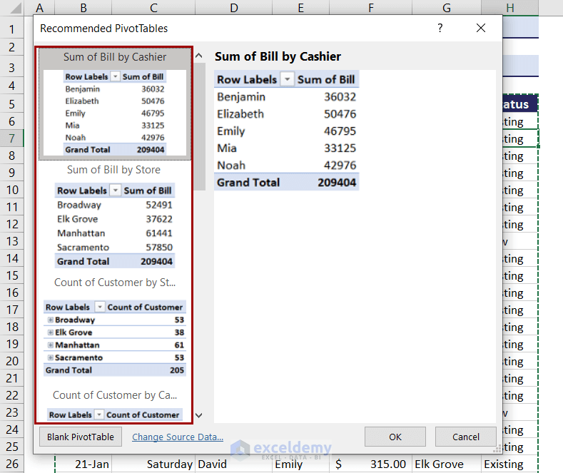
The pivot table will appear on a new sheet or the existing sheet, depending on the option you select.
Read More: How to Create a Pivot Table in Excel
How to Add Field to a Pivot Table in Excel
We have already mentioned dragging fields in a pivot table. The beauty of the pivot table is that you can drag and rearrange fields if you don’t like the summarization it gives initially.
To add a field to the pivot table:
- Click on the field name in the PivotTable Fields
- Without releasing the mouse button drag it to the desired field (row, value, column, or filter).
- Release the button after that.
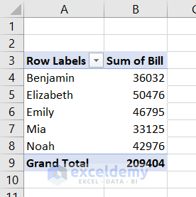
Here is a pivot table we have created from our dataset that shows the total bills by location.
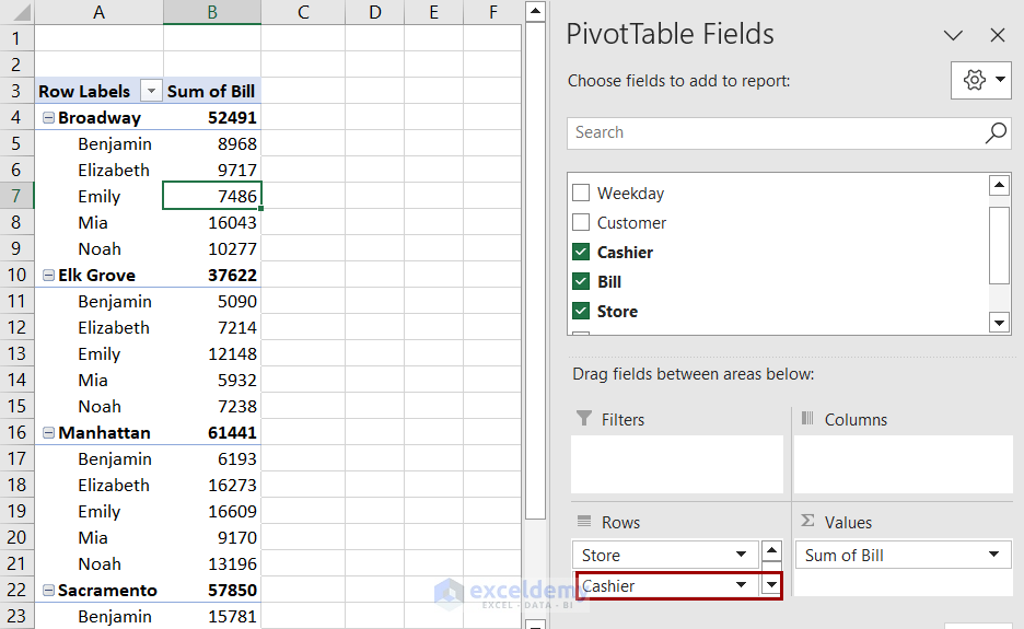
Dragging and dropping the cashier column will divide the location-based bills divided by cashiers.
Taking it to the columns area will reorganize the same values.
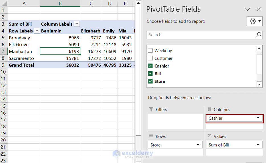
Putting the cashier field in the values area will add a column showing how many cashiers attended bills in each location.
Dragging the cashier field to the filters area will create a filter over the pivot table. You can select bills by each cashier using this filter.
For example, we wanted to find out sales by Benjamin from our dataset. Selecting Benjamin from the filter will give us that.

How to Show Different Calculations in Value Fields
A pivot table usually shows the sum of different counts of numeric values. Unless it is a non-numeric value. In those cases, the pivot table shows the count results.
The pivot table we have created shows the sum values of bills for the cashier.
We can convert them into % values of the total bill in the original dataset. Selecting Show Values As from the context menu after right-clicking.

Then you can select % of Grand Total and the pivot table will display calculations in percentages.
Read More: Pivot Table Calculations
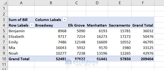
How to Create a Two-Dimensional Pivot Table in Excel
Let’s go back to the pivot table we have previously created, showing bills by each cashier.
The raw dataset of this table also contained customer names, their bills, dates, the store they had purchased from, and whether or not they were new or existing customers.
But the pivot table shows only the cashiers with the bills they have charged. If we want more information out of this, we need to create more dimensions in the table.
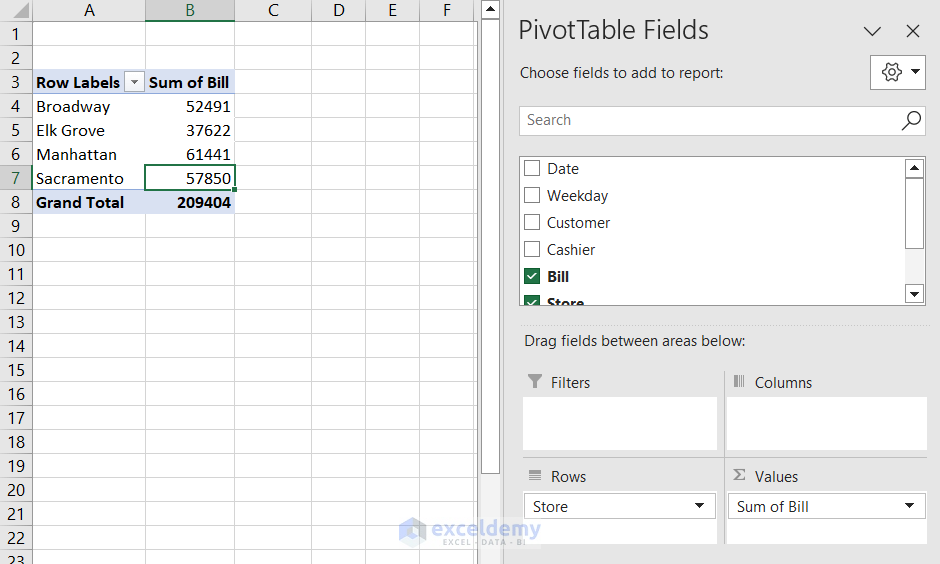
For example, we may need to know how much bills were paid based on the store locations. Follow these steps to see how we can do that.
- Select a cell from the dataset.
- Go to Insert >> Tables >> PivotTable.
- Select where you want the table to appear in the following box and click OK.
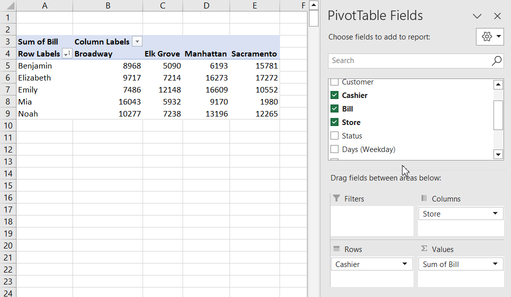
- Drag the “Store” field in the Columns area beside dragging Cashier to Rows and Bill to Values. This will create the two-dimensional pivot table.
How to Create Multi-Level Pivot Table in Excel
We have covered single and two-dimensional pivot tables in the previous sections. A pivot table can have more dimensions too.
For example, we can classify how many new and old customers each cashier billed in the row labels. With column labels, we can classify bills in each store location.
We need to follow these steps to create such pivot tables.
- Select a cell in the dataset and go to Insert >> Tables >> PivotTable.
- In the sheet where the pivot table appears, you will find the PivotTable Field
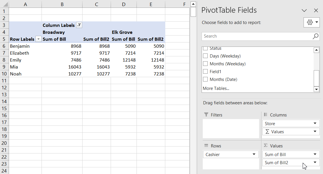
- Drag “Bill” to the “Values” area, “Store” to the Columns area, “Cashier” and “Status” to the Rows area to create the multi-level pivot table.
Multiple Value Field:
You can drag the same field twice in an area. Dragging “Bill” twice to the Values field will create two of the same values to occur in the pivot table.
How to Remove a Field from a Pivot Table
While creating multi-dimensional tables, we have seen how we can add extra fields to a pivot table. However, we can remove a field from a pivot table in two ways when it seems unnecessary.
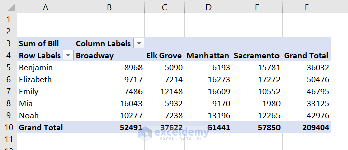
In the following figure, we have a filtered version of the pivot table we created previously.
We will remove the status of customers (existing or new status) and the second set of bills using the two methods.
- Unchecking the field from the PivotTable Analyze window can remove the field from the pivot table.
- Dragging the field from a particular area in PivotTable Fields also removes the field from the table.
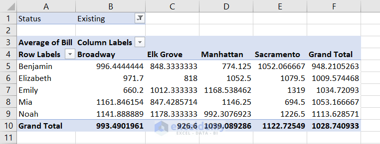
How to Change Summary Calculation of Pivot Tables
Besides showing sum values of numbers, the pivot table can also display other parameters like average, count, percentages, etc.
Let’s go back to the pivot table we previously created.
It shows the total sales in each store billed by each cashier. Changing these values to average will count average bills by cashiers in each store location.
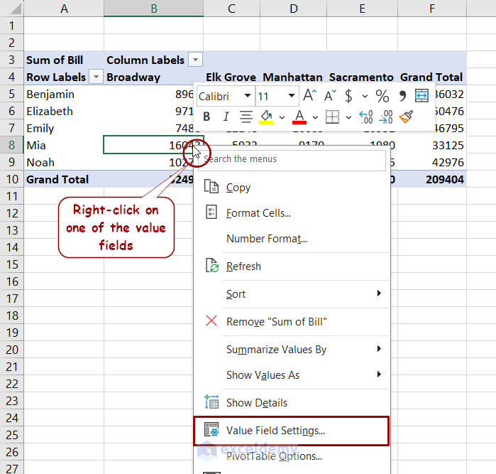
Follow these steps to change the summary calculation of a pivot table in Excel.
- Right-click on a value field on the pivot table.
- Select Value Field Settings from the context menu.
- In the Value Field Settings box, select Average under the Summarize value field by.
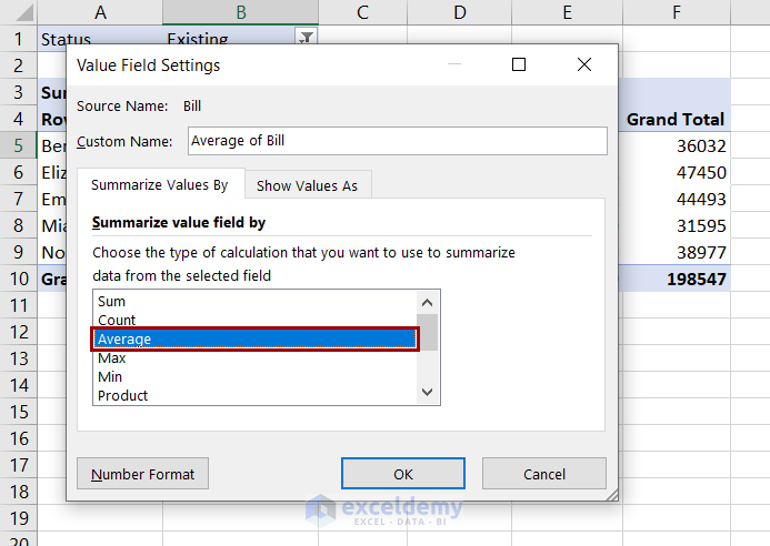
- After clicking OK, the sum values will change to the average in the pivot table.
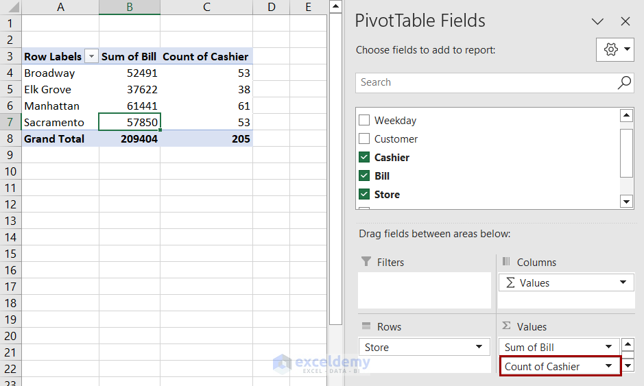
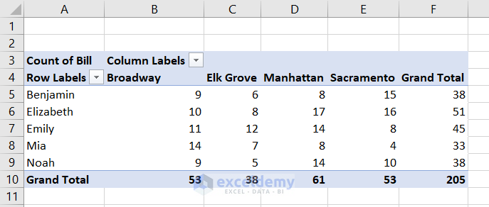
Besides showing averages, it can also display count values. This indicates how many times a bill was attended by each cashier in each store location.
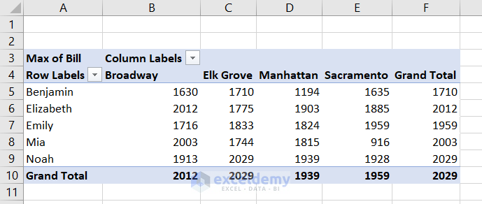
It can also show the maximum bills in each store location for different cashiers.
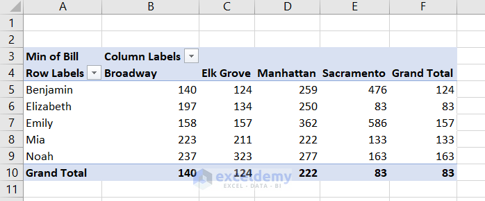
The same goes for minimum values too.
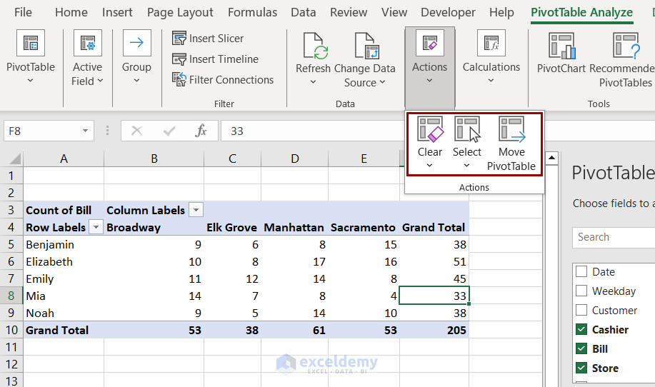
How to Use PivotTable Analyze Tab in Excel
Selecting a cell inside a pivot table creates two additional tabs in the ribbon: PivotTable Analyze and Design. You can access different tools from the PivotTable Analyze tab.
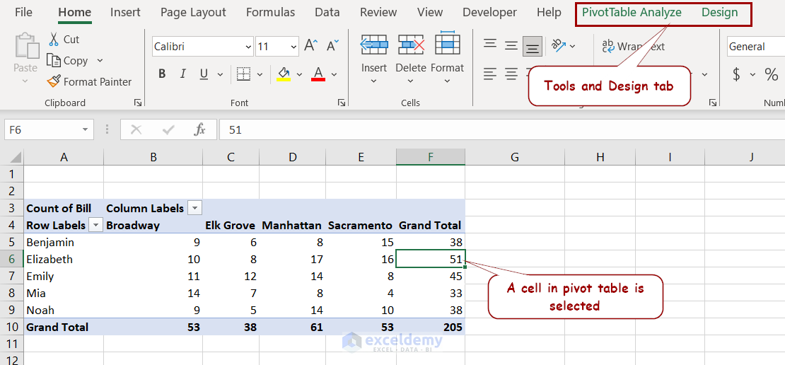
With the PivotTable Analyze tab, we can perform the following tasks.
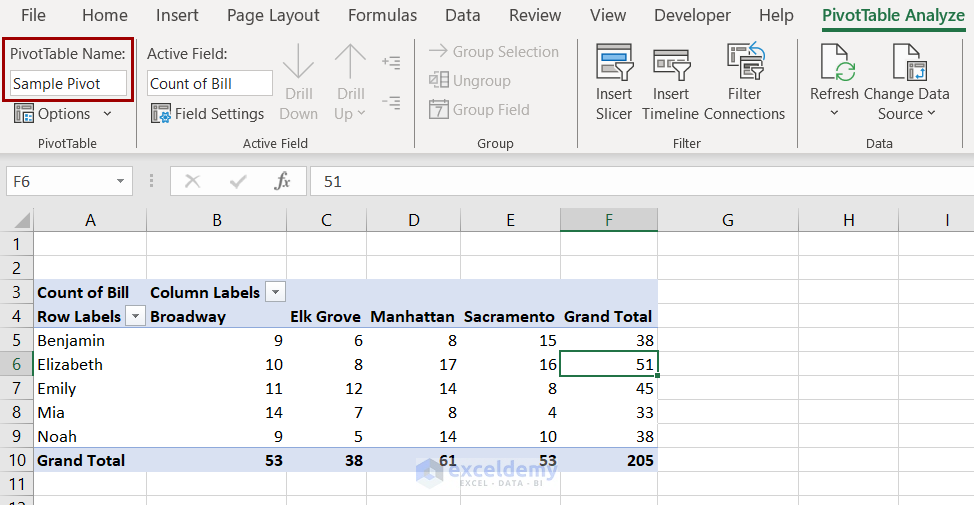
Changing Pivot Table Name: Inside the PivotTable group, you can change the name of the table from the PivotTable Name box. You can refer back to this table using this name in formulas.
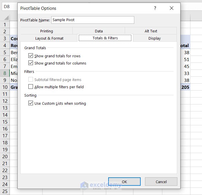
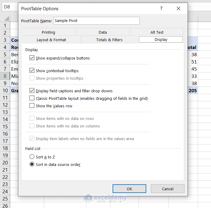
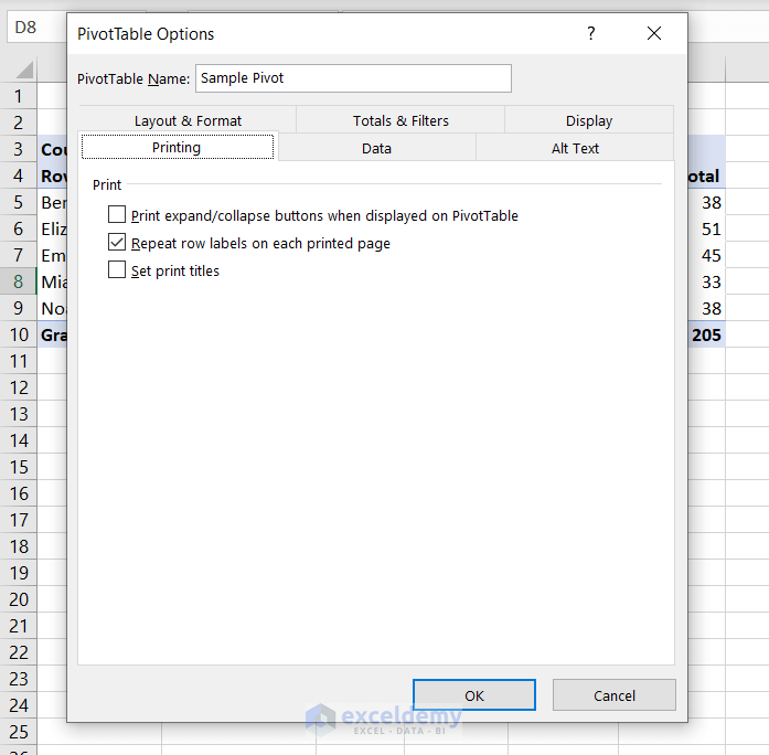
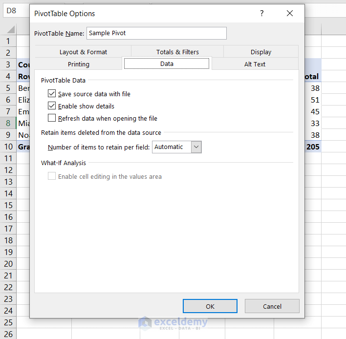
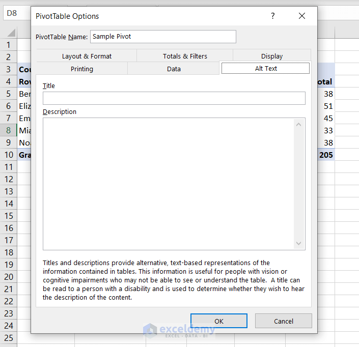
Options: After selecting the Options under the PivotTable group, you can get access to the Options box.
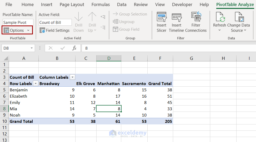
You can access the following options from this box.
- The Layout & Format tab can control how the pivot table displays its field values and labels.
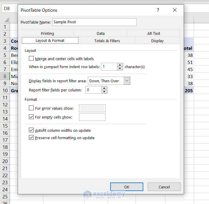
- The Totals & Filter tab contains different grand total display, filter, and sort options.
- You can access different fields’ display options from the Display tab.
- How the pivot table will print can be controlled from the Printing tab.
- You can control the source data and the refresh rate of the pivot table from the Data tab.
- The Alt Text tab allows us to add a title and description for the pivot table.
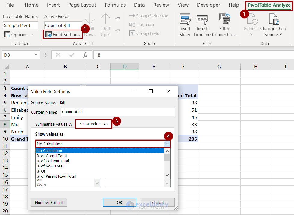
Field Settings: You can find the Field Settings inside the Active Field group. Using the Value Field Settings you can:
- Change the summary values in the Summarize Value Field By tab.
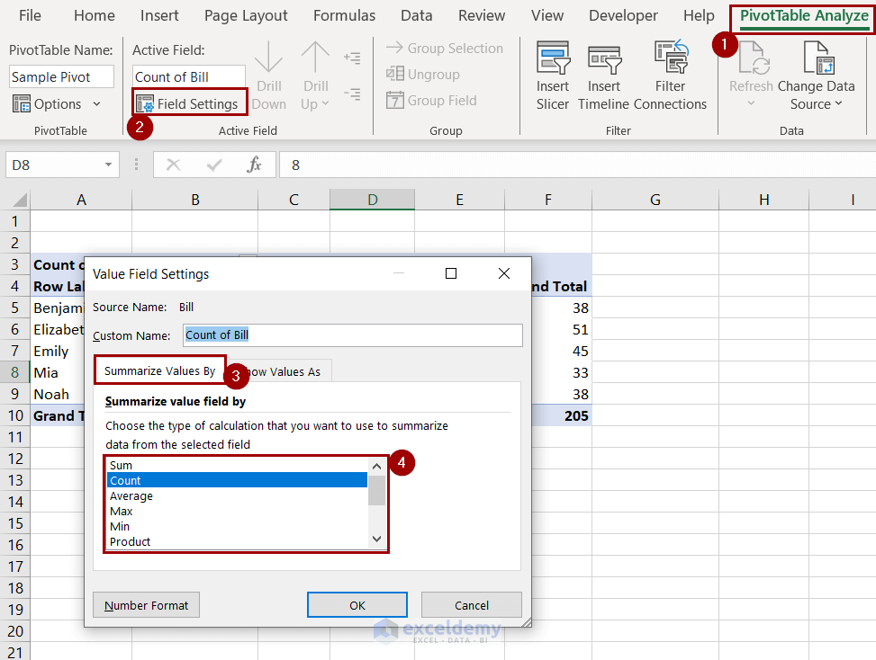
- Format how field values are displayed from the Show Values As tab.
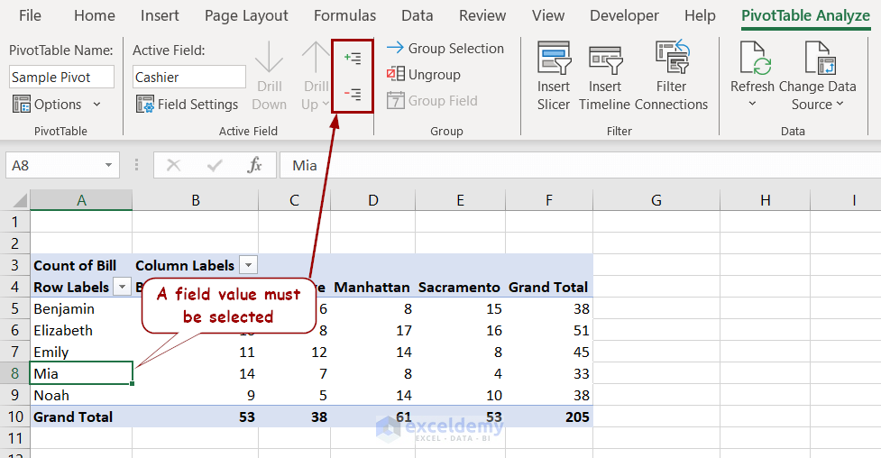
Expand and Collapse Field: After selecting a field in the pivot table, you will get the Expand Field and Collapse Field options in the Active Field group. This only works when there are hierarchies in the multi-level pivot table.
Grouping and Ungrouping Fields: Selecting a field enables two more options in the Group tab: Group Selection and Ungroup.
Group Selection groups multiple fields that can be treated as one later on. Ungroup reverses the process.
Filter:
- With the Insert Slicer option from the Filter group, you can add slicers. These slicers work as external graphic filters for the data.
- Insert Timeline adds a slicer based on dates. The original dataset must contain dates for this option to work.
- The Filter Connection offers options for different filters to connect to the pivot table.
Data Changes in the Pivot Table:
- You can refresh a pivot table using the Refresh option from the pivot table. Changes in the original dataset will be visible in the pivot table after using this option.
- With Change Data Source, you can completely change all values to a second dataset and disregard the first one.
Actions Group:
- You can clear a pivot table or parts of a pivot table using the Clear options from here.
- With the Select option, you can select a part or a complete pivot table.
- Move PivotTable option will move the table to a new location.
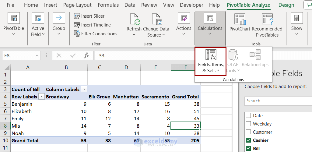
Calculation Options: Different Fields, Items, and Sets options are available under such names in the Calculations group.
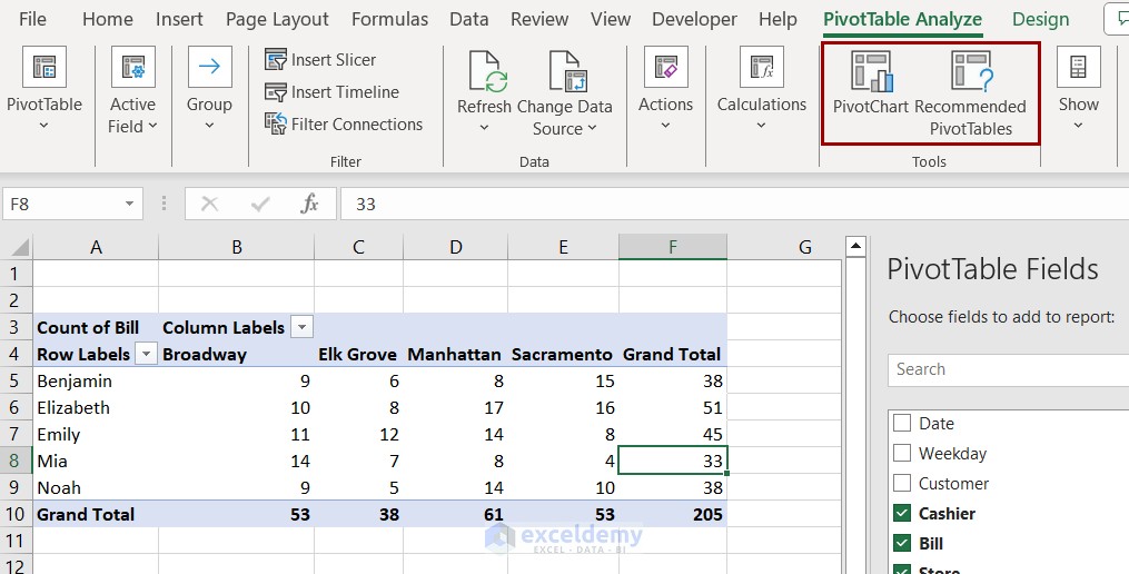
Plotting Charts and Changing Table:
- You can create a chart using the organized pivot table data using the PivotChart option from the Tools group.
- With the Recommended PivotTables option under the same group, you can change the table fields to a preset format.
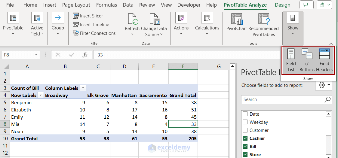
Additional Display Options: You can toggle the Field List, Headers, +/- buttons on and off using the options available in the Show tab.
Read More: Pivot Table Analyze
How to Insert a Calculated Field and Calculated Item in a Pivot Table
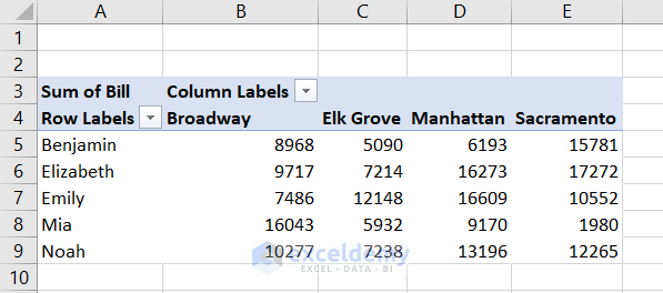
Let’s simplify our pivot table for a better understanding of this topic.
The calculated item will create groups in the field with modified new values, and the calculated field will create new columns based on a new formula. We will explain both in this section.
Calculated Field:
Suppose we want to calculate an extra 1% commission in the event of more than $10,000 sold. Other cases are not applicable. We can find the eligible cases and the amount of money using the calculated field very easily.
Follow these steps to add such a calculated field to the pivot table.
- Select a cell in the pivot table and go to PivotTable Analyze >> Calculations >> Fields, Items, & Sets >> Calculated Field.
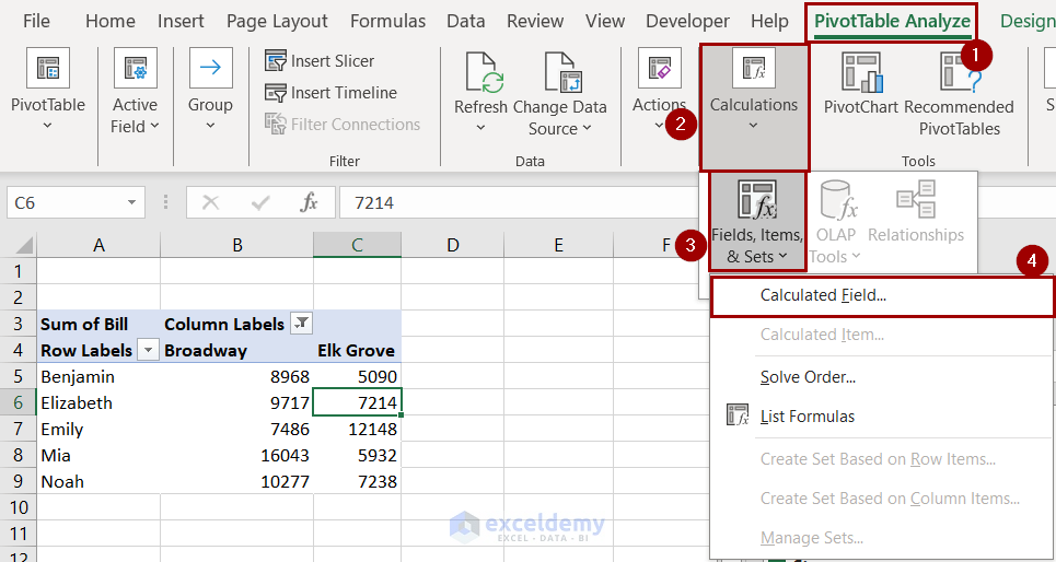
- In the Insert Calculated Field box, insert the following formula in the Formula field and click Add.
= IF(Bill>10000,Bill*1%,0)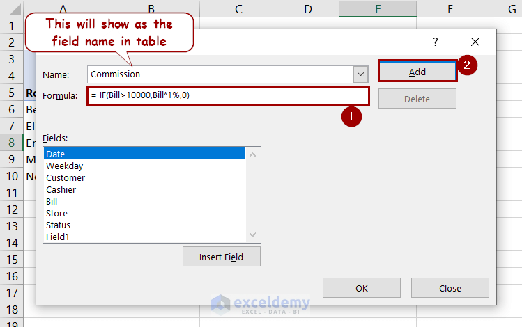
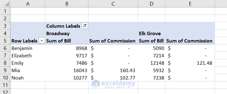
- After clicking OK, the pivot table will now look like this.
Calculated Item:
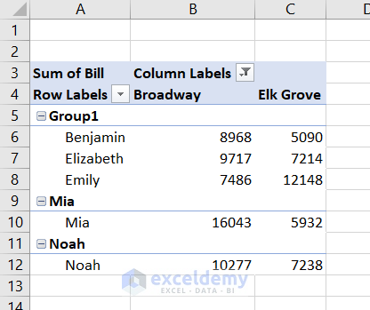
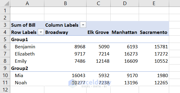
In the same pivot table, let’s assume Benjamin, Elizabeth, and Emily are in a team and the rest are on the other side. We want to calculate how much each group has sold. The pivot table can calculate that using the calculated item feature.
Follow these steps to see how we can do that.
- Select a cell from the row labels.
- Go to PivotTable Analyze >> Calculations >> Fields, Items, & Sets >> Calculated Item.
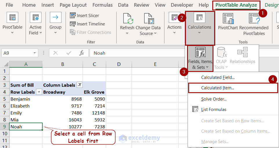
- In the Formula field, type in the following formula and click Add.
= SUM(Benjamin,Elizabeth,Emily)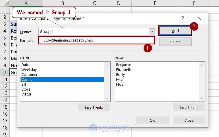
- Similarly, insert the following formula for group 2.
= SUM(Mia,Noah)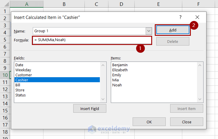
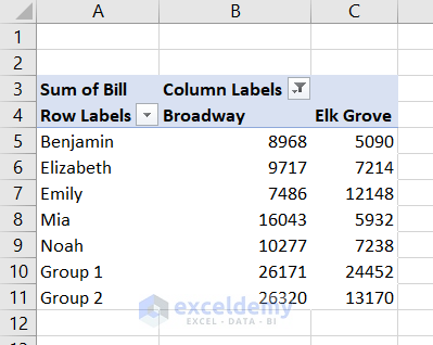
- Click OK and you will get the total sales of each group.
How to Group Pivot Table Items in Excel
We grouped different fields in the previous section using the Calculated Item feature. This method was efficient for creating multiple groups.
We can also create groups from the ribbon or context menu. This method doesn’t require any formula usage but is inconvenient for creating groups.
1. Group Row Labels
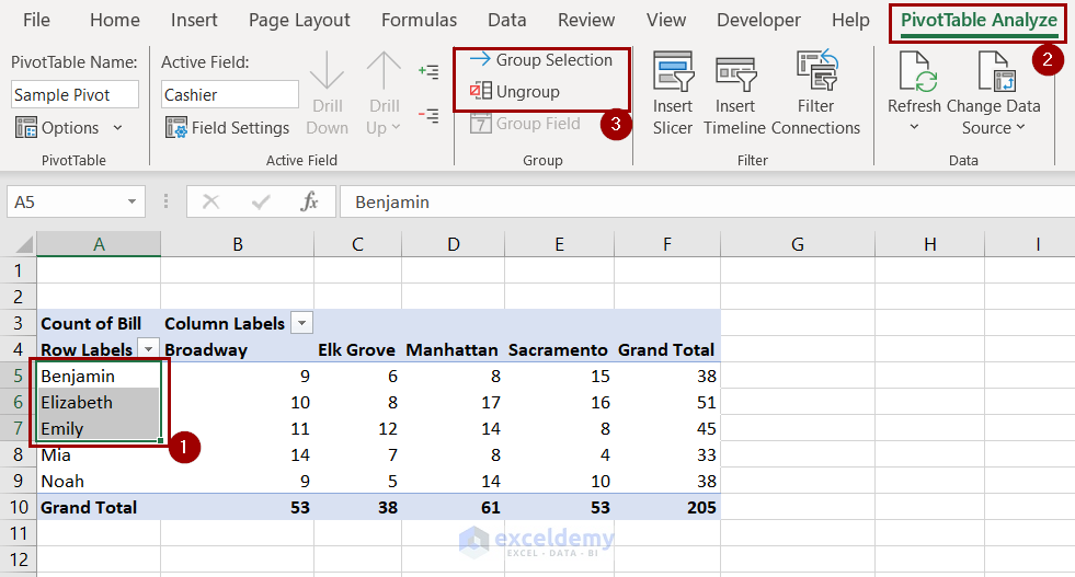
In the previously created pivot table, we want to add Benjamin, Elizabeth, and Emily to a single group.
We can use the following steps to group them together.
- Select the cells you want to group.
- Go to PivotTable Analyze >> Group >> Group Selection.
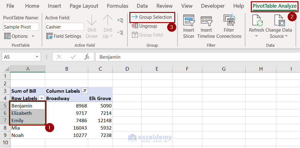
Now the pivot table will group them.
Note: If you want to put the rest into another group, as we did in the previous section, you need to manually select them and repeat the same process.
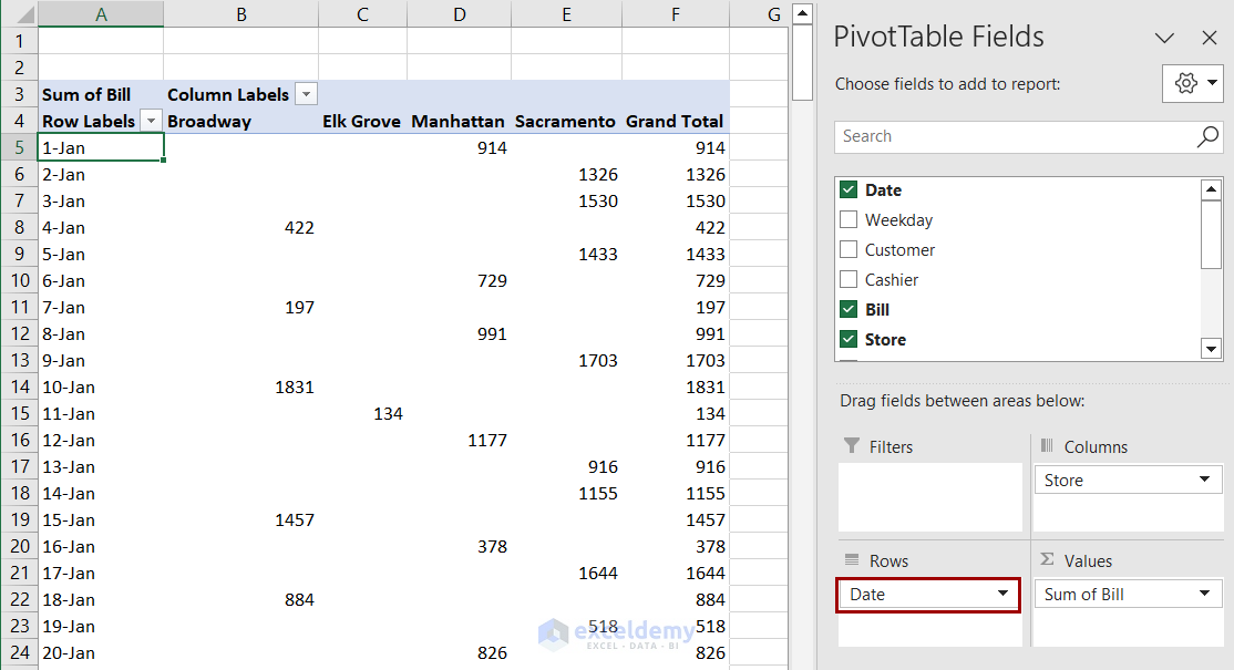
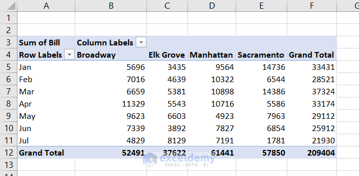
2. Group Dates
To understand the date grouping, we have slightly modified our pivot table. We used the dates as the row label of the table.
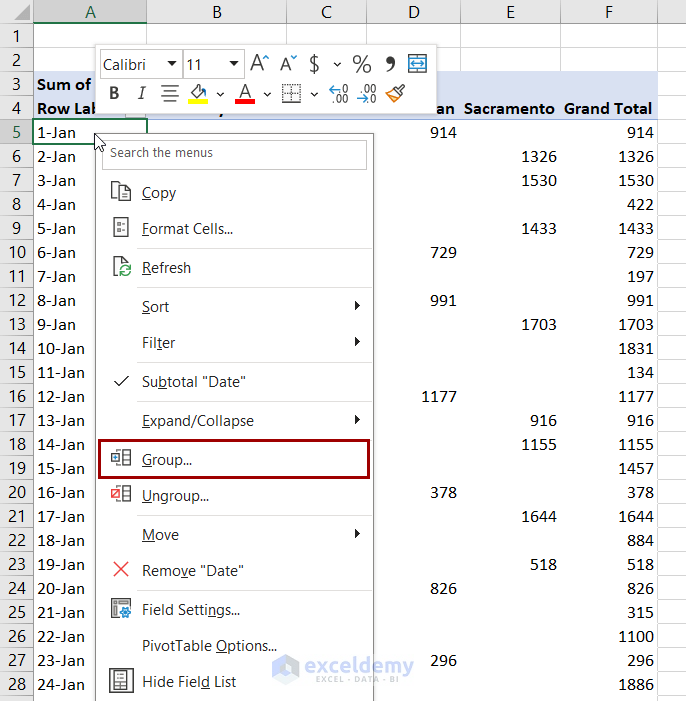
- Right-click on a row label and select Group from the context menu.
- Select a starting and ending date if you prefer to shorten the table. In the By field, select Months (as we are grouping the dates by months).
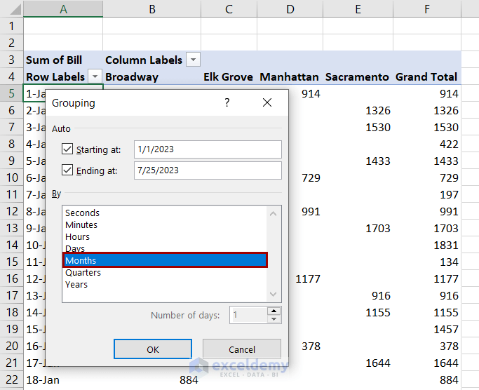
After clicking OK, we will get the total bills based on months.
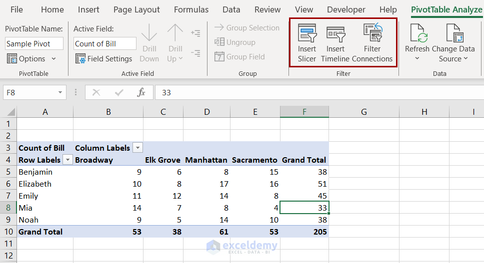
How to Ungroup Pivot Table Items
Grouping items simplifies the data in a pivot table. If you want the detailed version of the data or to get the previous view back, you can use the following steps to ungroup them.
- Select a cell inside the row labels.
- Go to PivotTable Analyze >> Group >> Ungroup.
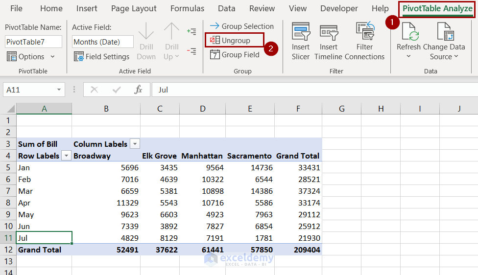
Excel will ungroup the data we have grouped before.
Note: You can ungroup using the option from the context menu too. It will open the same dialog box and you have to follow the same steps.
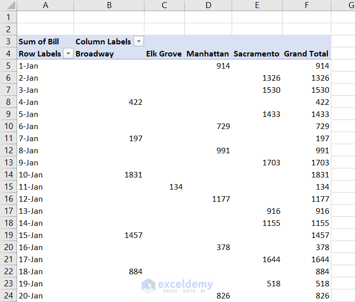
How to Refresh Pivot Table in Excel
We are making a slight change to a value in our original dataset, as marked in the following figure.
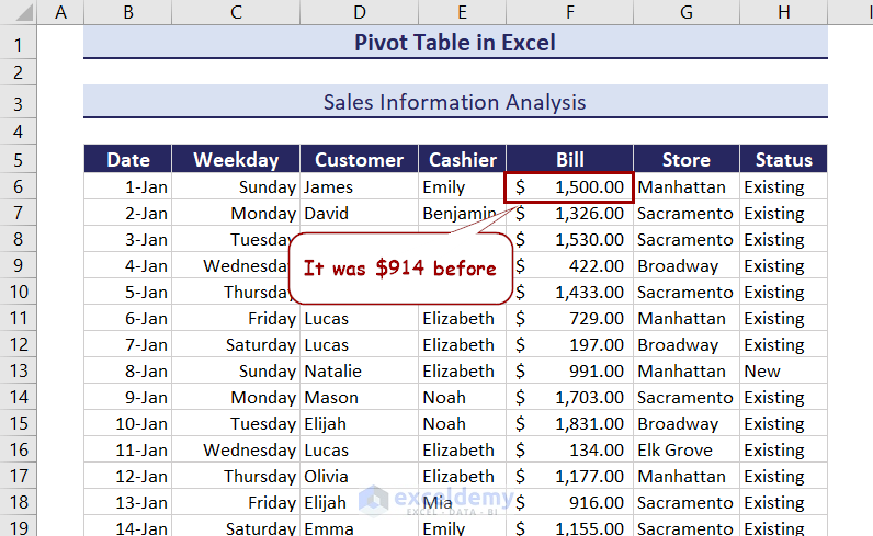
However, the table value doesn’t change after changing this value.
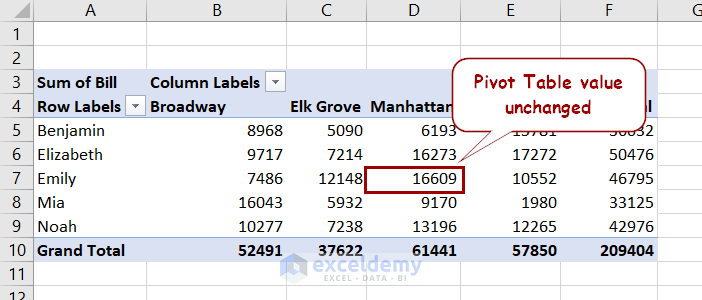
We need to refresh the pivot table if we want the updated value in the table.
Refresh a pivot table using the following steps.
- Select a cell inside the pivot table.
- Go to PivotTable Analyze >> Data >> Refresh.
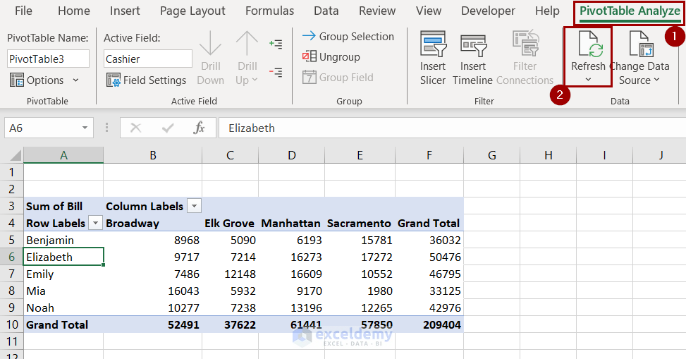
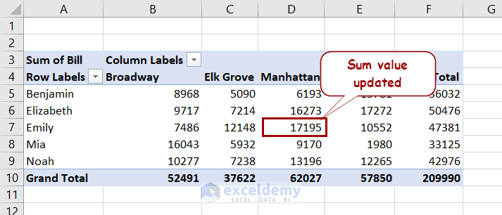
The table will now update according to the latest value.
Read More: How to Refresh Pivot Table in Excel
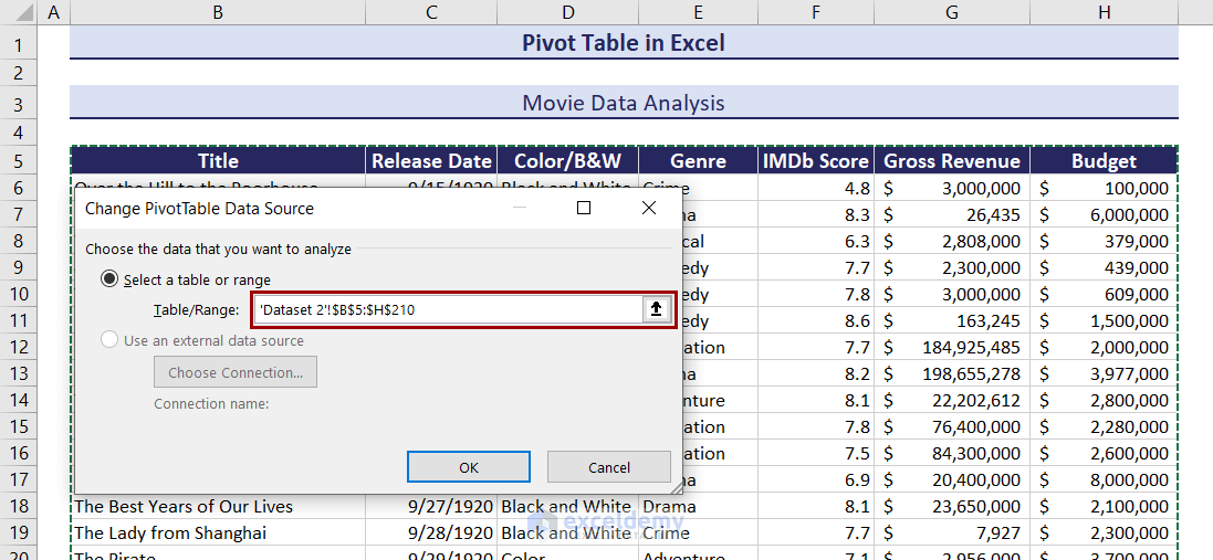
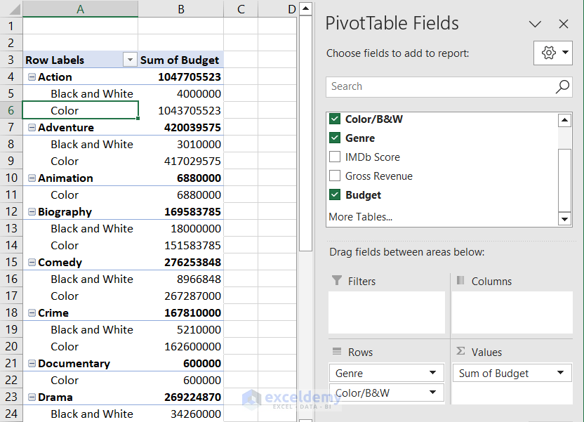
How to Change Data Source of a Pivot Table in Excel
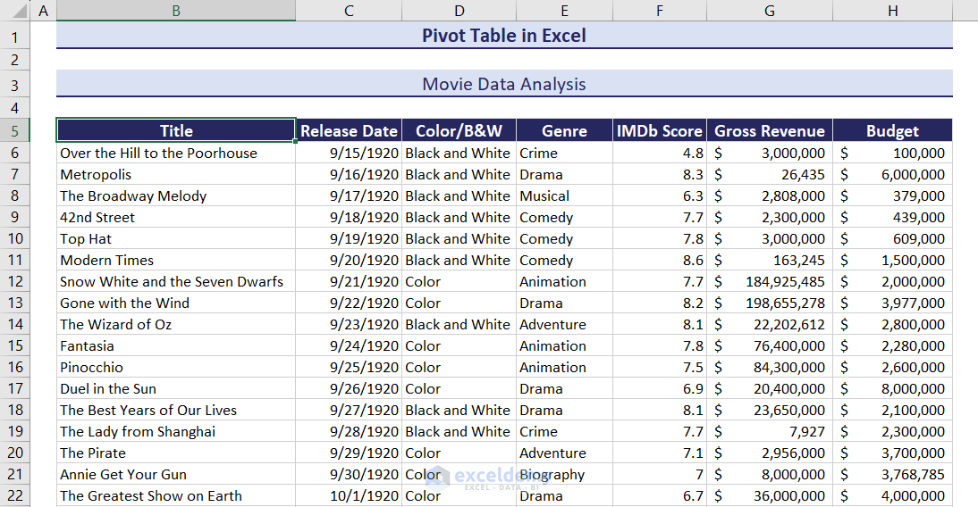
Here is another dataset in our workbook. We may want the pivot table to get data from this dataset instead of the previous one. We can always create a new pivot table in this scenario.
However, having too many pivot tables will make the Excel file unnecessarily large. And we want to have this data in the previously created pivot table only.
We can change the data source of the pivot table to the new dataset using the following steps.
- Select a cell inside the pivot table.
- Go to PivotTable Analyze >> Data >> Change Data Source.
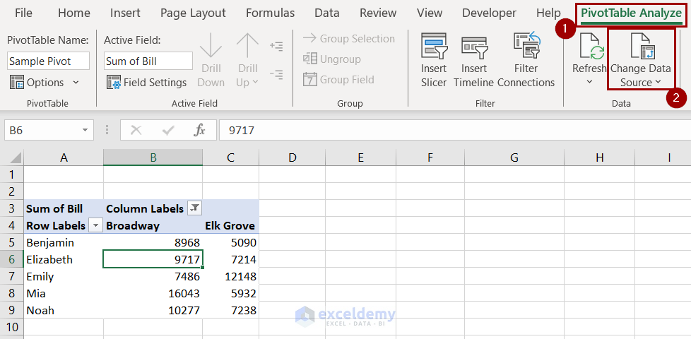
- A new box will pop up. Select the second dataset in the Table/Range field here.
- The pivot table will revert to its initial view.
- Drag the new fields to the desired areas to get the pivot table.
How to Move Pivot Table to a New Location in Excel
We can select a position for a pivot table if we create them in the same worksheet as the dataset. If we create it on a new sheet, the position usually starts at cell A3 in the new sheet.
Regardless of whether it was on a new sheet or an old one, we can still change the position of a pivot table using the following steps.
- Select a cell in the pivot table.
- Go to PivotTable Analyze >> Actions >> Move PivotTable.

- Select the new cell in the Location.
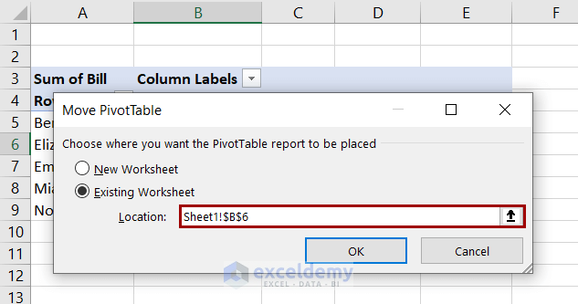
- Clicking OK will shift the pivot table to the new position.
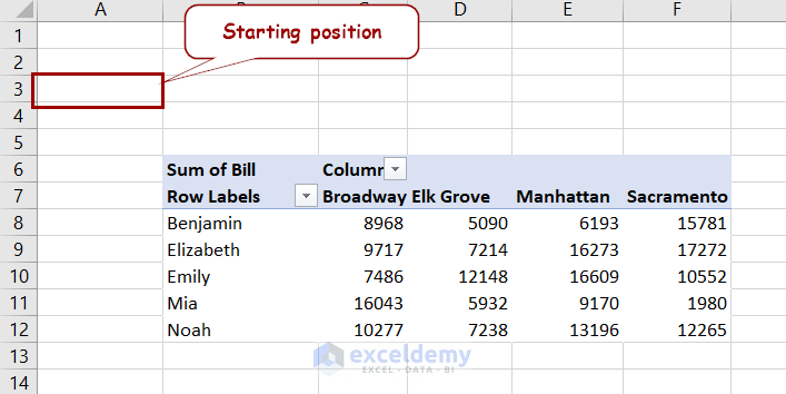
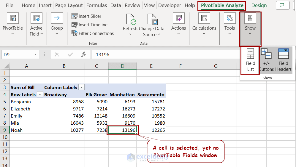
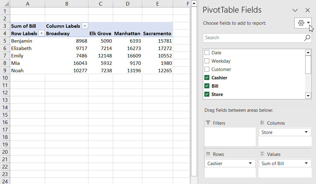
How to Change Pivot Table Field List View
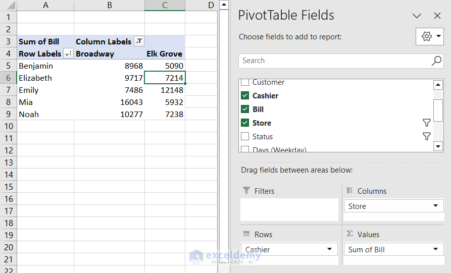
Selecting a cell inside the pivot table will usually open the PivotTable Fields window at the right of the worksheet.
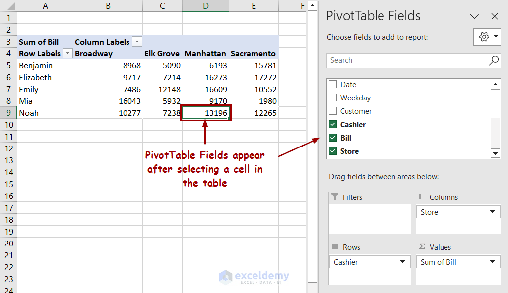
Excel provides us with features to turn it on and off, along with changing this view too.
Turning Pivot Table Field List View On/Off:
- Go to PivotTable Analyze >> Show.
- Select/Deselect Field List to show/hide the field list.
Changing Field List View:
There is a tool button available in the PivotTable Fields window. You can click on it and have a drop-down list consisting of different options for different views. You can change the preferred layout from here.
See the figure below for more details.
Read More: Pivot Table Field List
How to Format Pivot Table in Excel
The Design tab also appears after selecting a pivot table. Its primary function is to change the layout and design of a pivot table. We are going to discuss the different features of this tab in this section.
Show/Remove Subtotals
Subtotals are visible in pivot tables with grouped fields. Let’s take such a table we have previously created where all the cashiers are classified into two groups.
- To hide/unhide subtotals from a pivot table, select a cell and go to Design >> Layout >> Subtotals. Select the option you prefer.
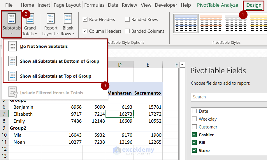
You will get the default view with the Do Not Show Subtotals option.
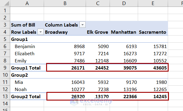
- Selecting to show the subtotals either at the top or bottom will give us something like this:
Show/Remove Grand Totals
When we create a pivot table it contains the “Grand Total” columns and rows by default.
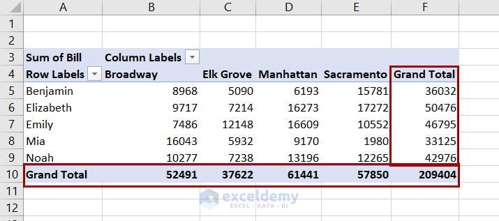
To turn it off:
- Select a cell inside the pivot table.
- Go to Design >> Layout >> Grand Totals.
- Select Off for Rows and Columns.
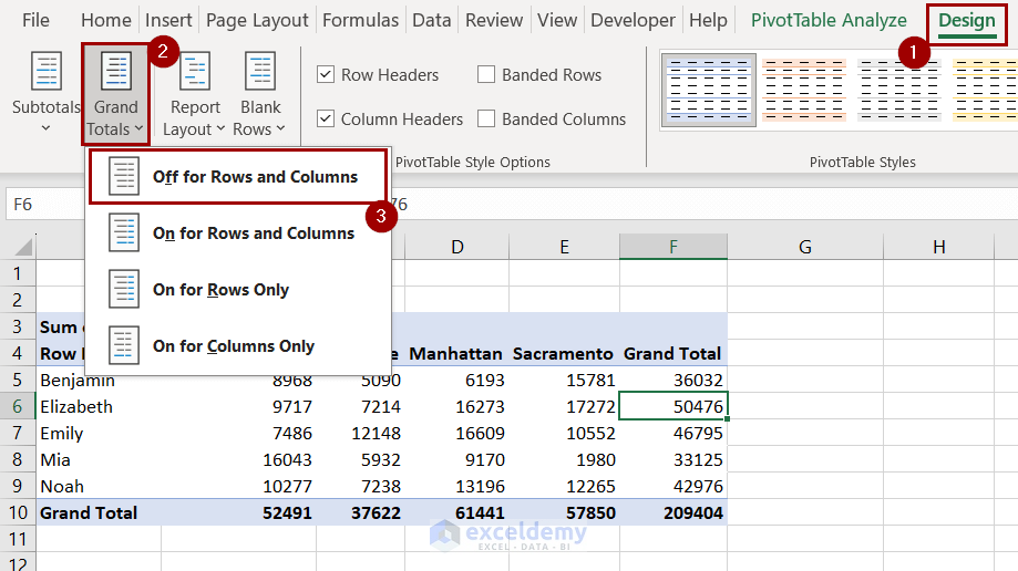
There are other options to explore here too, like having the grand totals for rows only, columns only, or both.
Remove “Row Labels” and “Column Labels” from Table
You may have noticed the “Row Labels” and “Column Labels” cells with filters on a pivot table.
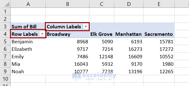
These show the row and column headers of the table. We can filter out certain fields from these labels using the filter beside them.
However, the terms are not presentable, and Excel has features to change that.
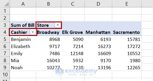
To change this:
- Select a cell inside the pivot table.
- Go to Design >> Layout >> Report Layout.
- Click on Show in Outline Form from the drop-down.
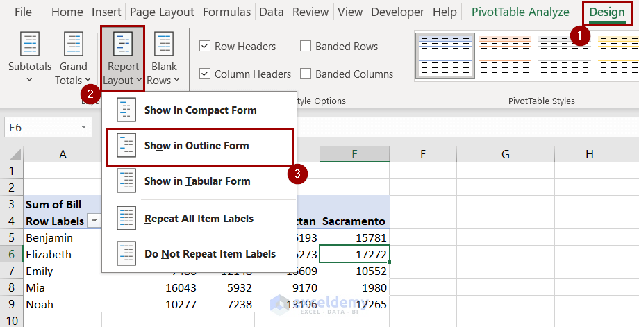
The “Row Labels” will turn into “Cashier” and “Column Labels” into “Store”.
Read More: How to Filter Excel Pivot Table
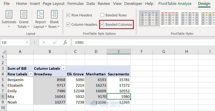
Pivot Table Style Options
You can explore different options in the PivotTable Style Options group of the design tab.
- Checking Row Headers and Column Headers on/off will add or remove formatted headers from the table.
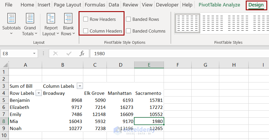
Note: The Row Headers option changes are only visible in some of the table presets.
- You can have every other row filled with the Banded Rows option checked.
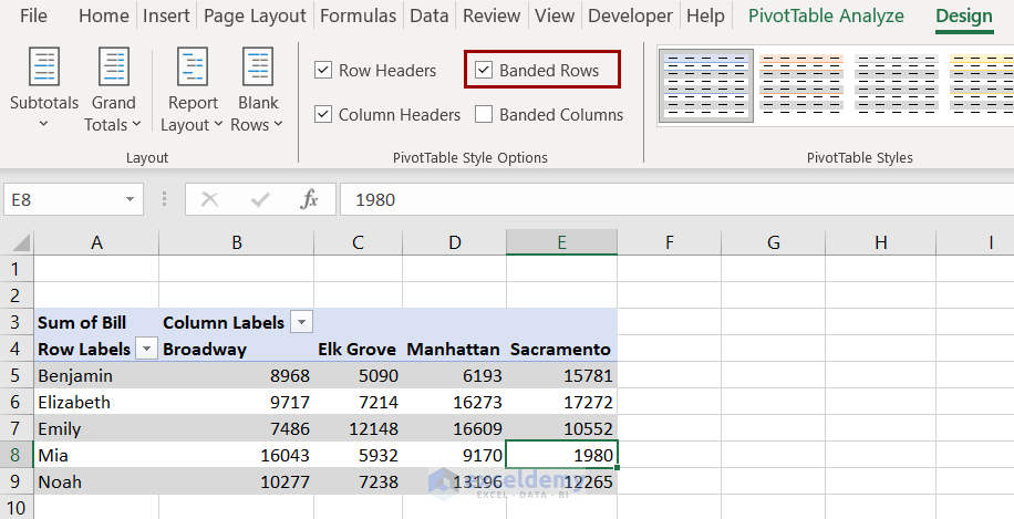
- The same goes for columns with the Banded Columns option.
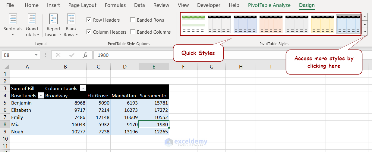
Change Pivot Table Styles
There are two main styles to choose from in a pivot table:
- In the PivotTable Styles group of the Design tab, you have access to some quick styles.
- Or, you can select the downward-facing arrow to access more designs. You can also create, save, and delete custom styles from here.
Change Date Format in Excel Pivot Table
First, rearrange our pivot table for dates as row labels.
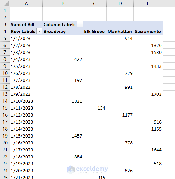
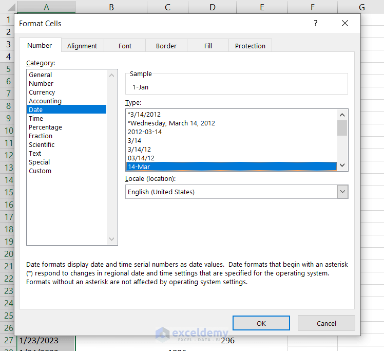
The dates in the pivot table are in “mm/dd/yyyy” format. To change this format, follow these steps.
- Select all the cells containing dates.
- Press Ctrl+1 to open the Format Cells dialog box.
- Select the date style you prefer. We have selected the “dd-mmm” format here.
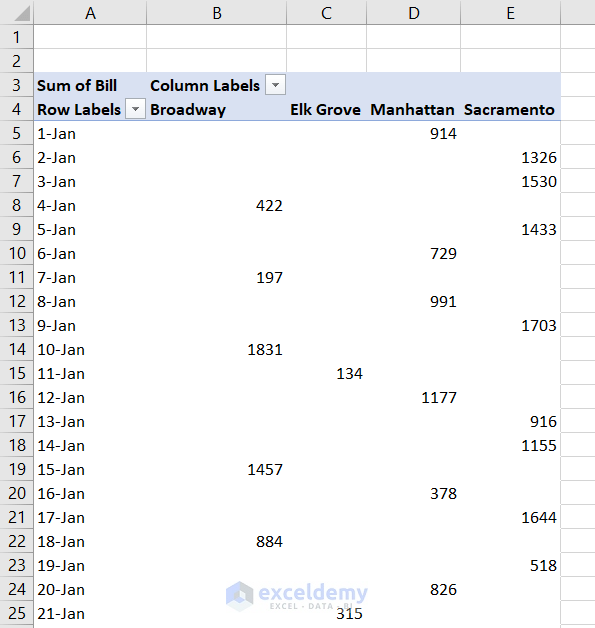
The dates will now look like this after clicking OK.
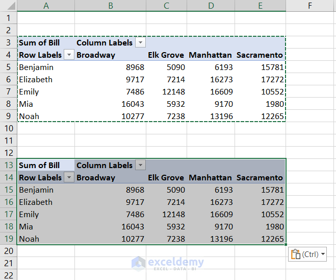
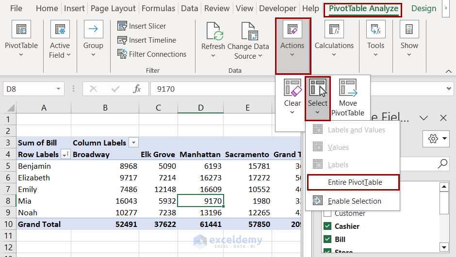
How to Copy Pivot Table in Excel
We are going to copy the below pivot table into a new cell, A13.
- First, select the whole table. You can do that by selecting a cell in the table and pressing Ctrl+A.
- Or, select PivotTable Analyze >> Actions >> Select >> Entire PivotTable.
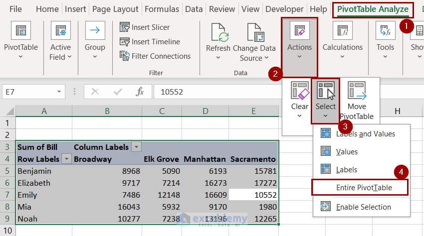
- Press Ctrl+C to copy the table to the clipboard.
- Paste using Ctrl+V after selecting the desired cell to paste it into.
Read More: How to Copy a Pivot Table in Excel
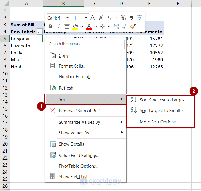
How to Sort a Pivot Table in Excel
In this section, we will explain how to sort a pivot table. We can sort a table based on both fields or values.
Both sorting methods are the same. We will demonstrate sorting by values. We will use the same pivot table for reference.
- Right-click on a cell of the pivot table.
- Select Sort from the context menu.
- Select your preferred sorting option from the list.
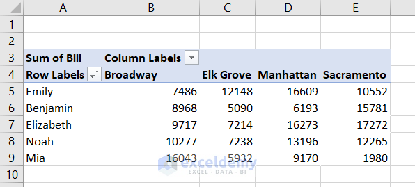
- Sorting from smallest to largest option gives us the dataset like the following.
Note: While sorting by labels, you need to right-click on any of the row or column labels.
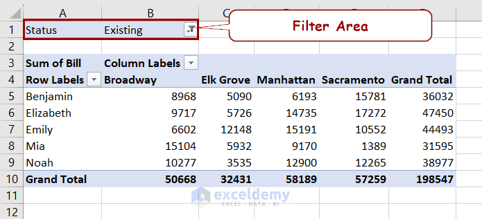
How to Filter a Pivot Table in Excel
In the pivot table parts, we have mentioned the Filter field. Our original dataset contained a record of whether the transaction was from an existing customer or a new one.
The pivot table doesn’t mention that.
The pivot table combines both the data instead because we didn’t mention separating them when we created the table.
We can separate them by adding the status as a field to the row or column labels. However, we are going to use it as the filter in this section.
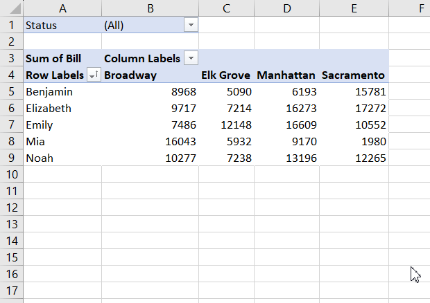
To add the status as a filter, drag the “Status” field inside the Filter area of the PivotTable Fields.
You can now filter existing and new customer bills using this new field.
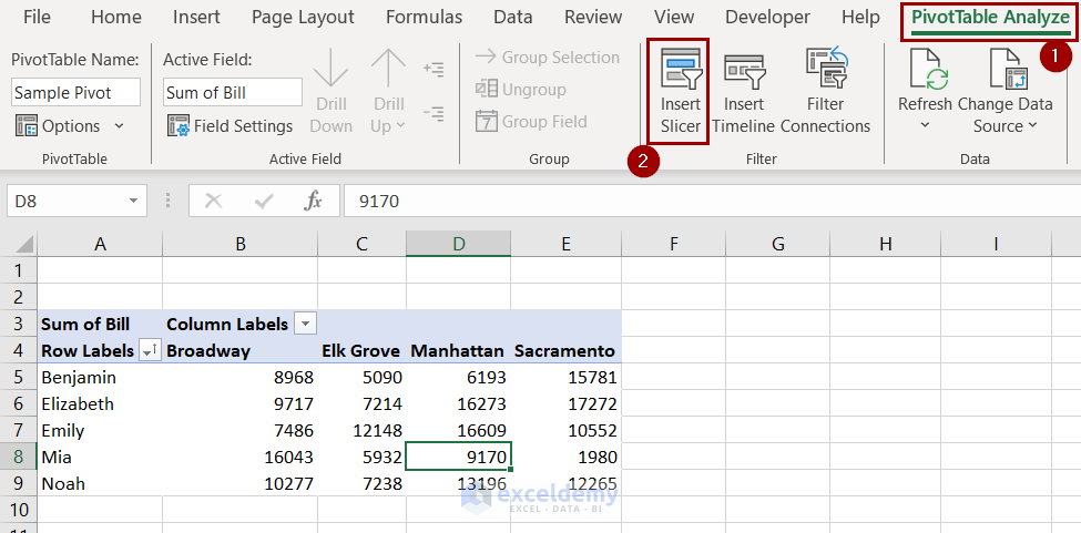
Add Slicer in Excel to Filter Pivot Table Quickly
A slicer can add more graphic elements to the pivot table. It is more user-friendly to filter and manipulate data in a pivot table.
To add a slicer, follow these steps.
- Select a cell inside the pivot table.
- Go to PivotTable Analyze >> Filter >> Insert Slicer.
- Select a field inside the Insert Slicers We are selecting “Status” here to filter new and existing customer bills.
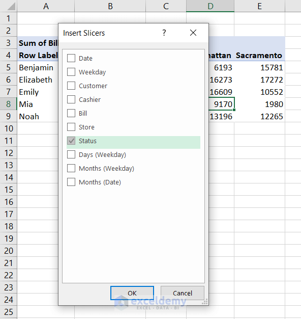
- Click on OK and a slicer will appear on the worksheet.
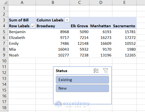
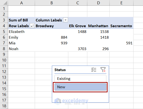
You can now select a type from this filter and get the same result as the Filter field.
Read More: Excel Pivot Table Slicers: All Things You Need to Know
How to Extract Data from a Pivot Table Quickly
Excel has the GETPIVOTDATA function to extract data from a pivot table. The syntax of the function is:
- data_field: This is the name of the field we extract data from.
- pivot_table: A reference to the pivot table. This can be a cell, a range, or the whole table.
- [field1, item1]: Optional fields to describe the data we want to fetch from the table.
Suppose we want to get the following information from our pivot table.
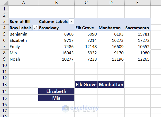
In cell C14, we need to use the formula this way.
=GETPIVOTDATA("Bill",$A$3,"Cashier",$B14,"Store",C$13)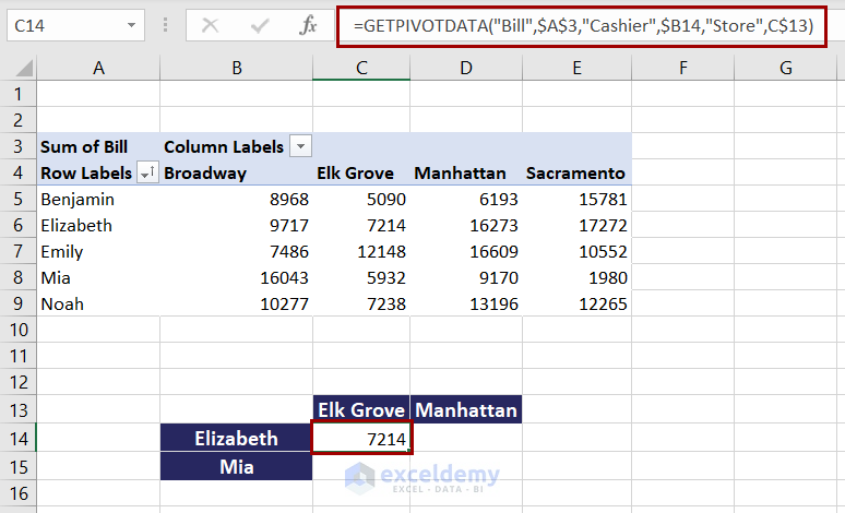
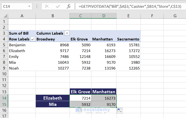
Now fill out the formula for the rest of the cells to get all the values.
The A3 is the reference point in the pivot table we are using. “Bill”, “Cashier”, and “Store” are the value, row, and column fields of the pivot table.
The argument pairs indicate to match the row of Elizabeth from the cashier and Elk Grove from the store. It returns the bill (from the second argument) of these matches from the pivot table (from the first argument).
Note: You can insert an equal sign (=) and click on a pivot table cell to get the formula directly. However, the arguments are hard-coded in such a way. You can’t use the fill handle that way without changing them to cell references.
Read More: How to Use GETPIVOTDATA in Excel
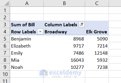
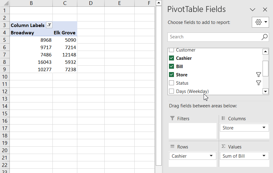
How to Calculate Difference in Pivot Table
This is our pivot table after some slight modifications. We have filtered out two columns and grand totals to make it compact. The table displays the sum of bill values made by each cashier in different stores.
We are going to change the fields between areas to show the difference from its previous entry.
Follow these steps to calculate the difference in the pivot table.
Calculate Difference in Rows:
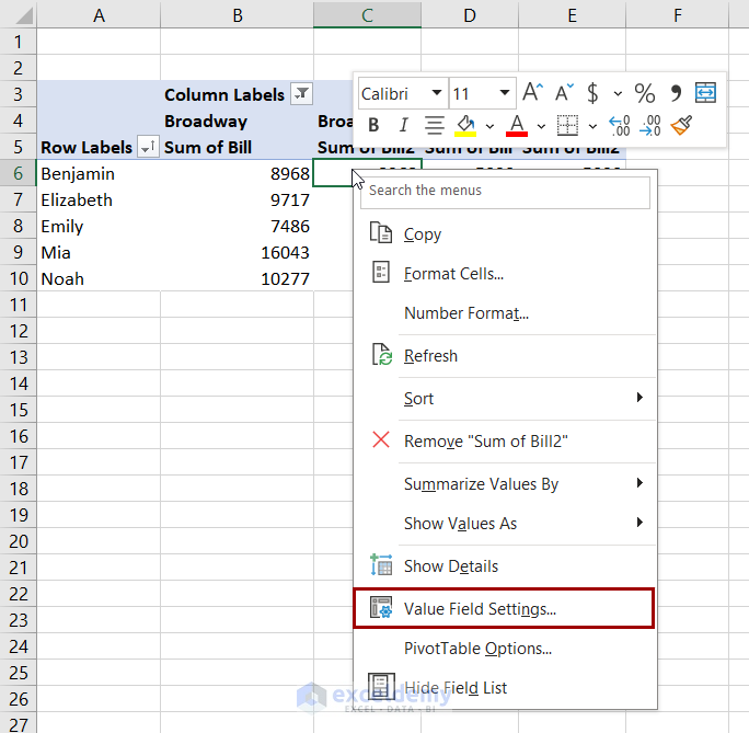
- Create another value field for bills in the pivot table.
With this step, we are copying the same values of the bill to make changes to those entries.
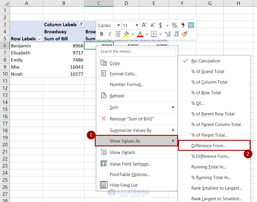
- Right-click on a duplicated value or column field. Select Value Field Settings from the context menu.
- In the Value Field Settings dialog box, select the Show Value As tab.
- Select Difference From in the Show Value As drop-down.
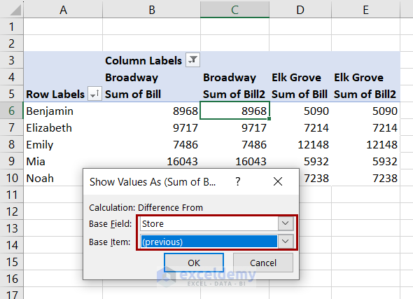
- Select Cashier as the Base Field and previous as Base Item.
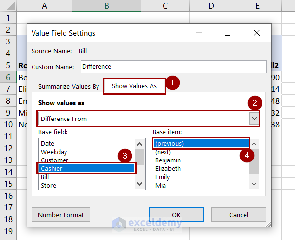
- Click OK and you will get the difference value in each row from the previous rows in the duplicate values.
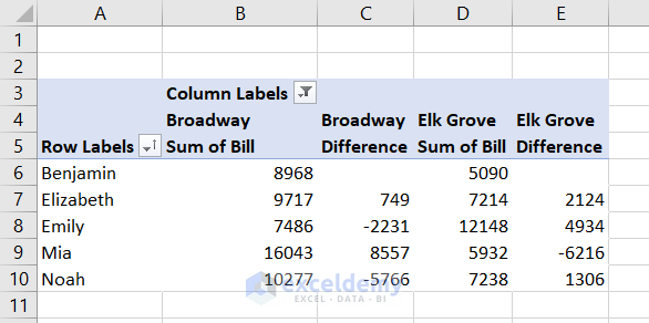
Here the first entries are blank. Because there is no previous value to differentiate from here.
Calculate Difference in Columns:
- Right-click on a duplicated column or value field. Select Show Values As from the context menu, and then select Difference From.
- Select Store in the Base Field and (previous) in the Base Item.
- Clicking OK will give the difference in each column.
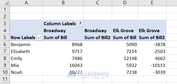
Notice that the first entries are blank. Because there is no previous value to differentiate from here.
Read More: Pivot Table Value Field Settings
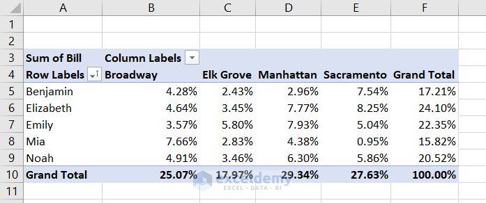
How to Display Percentage Contribution in a Pivot Table
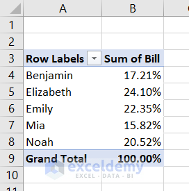
If we go back to the original pivot table we have created, we can see the sum of bill values in each store made by each cashier shown in it.

We dragged the bill values into the field column to create the pivot table. However, we want the percentage contribution of each of the entries to the total sales now.
We can achieve that using the following steps.
- Right-click on a value or column field.
- Select Show Values As and then % of Grand Total from the context menu.
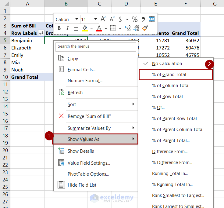
The pivot table will now display the percentage contribution.
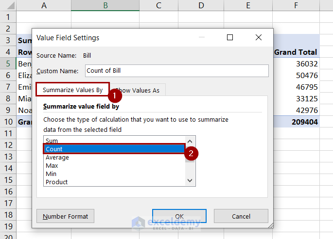
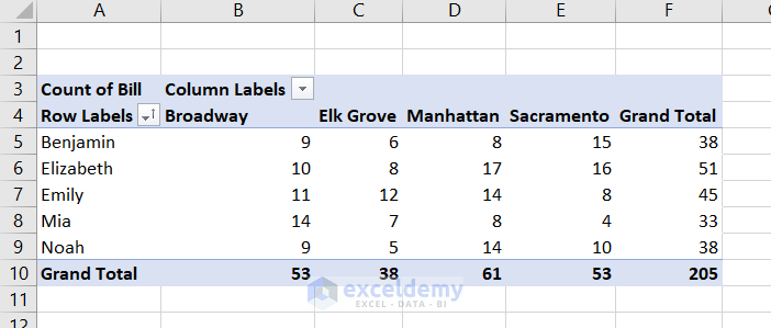
How to Use Pivot Tables for Frequency Distribution in Excel
In the previous example, we showed the bill values as a percentage contribution to the total sales. We will show the frequency in this example. In other words, our pivot table is going to display how many times a bill was issued in each branch by each cashier.
Here are the steps to do that.
- Right-click on a value or column field.
- Select Value Field Settings from the context menu.
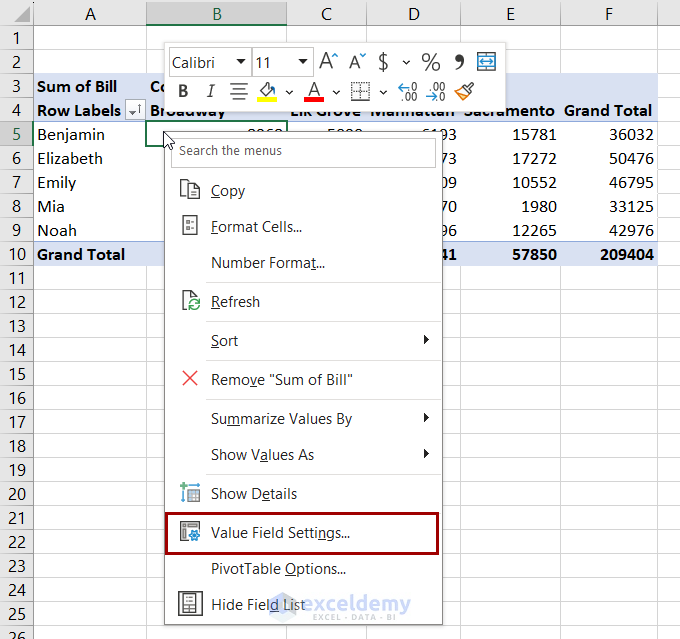
- Go to the Summarize Values By tab in the Value Field Settings dialog box and select Count.
- Clicking OK will give the total bill counts instead of the total bills.
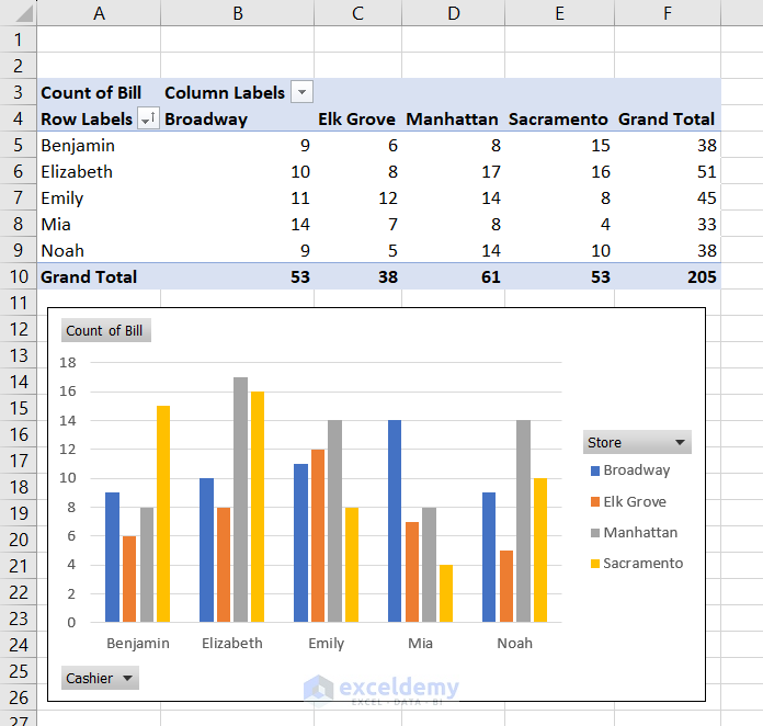
How to Create PivotChart from a Pivot Table
Excel has the PivotChart feature to create charts from a pivot table. This chart is dynamic and updates with changes in the pivot table. We are going to explain how to make a pivot chart from the frequency distribution we have created.
- Select a cell in the pivot table and go to PivotTable Analyze >> Tools >> PivotChart.
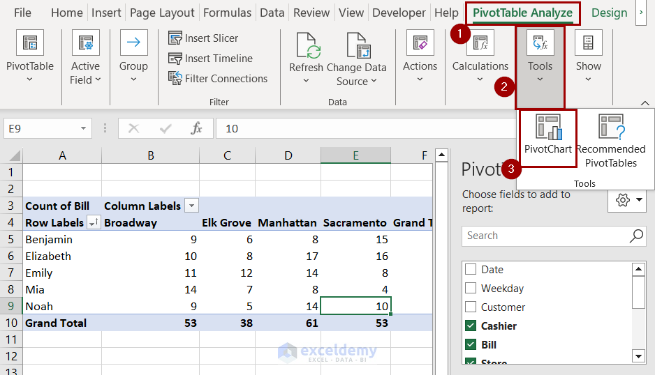
- Select the type of chart you prefer from the Insert Chart box.
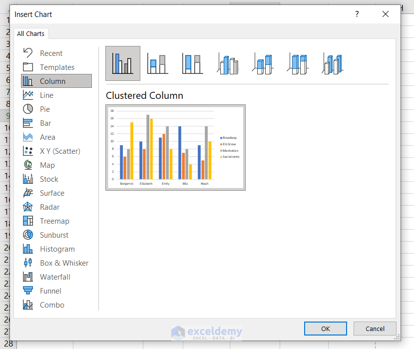
- Clicking on OK will give us the pivot chart on the worksheet.
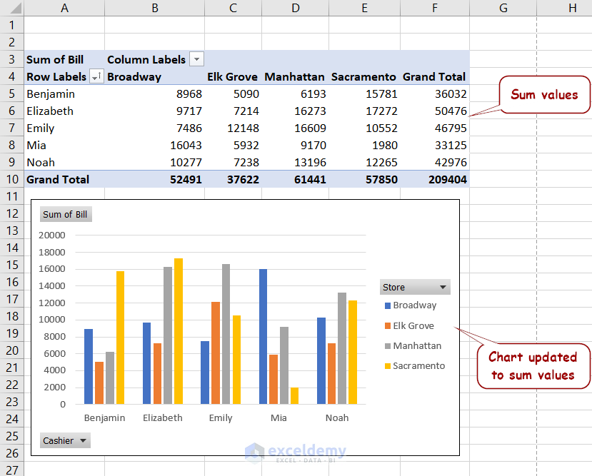
If we revert the values to sums, the chart changes accordingly.
Read More: How to Use Pivot Chart in Excel
How to Remove a Pivot Table in Excel
To remove a pivot table, select the entire table first. Select a cell in the table and press Ctrl+A for that. Or, you can select PivotTable Analyze >> Actions >> Select >> Entire PivotTable.
Now go to PivotTable Analyze >> Actions >> Clear >> Clear All.
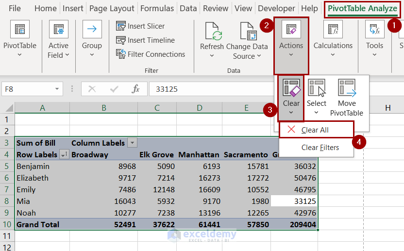
This will remove the pivot table and all its caches from the workbook.
Note: You can also press Delete after selecting the table. It won’t remove the cache from the workbook.
Read More: How to Delete Pivot Table
Tips and Tricks for Using Excel Pivot Table
- Properly clean and format your data. Remove unnecessary blank rows and handle missing data and hidden values.
- Avoid merged cells in the source data.
- Drag and drop fields intuitively. Dragging different fields can cause different outputs in a pivot table.
- Choose the appropriate field names.
- Use filters, slicers, and groups to improve interactivity.
- Properly format data, such as percentages, dates, counts, etc., for clarity.
- Sort the data when necessary.
- Use pivot charts with the table for a more graphic presentation.
- Refresh the data regularly in case the original dataset updates.
- Double-click on the data to see the values behind the subtotals.
Issues Related to Pivot Table in Excel
Here are some common issues you might face while working with pivot tables and solutions.
1. New Data Not Including After Refresh
Refreshing a pivot table updates it to the latest changes in the original dataset. However, when we insert new data under the original dataset, refreshing doesn’t include it. Excel counts the new data as a separate entry and doesn’t include it in the table.
Solution:
One way to solve this is by changing the data source of the pivot table and selecting the whole range again. But we have to do this every time we enter data.
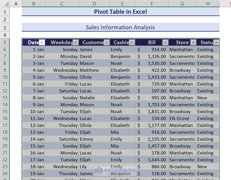
Another way is to convert the dataset into a table before turning it into a pivot table. For that, select a cell in the dataset and press Ctrl+T.
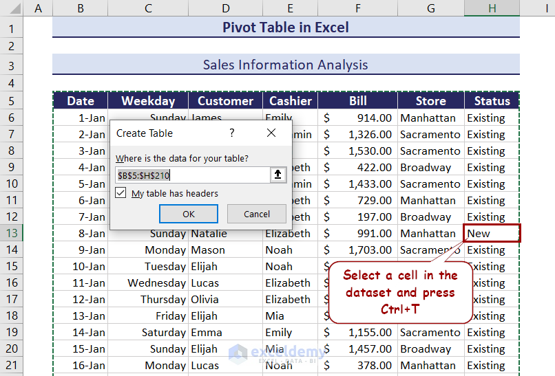
Click on OK and the dataset will turn into a table.
Insert a pivot table now, and it will update after a refresh when you insert new data in this table.
2. Changing Certain Field Names
Here is a simple dataset we have created.
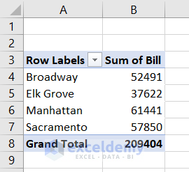
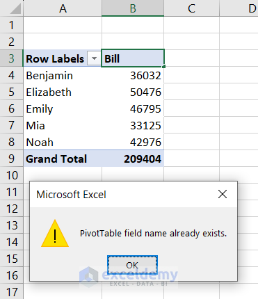
When we want to change the name of the column “Sum of Bill” to “Bill”, Excel won’t let us. Because there is a field with such a name in the pivot table cache.
Solution:
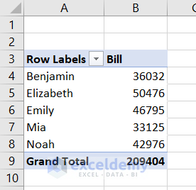
Instead of “Bill”, we can insert “Bill “ (a space at the end). The pivot table will not find both the same, and we can also get the desirable cell value.
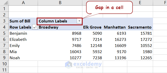
3. Blank Value in Pivot Table Cells
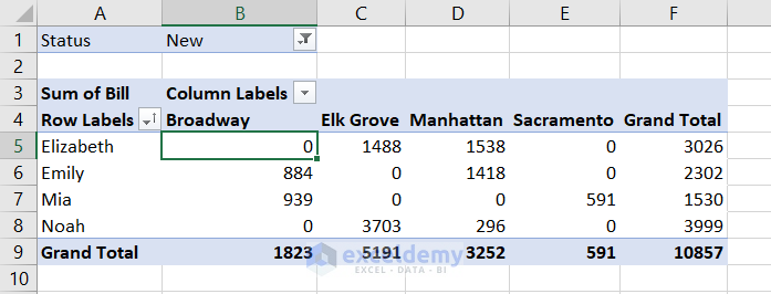
This is a pivot table we created in a previous example. It shows the total bills of new customers in different branches served by different cashiers.
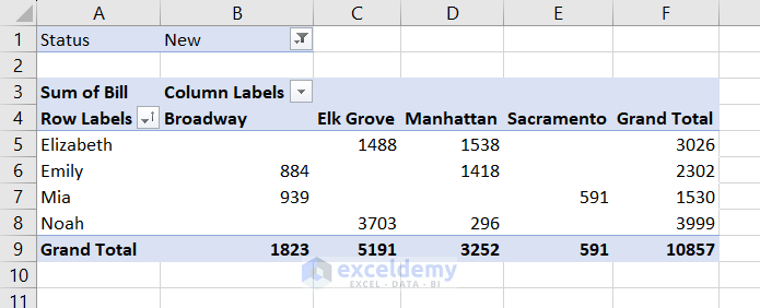
You can notice that some values here are blank instead of showing anything. The blank value occurs because no such values existed in the original dataset. For example, Elizabeth didn’t serve any new customers at the Broadway branch for that duration. Hence the blank value in the pivot table.
The zero or blank values in the original dataset also cause the same result in a pivot table.
Solution:
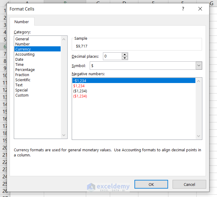
In these cases, you can display 0, “null” or other values. Follow these steps for that.
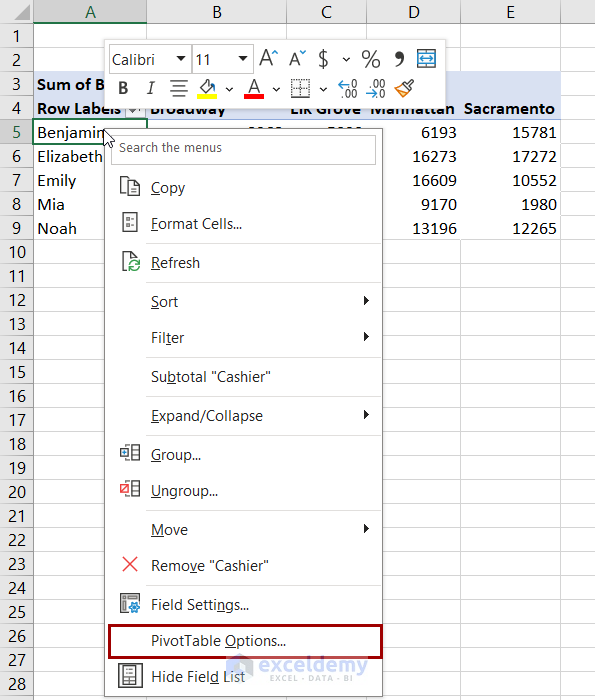
- Right-click on a cell in the pivot table and select PivotTable Options.
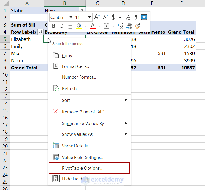
- In PivotTable Options, go to the Layout & Format tab.
- Check For empty cells show and insert a value beside the option’s field.
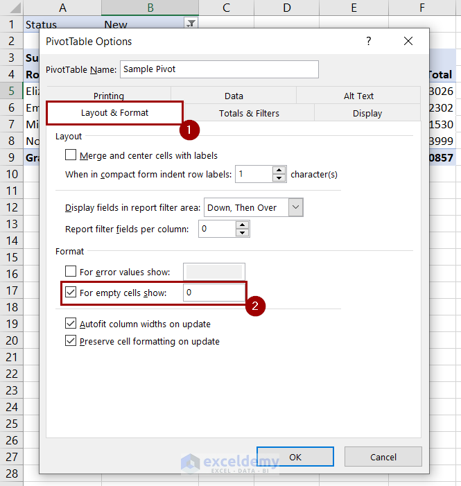
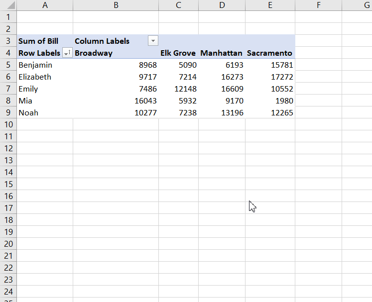
- Click OK and the blank values will turn into the values you have inserted.
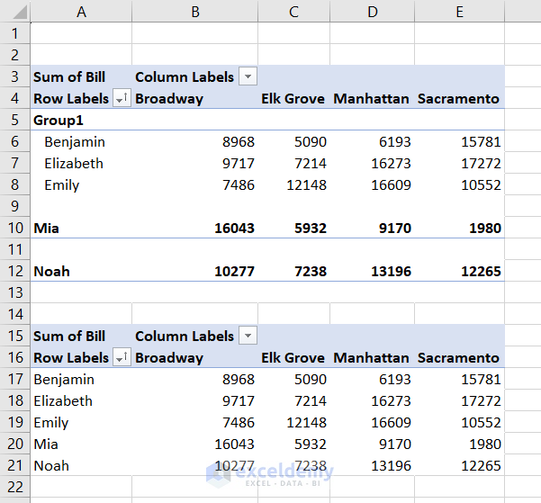
4. Grouping One Pivot Table Affects Another
Here are two pivot tables created from the same dataset.
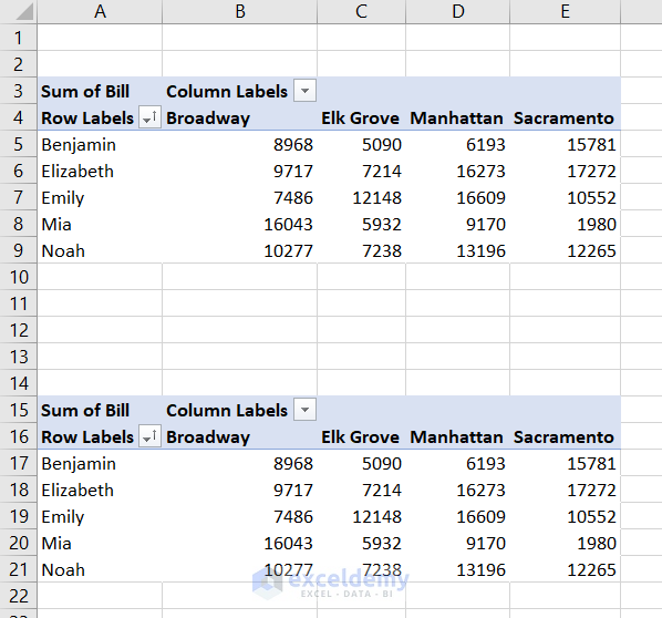
When we group some labels in one table, it categorizes the labels in the other one too.
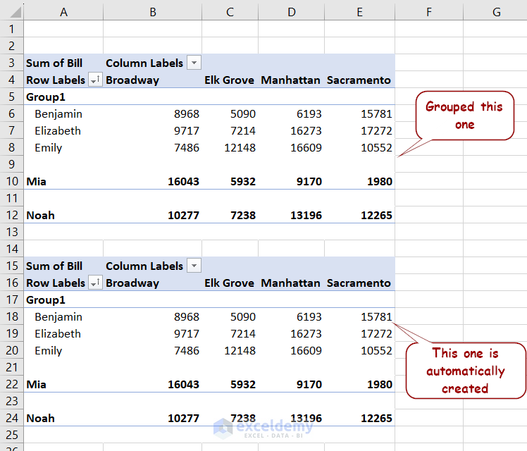
This happens because both tables use the same cache.
Solution:
- Select one pivot table and press Ctrl+X to cut the table.
- Paste it onto a new workbook (It has to be a workbook, not for new sheets).
- Refresh the pasted table in the new workbook.
- Now copy and paste it back to the original place.
Now grouping one won’t affect the other, even in the same worksheet.
5. Pivot Table Not Keeping Number Formatting
If you format a cell in a pivot table and change the field in the table later on, it can go back to the previous formatting sometimes.
Solution:
- Right-click on a value or column field and select Value Field Settings from the pivot table.
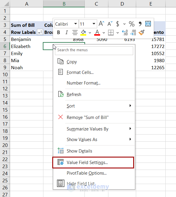
- Click on Number Format in the Value Field Settings
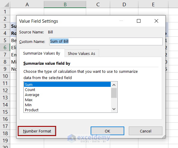
- Select proper formatting from the Format Cells box now.
6. Refreshing Pivot Table Changes Column Width
Here is a pivot table with an extra column width.
When we refresh the table, it automatically fits the column width.
However, there can be cases where you want to keep the extra width, and this feature won’t let you do that.
Solution:
- Right-click on any cell in the pivot table and select PivotTable Options from the context menu.
- Uncheck the Autofit column width on update in the dialog box.
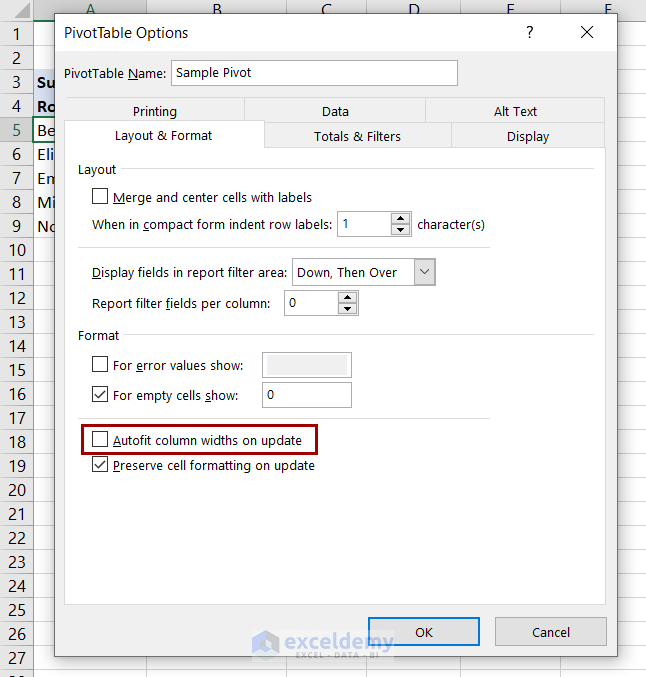
Now, refreshing the table won’t change any of its column widths.
Download Practice Workbook
That concludes our discussion on the pivot table feature in Excel. We have covered different parts of a pivot table, how to create different types of pivot tables, and how to create them from different sources. We have also covered interactions of different fields in a pivot table, changing summary calculations, calculating differences, etc.
The article describes different tools for the pivot table available in Excel and how we can change the design and labels in the table. It also includes copying, selecting, moving, and removing a pivot table. In the end, we have discussed some common issues users face regularly with the feature and how to solve them.
Pivot Table in Excel : Knowledge Hub
<< Go Back to Learn Excel

