You may have created a chart in Excel on the basis of some gathered data. But sometimes you may need to create Sparklines in your Excel worksheet to make your data more reader-friendly.
Sparklines are small, data-dense charts that can be embedded in a cell within a spreadsheet. They provide a quick and easy way to visualize trends and patterns in your data, making them a valuable tool for anyone who works with large amounts of data in Microsoft Excel.
In this tutorial, we will explore how to create sparklines in Excel, step-by-step with two easy methods. We’ll cover the different types of sparklines you can create, how to format and customize them to suit your needs, and how to make the most of their visualization capabilities to gain insights from your data.
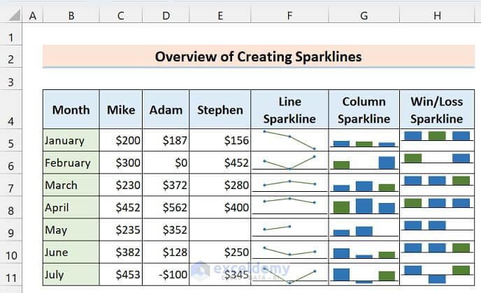
Here’s an overview of creating sparklines in Excel.
What Are Sparklines in Excel?
Sparklines in Excel are small, visual representations of data that are typically placed within a cell of a spreadsheet. They provide a quick and easy way to display trends and patterns in your data, without taking up a lot of space on your worksheet.
Sparklines can be created for a range of data, such as a column, row, or group of cells, and they can show changes in the data over time, highlight highs and lows, and compare different sets of data.
They are particularly useful for displaying a lot of data in a small space, such as in a dashboard or summary report.
Different Types of Sparklines in Excel
There are three types of sparklines in Excel:
- Line Sparklines: Line sparklines are used to represent the trend of a data series over time. They are helpful for displaying trends or patterns in data, such as an increase or decrease in sales over time.

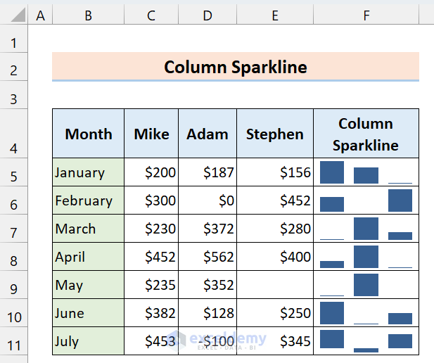
- Column Sparklines: Column sparklines are used to represent changes in data values, such as increases or decreases in sales or expenses. They are helpful for comparing values within a single data series.
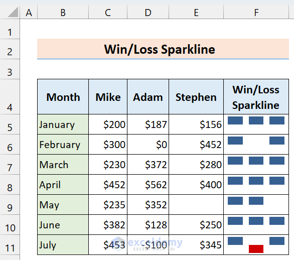
- Win/Loss Sparklines: Win/loss sparklines are used to represent whether a data series is positive or negative. They are helpful for quickly identifying trends in data, such as whether sales are increasing or decreasing.
Read More: Types of Sparklines in Excel
Why Use Sparklines in Excel?
Sparklines are small, compact charts that can be included within a single cell of an Excel worksheet. They provide a quick, clear, and easy-to-understand visual representation of data trends, patterns, and variations, making it easy to identify and analyze important insights at a glance.
Here are a few reasons why you might want to use sparklines in Excel:
- Visualizing data trends: Sparklines can quickly highlight data trends over time or across different categories, making it easier to identify patterns and spot outliers.
- Saving space: Sparklines take up very little space, so you can include multiple charts in a small area of your worksheet without cluttering them up.
- Enhancing data analysis: Sparklines can be used to visually enhance your data analysis by providing context and highlighting important data points, making it easier to draw meaningful insights from your data.
- Improving communication: Sparklines can help you communicate your data insights more effectively to others, as they provide a clear and concise way to visualize data trends and patterns.
Overall, sparklines are a useful tool for anyone who works with data in Excel, whether you’re a business analyst, financial planner, or just someone who needs to visualize data trends quickly and easily.
How to Create Sparklines in Excel: 2 Easy Ways
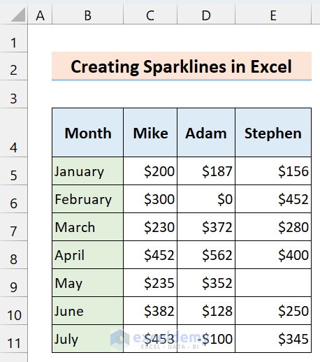
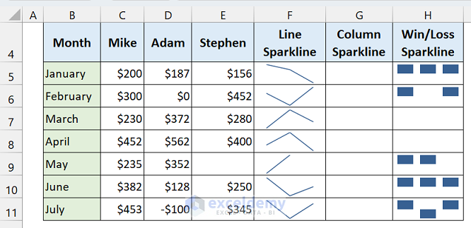
Let’s get introduced to our dataset that represents the sales of some salespersons for a shop over a certain period of time.
1. Create Sparklines Using Sparkline Command from Insert Ribbon
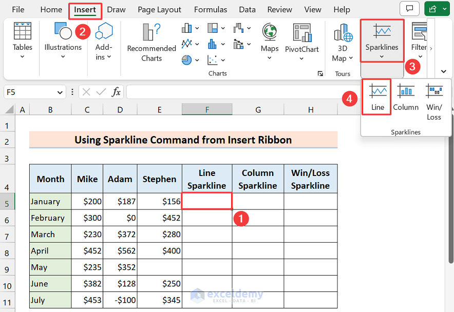
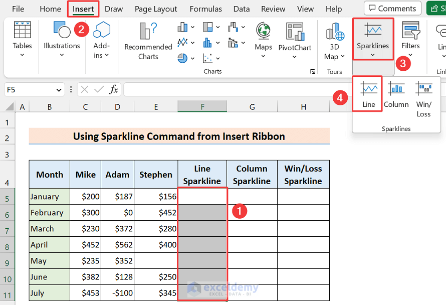
First, we’ll learn how to insert a sparkline in a single cell using the Sparklines command from the Insert ribbon.
- Select a cell where you want to insert the sparkline, and we’ll insert it in Cell F5.
- Next, click as follows: Insert > Sparklines.
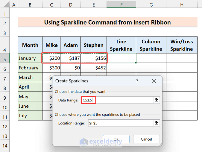
- Then you will get the three types of sparkline, select one of them because you can’t insert multiple types of sparkline at a time. We selected Line Sparkline.
- The Create Sparklines dialog box will open up to set the data range. Select the data range (C5:E5) and press OK.
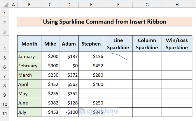
- Now see, a sparkline is inserted in that cell.
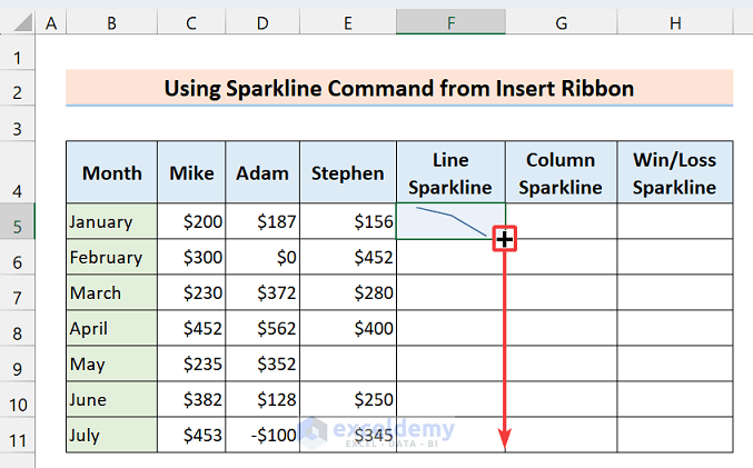
Adding Sparkline for Multiple Cells
The process of inserting sparkline in multiple cells at a time is nothing so different, just apply the same command for multiple cells or you can use the Fill Handle tool too.
- After inserting the sparkline in the first cell, drag down the Fill Handle icon along the column or row.
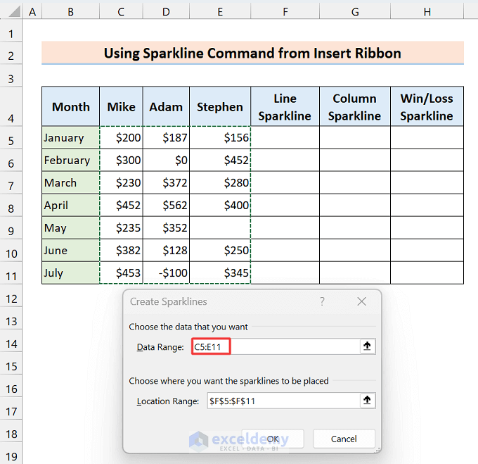
- Or, first, select multiple cells and apply the following commands again: Insert > Sparklines > Line.
- Select the data range (C5:E11) and press OK.
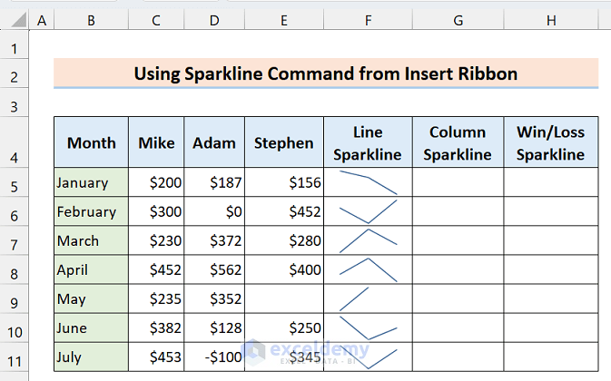
Then you will get multiple sparklines at a time.
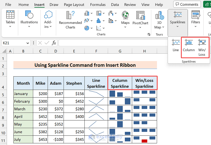
- By using the option of the other two sparklines, you can insert Column or Win/Loss sparklines.
Read More: How to Create Column Sparklines in Excel
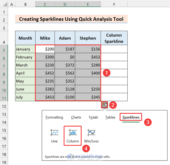
2. Use Quick Analysis Tool to Create Column Sparklines in Excel (Only for Adjacent Rows/Columns)
Now we’ll learn a very quick way to insert sparklines. Excel offers the Quick Analysis tool to analyze your data easily and quickly using charts, formulas, or tables. The Sparkline charts are available there too. We’ll insert the Column sparkline using it.
The one drawback of this method is- you can only insert sparklines in the adjacent row/column of the selected range.
- Select the data range and soon after the Quick Analysis tool icon will be visible at the right-bottom side of the selected range.
- Click on the Column option from the Sparklines section.
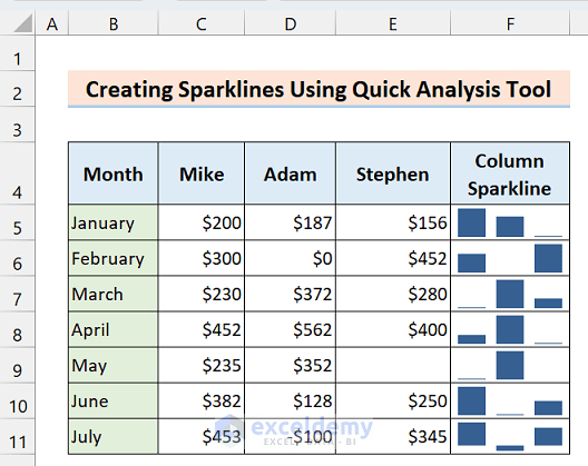
- Here’s the output.
How to Customize Sparklines in Excel
There are a lot of customizations in sparkline charts. Like, you can change the size, color, style axes, etc. so it helps a lot to return a good look in our sparkline charts. Let’s learn some most common and frequently used customizations.
Resize Sparklines
There’s no dedicated command to resize the sparkline. If you change the sparkline’s cell size, the sparkline chart’s size will be changed according to that. Let’s change the size of Cell H11 of the Win/Loss sparkline.
- Click and hold the sidebar of the row/column number.
- Then just drag to resize as much as you want.
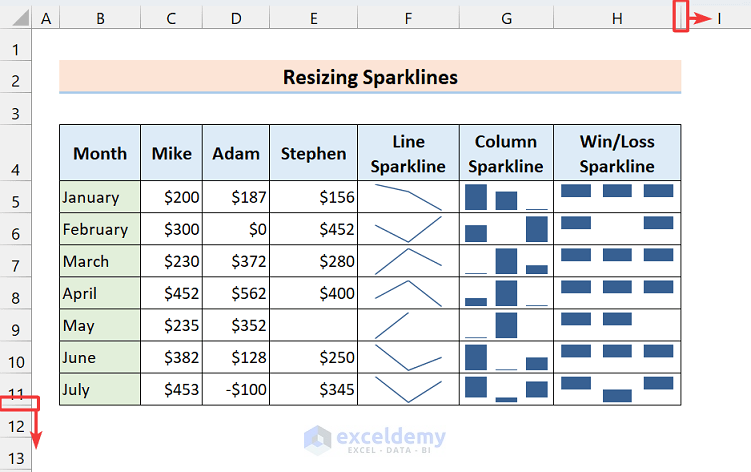
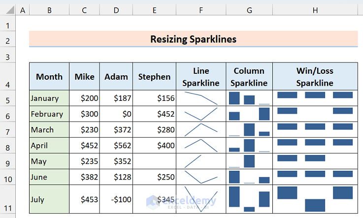
- See, the size of Cell H11 is increased.
Group & Ungroup Sparklines
If we make a group for our sparklines then it seems more convenient to apply other operations to it. So, here we’ll learn to group and ungroup them.
Group
- To group the sparklines, select the range of sparklines and click on the Group option from the Sparkline ribbon.
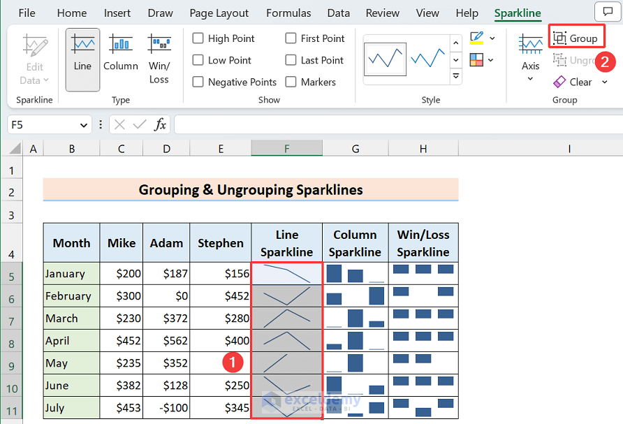
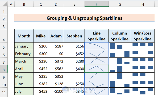
- Now if you click on any sparkline from the range, all the sparklines will be selected with a blue color border.
Ungroup
- To ungroup the sparklines, again select the sparklines and click on the Ungroup option from the Sparkline ribbon.
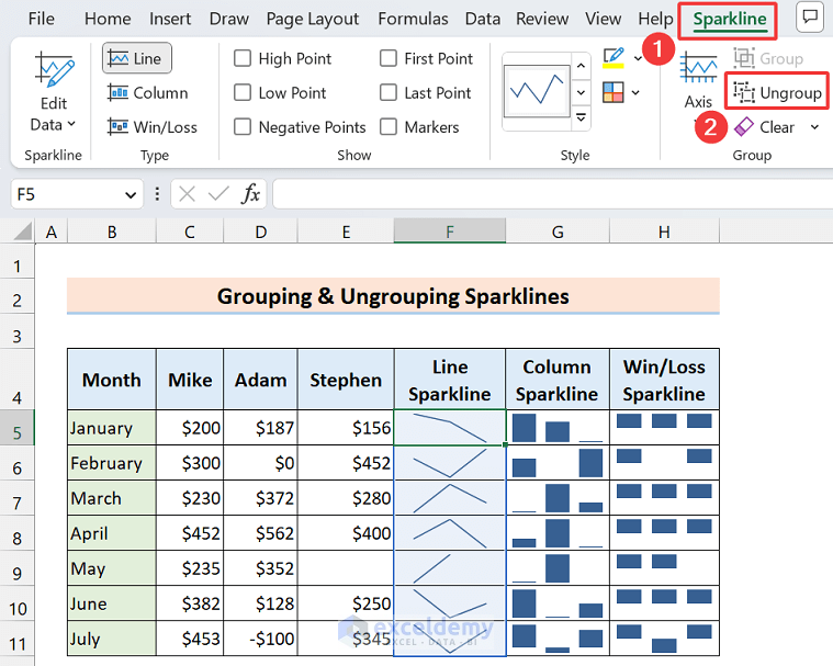
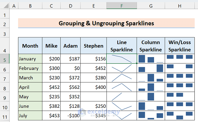
- Now the sparklines are ungrouped.
Read More: How to Ungroup Sparklines in Excel
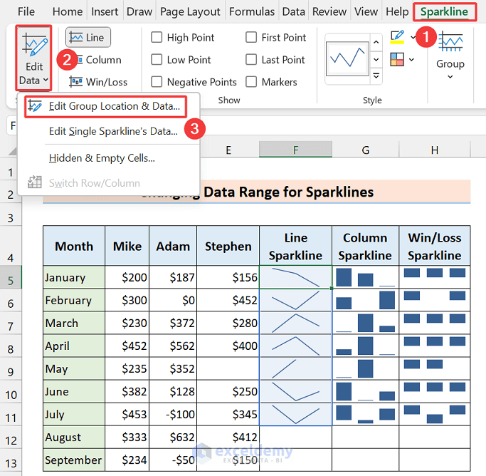
Change Data Range for Sparklines
Suppose, you have already inserted sparklines but suddenly you have changed the dataset then instead of inserting sparklines again it’s feasible to change the data range. Here you see, we added two more rows, let’s add them to the previous range of Line sparklines.
- Select the line sparklines and click Sparkline > Edit Data > Edit Group Location & Data…
- Use the Edit Single Sparkline’s Data… option if you want to change the data range for a single sparkline.
- The Edit Sparklines dialog box will open up to set the new data range and destination range.
- Set the new ranges (C5:E13) and press OK.
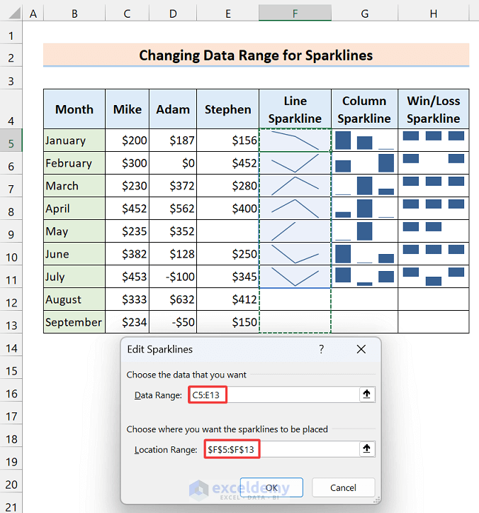
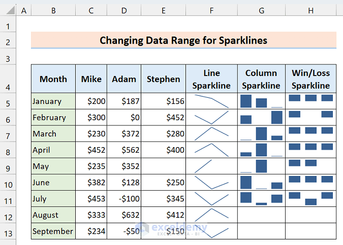
- We can see the data range.
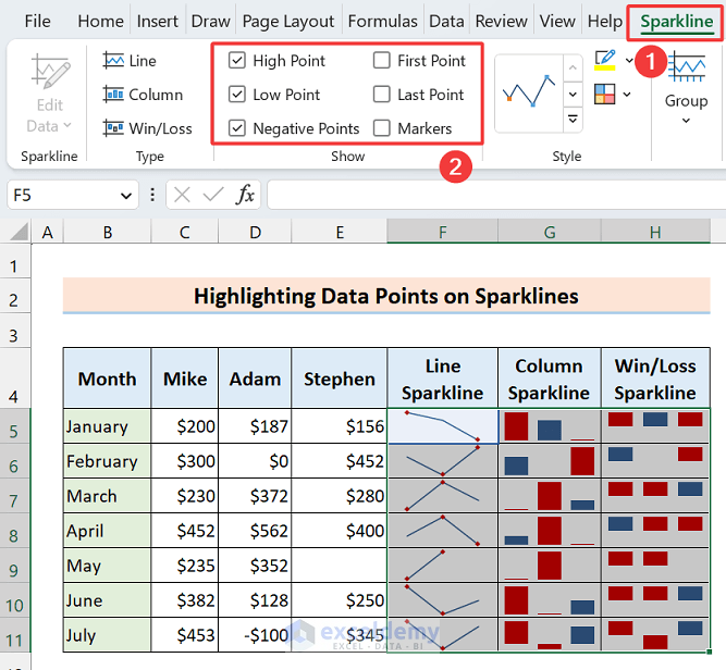
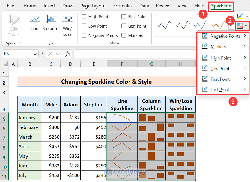
Highlight Data Points on Sparklines
Sparklines get more readable and understandable if we highlight the high point, low point, first point, last point, negative point, etc. It adds another dimension to analyzing data.
- Select your sparkline chart range and then click on the Sparkline ribbon.
- Then in the Show section, you will get the points to highlight.
- Mark your required points. We marked the High Point, Low Point, and Negative Point.
- And see, the corresponding points are now highlighted in red color.
Read More: How to Add Markers to Sparklines in Excel
Change Sparkline Color & Style
For a better visual representation, we can change the color and style of the sparklines easily. You can select one from the default list or can make your own.
- Go to the Sparkline ribbon after selecting the Sparkline range.
- Then from the Style section, choose a style. We chose a deep orange color style.
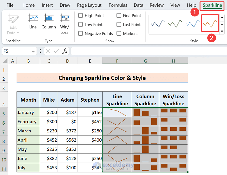
- From the Marker Color dropdown, you can select different colors for different points.
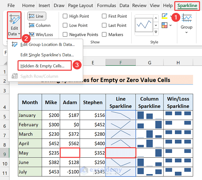
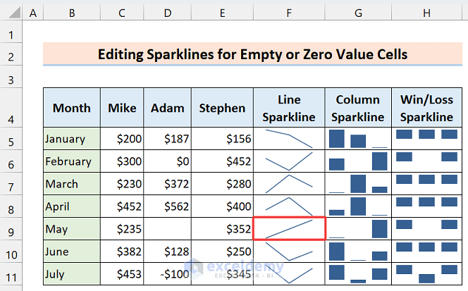
Edit Sparklines for Empty or Zero Value Cells
Take a look at Cell D9, the cell is empty, so there is no connection between the high point and the last point in the Line sparkline. But you may want to connect them, no worries Excel has an option for this.
- Select the cell and click as follows: Sparkline > Edit Data > Hidden & Empty Cells…
- After appearing in the below dialog box, mark Connect data points with line option and press OK.
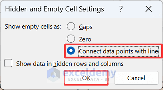
- Now see, the line sparkline is drawn avoiding the empty cell.
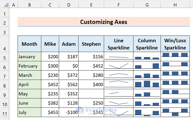
Customize Axes
Have a sharp look at the sparklines, the maximum point is the same in every row. This is because every row is independent here so every high point takes the highest size in every cell and then the other values are placed based on that size.
But you may need to insert the sparkline charts based on all values of your dataset. Along with that, we can also display the horizontal axis.
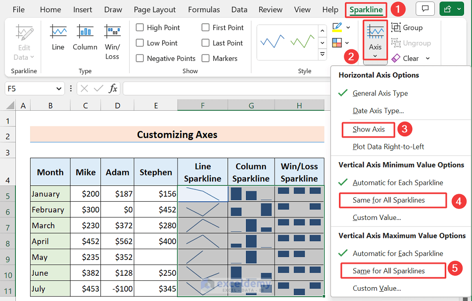
- Select the Sparkline charts and then click on the Axis drop-down from the Sparkline ribbon.
- Next, mark Show Axis from Horizontal Axis Options, and mark Same for All Sparklines option from Vertical Axis Minimum Value Options and Vertical Axis Maximum Value Options.
- The axis is now visible and the maximum points are now based on the highest value of the entire range.
Insert an Axis
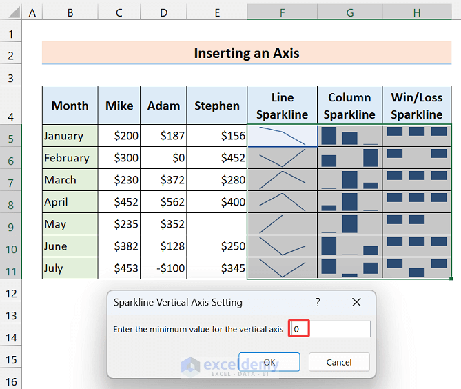
Notice another thing, in the column sparkline the lowest point seems tense to zero although the sales are not zero. So sometimes, it seems confusing to understand the sparkline charts. Let’s see how we can overcome this situation.
- Select the Sparkline charts (F5:H11) and then click on the Axis drop-down from the Sparkline ribbon.
- Click on the Custom Value option from the Vertical Axis Minimum Value Options.
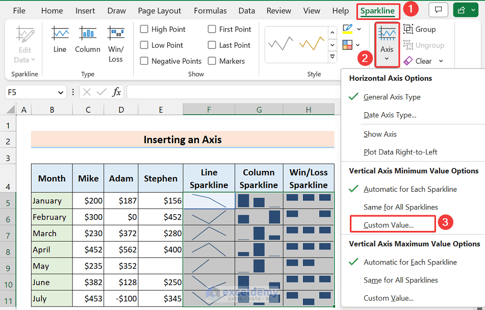
- After appearing in the Sparkline Vertical Axis Setting dialog box, type zero and press OK.
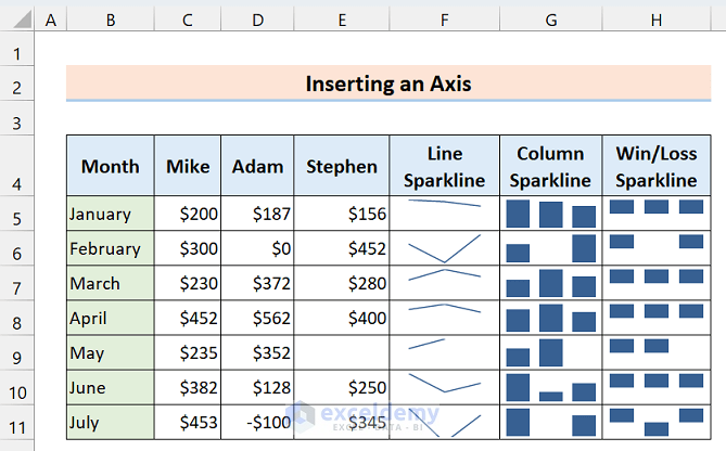
Here’s the output based on the new axis value.
Delete Sparklines
There is a dedicated command in the Sparkline ribbon to remove sparklines. By using the command we can delete specific sparklines or grouped sparklines.
- To erase a specific range of sparklines, select the cells (H7, H8) and then just click as follows: Sparkline > Group > Clear.
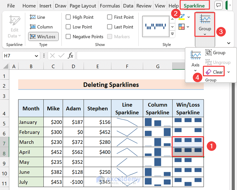
- No sparklines on those cells anymore.

- To delete grouped sparklines, click on any cell of the grouped sparkline and click as follows: Sparkline > Group > Clear > Clear Selected Sparkline Groups.
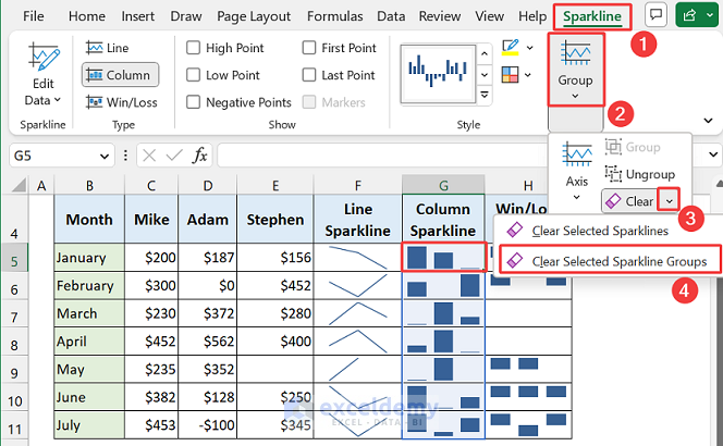
The grouped column sparkline is removed.
Things to Remember
- Availability: The sparkline feature is available from Excel 2010, so you won’t get it in the earlier version.
- Data Type: Sparkline chart only supports numeric data, it avoids text or errors.
- Property: Sparkline doesn’t seem like an object, it works like an image in the background of a cell.
- Excel Table: Using Excel tables or Pivot Tables, we can create Sparklines.
- Data Range: Make sure to select the correct data range for your sparkline. If you select the wrong range, your sparkline may not accurately reflect the trends and patterns in your data.
- Scaling: Be careful when scaling your sparklines. If you scale your sparklines too small or too large, they may become difficult to read or may distort the data.
- Axis Options: It’s important to set the minimum and maximum values of the axis options correctly. If you don’t, your sparklines may not accurately reflect the data and may give a misleading impression of the trends and patterns.
- Context: Remember to provide context for your sparklines. While sparklines are great for showing trends and patterns, they may not provide enough information on their own. Consider adding labels, headings, or other information to provide context for your sparklines.
- Paste Option: While pasting the sparklines to other apps like Docs or PowerPoint, paste it in Pictureformat.
- Limitations: Keep in mind the limitations of sparklines. While they can be useful for visualizing trends and patterns, they may not be suitable for all types of data or for large datasets. If your data is too complex or too large, sparklines may not provide enough detail to accurately reflect the trends and patterns.
- Updating: Remember to update your sparklines whenever you make changes to your data. Sparklines are dynamic and will update automatically if you’ve set them up correctly, but it’s important to check that your sparklines are up to date before sharing or analyzing your data.
- Other Operations: After inserting a sparkline in a cell, you can also insert formula or conditional formatting.
- Compatibility: The sparkline feature doesn’t work in the compatibility mode of Excel.
Frequently Asked Questions
1. How do sparklines work in Excel?
Sparklines are small, simple line charts that can be added to individual cells in Excel. They provide a quick and easy way to show trends and variations in data, without the need for a full chart. Sparklines are especially useful for visualizing large datasets in a compact and efficient manner.
2. How to create sparklines in Excel 2007?
While the Sparkline feature is not available in Excel 2007, you can still create a similar effect using Excel’s line chart feature.
To create a sparkline-like line chart in Excel 2007, you would select the data range you want to chart, then click the “Insert” tab, select “Line Chart” and choose the chart type that displays the data most effectively.
Finally, you can format the chart to make it smaller and more suitable for embedding within a cell.
3. Why does my Excel not have sparklines?
Sparkline feature is available from Excel 2010. Also, the sparkline feature doesn’t work in the compatibility mode of Excel.
Conclusion
In summary, sparklines in Excel offer a powerful way to quickly analyze data and identify patterns or trends, without the need for a full chart. While the Sparkline feature is not available in older versions of Excel, you can create similar line charts that are just as effective.
By selecting the data range, inserting the chart, and customizing its appearance, you can create sparklines that are visually appealing, easy to understand, and fit neatly within a cell. Sparklines are a valuable tool in data analysis. We use it in a variety of fields, including finance, sales, marketing, and more.
Whether you’re an Excel novice or an expert, adding sparklines to your spreadsheet can help you gain new insights and make more informed decisions.
Please let us know if you still have any more queries on how to create sparklines in Excel, you can share your feedback in the comment section. Have a great day!
Related Articles
- How to Create Excel Sparkline for Multiple Data Ranges
- How to Use Sparklines in Excel
- How to Use Win Loss Sparklines in Excel
<< Go Back to Excel Sparklines | Learn Excel

